My concept was something along the lines of the gods of autumn painting the leaves their colors. What I really wanted to do was take my leaf skeletons (seen here), possibly paint them green, and then pour red and yellow paint onto them, catching the paint pour in the photo. But, that was a bit complicated -I wasn't sure how to stage it. So, I painted the leaf skeletons red, orange, and yellow instead, and then staged a shot where the paintbrush hung over the leaves by a thread I could clone out. I tried it 2 ways -with the paintbrush still to show detail, and with the brush swinging to get some motion blur. Neither worked in my opinion:
I thought the paint was too much and the leaves just weren't right. And the idea of the paintbrush hovering wasn't coming through because there was little to hint at such a 3-D space. So the next day I gathered a few colorful leaves -there weren't many, but I found a few, and I tried again. I thought this time I'd do something similar, but make the leaves more central since they are the main idea anyway. Unfortunately, I failed again.
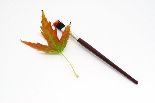
This one was getting a bit closer. It was less gimmicky, more about the leaves, but again -the paint buckets weren't showing up against the white. At this point, they were days old, the paint was dry, and they were very stuck to the white paper. I didn't really want to redo the photo with a black background and felt that the paintbrush would get lost if I did that anyway. So, I decided to lose the paint buckets. That left me with leaves and a brush. I arranged the items in several different ways, and eventually decided to simplify the shot by choosing just one leaf. As soon as I looked through the camera, I knew I was getting closer. Here's the end result:

It looks quite nice large. I'm currently using it as my wallpaper and I think that although it underwent many changes, it still conveys the same feeling that I was hoping for when I first conceived of the project.
What do you think? Feel free to comment here, on the Photography_Beginners yahoogroup, or on Flickr.
1 comment:
I actually like the image with the paint cups better than the image with the leaf and brush. The image with the paint cups seems to convey (to me) that the paint is actually spilling on to the leaf and leaves (no pun intended!!) the viewer wanting more (or possibly questioning what is going to be "painted" next). The original image seems to boring for lack of a better term. Nothing is happening.
Just my opinion!!
Ralph
www.ralphbucci.com
Post a Comment