Showing posts with label histograms. Show all posts

Tuesday, February 10, 2009

Adjusting curves by a photo's histogram

Because you can adjust the brightness of your monitor, how do you know if your photo is light or dark? Judging exposure on your computer monitor, unless it's calibrated, is not a good idea. Luckily, there's a tool that can help us judge if our photo is too light or too dark -it's called a histogram. If you are unfamiliar with reading histograms, read this article.

So, let's open this photo in Gimp: (feel free to download it to follow along)
http://www.flickr.com/photos/15059459@N02/3269890274/

Then, open the Curves tool:
HistoImageEditing1
(click on image to view it larger)

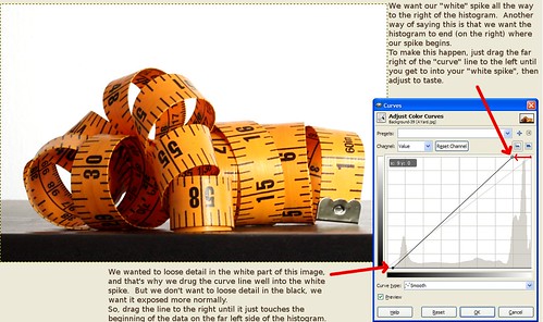
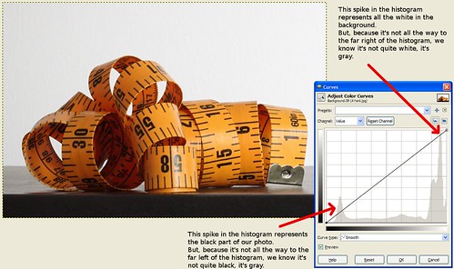
In the background of the Curves tool you can see the image's histogram. For this image, I wanted the white background to be pure white, meaning I wanted it intentionally over-exposed so it lost it's detail. That means, I expected the white spike on the right side of the graph to spill off the right side of the graph instead of being so far into the graph on that side.

I can also see that the spike on the left representing the black parts of the photo is too far in as well.

To fix the white, click on the far right hand part of the curves line and drag it to the left until it's in the middle of the "white spike". Essentially what you're doing here is making the histogram end in the middle of that white spike. In this case, to get the far left side of the photo to become pure white you actually need to drag the curve line past the middle of the spike as shown in the final screenshot below.

For the black, we're not aiming to loose the detail like we wanted to do with the white, so we're just going to drag the curve line on that side to the right until it touches the point where the data just begins on the left side of the histogram.

The result should look like this:
HistoImageEditing2

...now the white is pure white instead of gray and the black part at the bottom doesn't look so washed out.

Histogram basics

Histograms don't look that hard. Many people make assumptions about them based on reading similar graphs in the past, but this leads to so many people thinking it's the shape of the data that matters when, in truth, all that matters most of the time is the far left edge and far right edge of the graph.

So, let's start over. Here's what you need to know:
  • The far left edge of the graph represents black
  • The far right edge of the graph represents white
  • The middle is all the shades of gray in-between (and for color photos, just think about them being converted to black and white before being represented on the graph)
What this means is:
  • If the data peters off to zero at the edges of both ends of the graph, your exposure is perfect.
  • If the data gets chopped off on the left side and peters off to zero on the right before reaching the far right edge, your photo is too dark or "underexposed".
  • If the data gets chopped off on the right side and peters off to zero on the left before reaching the far left edge, your photo is too bright or "overexposed".
Here's some examples:

Proper exposure:


Too dark (under-exposed):


Too bright (over-exposed):

Tuesday, December 2, 2008

Intro to histograms

Digital SLR owners (and perhaps some digital point and shoot's as well) have the ability to view photos they've taken along with something called a "Histogram". This article will explain what a histogram was and how it can be used to improve your photography.

What is a histogram?

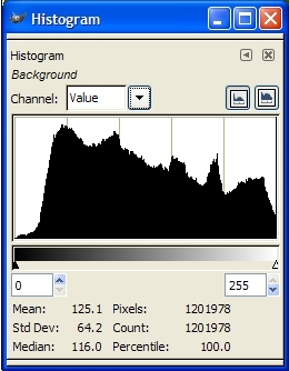
Well, it's a graph, so let's start with an example: (Click on the photo to view a larger version.)

Below the graph, you can see the key, which goes from black all the way on the left, through all the shades of grey until it gets to white at the right-hand side.

So, the graph represents the data in the photo broken down to show how much of the data is of dark, light, or one of the shades of grey in-between.

Does that mean it only works for black and white photos?

No, the histogram works for color photos as well. It's more about "tone" dark red and dark blue are both treated the same (as "dark")... You can think of it as the camera converting the color to black and white to create the histogram if it makes it easier for you to conceptualize.

So, what does this information tell you?

Well, when you review a photo on the LCD screen of your camera it's hard to tell if your photo is too light or too dark because the brightness of your LCD is adjustable. So, how do you know if your photo is dark or if the LCD brightness just needs to be increased because you're outside in sunlight and your LCD was adjusted indoors? The lesson: Looking at the histogram is much more accurate than looking at the photo on your LCD.

What we are often most concerned about when it comes to exposure (how light or dark the photo is) is to make sure that we didn't over-expose or under-expose the photo to the point where we lost detail in the highlights or shadows. We can tell if we've lost detail in the shadows because the data on the histogram will go off of the far left of the graph (the black part), or if detail was lost in the highlights, the photo the data will go off the right side of the graph.


Practical use:

So, let's look at that sample histogram at the top of this article -what does it say about the photo it was taken from?

See how the graph ramps up slowing from the left? that means that there's very little absolute 100% black pixels, so there's no detail loss in the shadows. Now, look at the right side -it doesn't peter off as slowly on the right as it did on the left does it? Instead, it abruptly gets cut off. That means there's a lot of 100% white pixels, which means there was some detail loss in the highlights.

It's easy to assume that histograms that fall off of either side are "bad", but that's not the case. It's important to consider the photo you've taken when looking at the histogram because sometimes under or over-exposed areas are ok. (If you're using a white background and you want it to be blown out for a "high key" look, for example.)


Examples / Practice:

Here are some example photos along with their histograms so you can get a better feel for how to read a histogram: (click the photos to view the large version).

A photo showing a wide range of tones (slightly overblown):

"Full spectrum" histogram


A photo with the majority of it's data in the dark area of the histogram:

"Lots of dark" histogram

A photo showing a lot of over-exposure in it's histogram:

"Lots of white" histogram


A photo showing a lot of dark and light areas without much in-between (grey):

"A lot of dark, a little gray, and more white" histogram


Links:

For further reading, see: http://www.luminous-landscape.com/tutorials/understanding-series/understanding-histograms.shtml

..and here's a reason you may want to intentionally over-expose your photos by a little bit. (VERY interesting): http://www.luminous-landscape.com/tutorials/expose-right.shtml

Monday, October 29, 2007

Getting sharp photos in low light

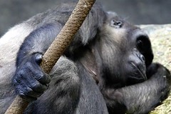
The gorilla's hand

(Click on the photo for a larger version, the EXIF data, etc)

On Saturday I met Mike (ndisgr8) from my yahoogroup at Brookfield Zoo and we spent the whole day taking pictures. It was overcast in the morning, which made many of the indoor exhibits, which are largely lit up via skylights, very dark. As a result, it was extremely difficult to get high enough shutter speeds to get a decent photo in there. I figured this was a great example of low-light photography which everyone seems to run into as a problem from time to time, so here's a write-up about how I dealt with the situation and managed at least a couple decent pics from the ape house...

Equipment:
I was using my Sigma 50-500mm f/4-6.3 lens because this zoo gives the apes a lot of space to roam around and play, so I needed all the "zoom" I could get. For those who aren't familiar with the "f numbers" on lenses, it's included in the description of the lens for just this purpose (low light photography). The lower the "f numbers", the better the lens performs in low light. When you have a range of f-numbers like for this lens, it means that at the wide end (50mm) , 4 is as low of a number as you'll be able to choose for your aperture. At the long end (500mm), it's 6.3.

The reason this matters is as follows: The lower the aperture number, the faster your shutter speed can be. This is because as the aperture numbers get lower, you're letting more light into the camera, with more light via aperture, you can get faster shutter speeds (which allow less light to get in because the shutter doesn't stay open very long). -It's all a matter of balance.

Step 1: Aperture
This lens (the "Bigma") is not very "fast" (meaning it has relatively high f-numbers), so it really limits me when there's not much light. Because of this, I immediately put my camera on aperture priority mode and set it for it's lowest aperture number so I could get the most light possible via aperture (which would, therefore, allow the fastest shutter speeds possible).

Step 2: ISO
Before even bothering to begin looking for photo opportunities, I also set my ISO to 800. The higher your ISO number, the faster your camera will record the light when you take a picture. So, in low light you want to choose a high numbered ISO.

The cost for using high ISO numbers, however, is noise. Most noise can be removed in software later, but there's always an effect on picture quality. You should, therefore, always shoot in the lowest possible ISO setting for the lighting conditions you are in. In other words, remember to set it back down to 100 when you're shooting in daylight again.

Each camera is different as far as how much noise it produces at different ISO's, so it's a good idea to experiment and know how your camera behaves and how well you can remove the noise it produces at each different setting. This way, you'll know not to go above (in my case ISO 800) or you're risking not being able to remove the noise from the photo effectively. -I did end up moving to ISO 1600 later on in the ape house as a last resort because I wasn't getting any clear shots at ISO 800.

Step 3: Check your shutter speeds
Next, I lined up a shot and checked my shutter speed. With most SLR's you can see the shutter speed in your viewfinder. In this case, I was seeing shutter speeds ranging from 1/10 to 1/60 most of the time.

Remember, the rule of thumb is that you need a tripod if your shutter speeds are faster then the reciprocal of your focal length. That's just a fancy way of saying that if you're shooting with a 500mm lens like I was, your shutter speeds should be faster than 1/500th of a second. If you're shooting at 300mm, they should be faster than 1/300th of a second, etc. (Although 1/60th of a second is as slow as you should go with any lens because it's hard to hold the camera steady enough when your shutter speeds are slower than that regardless of how wide the lens is.)

So, I needed shutter speeds that were up to 50 times what I was getting!

Step 4: Put your camera on a tripod
I had a monopod with me just because my lens is so heavy, but I didn't have a tripod. So, I leaned the monopod against the railing and steadied it further by bracing it against side-to-side movement with my foot. A tripod would have made it more steady.

Of course, the monkeys and apes were rarely perfectly still, so even with a tripod, you'd still get blur unless they happened to stay still during the shot.

Step 5: Use burst mode
If you've done all you can with settings and steadying the camera, but your shots are still coming out blurry, your best bet is to take as many shots as possible. Many people aren't aware of it, but they jerk the camera a bit when pushing the shutter button to take a photo. That may be contributing to the blur, so if you put your camera in burst mode you can hold the shutter button down and it'll take several shots one after the other. Even if you're sure you don't jerk the camera, just by shear volume, this will increase your chances at a clear shot.

Step 6: Get creative!
I was doing all of that as well as trying to concentrate only on the apes that were in the best light and I was still having trouble getting clear shots. So, for a few shots I decided to try something different. I was shooting in RAW, so I knew that I'd have a good chance of getting most of the data out of a photo even if it was severely under-exposed (dark), so I intentionally under-exposed several photos as a last resort.

Your camera should have an exposure meter that looks like this: [-2...-1...0..+1..+2] and there's a small indicator that shows you your current exposure setting. "Zero" is normal exposure, but if you use exposure compensation to move the indicator towards the positive numbers, you're telling the camera to over-expose the photo by that amount. When you move the indicator towards the negative numbers, you're telling it to make the photo darker (under-exposed).

Darker photos are a result of letting less light into the camera, so when you move the exposure down into the negative numbers you should get higher shutter speeds. When you're shooting in RAW you're often able to lighten up the photo by up to 2 stops (which correlate with the numbers on that exposure graph on your camera).

So, I moved the exposure meter down to -2 and took a shot. I reviewed the photo on my LCD and turned on the option to view the image's histogram. I made sure the data didn't run off either side of the graph (because that indicates that you're missing data, which you can't get back even in RAW). The photo was very dark, but the histogram looked ok, so I tried a few shots like that and hoped I'd be able to "save them in software" later.

Summary:
The photo above is one of the ones I took on ISO 1600 and under-exposed by 2 stops, then "saved" in the RAW software that came with my camera (Digital Professional Pro). The "right" solution to this kind of a problem is a "faster" lens (meaning a lens with lower f-numbers), but everyone eventually finds themselves in a situation where they didn't expect to have a low-light issue and they need to do what they can with what they have. Hopefully, this write up has given you some ideas for the next time you're shooting in low-light.


Extended reading / other resources:
Friday, September 28, 2007

Friday, July 20, 2007

An introduction to histograms...

Does your camera have an option to show a photo's histogram? (If you aren't sure, check your manual.) If so, and you don't know what it is, read on! You're missing out on a very powerful tool!

It's nearly impossible to tell if a photo you've just taken is too light or too dark (or "exposed properly") on your camera's LCD screen. In bright sunlight you have to shade the screen with your hand, then squint and zoom and in the end you really have no idea until you view it full size on a screen. Even under the best lighting conditions it's difficult to evaluate exposure on the LCD screen because the brightness on the screen itself can be adjusted -so is it right? or just right on your tiny LCD screen? This is where your histogram comes in handy!

Before we get to what the histogram is, let me break down the term "tone" for you (sometimes people get confused by what a color's "tone" really is). By tone, I mean how dark or light a color is. Any color. In other words, if you converted the photo to black and white, it's all the shades of gray between black and white.

So, your histogram will show all the tones in your photo in a graph that goes from black (usually on the left) to white (on the right). You can think about it like this: it converts your photo to black and white, then takes all the pixels and lines them up on the graph -all the black ones are on the far right, then 99% black, 98% black, etc all the way down the line to pure white on the right. ...it's an interesting but abstract thing to do, right?

So, here's why it's useful... If your graph shows a lot of data on the far left (black) side of the graph, you have no detail there. That means, no matter how much you lighten it in post-processing you'll never be able to get anything out of those areas -they are pure black.

Of course, a lot of black isn't bad for all photos. -If we're talking about a photo of a person with a pure black background a lot of pure black would be expected. But, if it's a photo of a bird up in a tree, it's probably under-exposed.

Likewise, if the histogram shows a lot of data on the far right side (towards white), then you have very little detail in the highlights of the photo. But, again, if you took a photo with a pure white background that would be expected. If you wanted detail in the white areas of the photo, however, you'd want to re-take the photo so the data doesn't run off the right side of the graph. (It should peak, then go back down before the graph ends on the right-side.)

It's difficult to understand the idea of using these graphs unless you see them, so here are a few examples of some photos and their histograms. The first 3 are kindof extreme examples, the 4th is a more normal photo. Note that on that one the data runs off the right-side of the graph (I overexposed it a bit!).

(Click on the photo for a larger version and an explanation of what the histogram shows.)

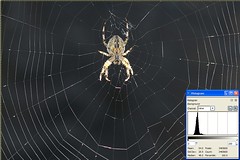
SpiderDarkHisto

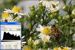
FlowerBlownOutHisto

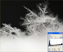
SnowflakeYinYangHisto

Full spectrum histogram


If you don't understand something or have trouble with any of my tips, feel free to contact me via a comment on this (or any) article, or see my website for my email address and I'll be happy to help you out!


Digg!