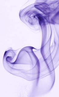
Showing posts with label image editing. Show all posts

Wednesday, June 8, 2011

Black and white conversion

The easiest way to convert a photo to black and white is to choose the menu item or button in your imaging software that just converts it for you. In Gimp 2.6.3 you find this under the "Colors" menu and it's called "Desaturate". But like many other things in photography, the easy way isn't always the best way to go about things.

I'm going to use this photo as an example for two different ways to do black and white conversions. I use Gimp, but these different techniques will work in Photoshop and many other programs as well. Here's the photo we'll be working with for this article
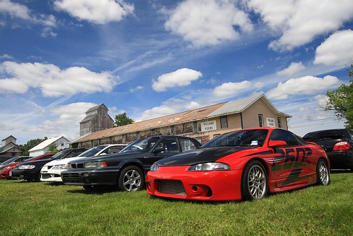
Car Show

First, I'll show you what you get when you just "Desaturate" or do an auto color to black and white conversion
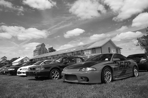
Example D

This isn't a bad black and white conversion, but the car ends up being a shade of gray that's very close to that of the grass, so it doesn't stand out well. The barn is a lighter shade too that blends in with the sky rather than standing out. So, let's talk about how Channels can help us get a better result.

Back in the day black and white photographers would carry filters with them that were red, green, or blue to adjust what colors would appear darker or lighter. Channels works in much the same way. This requires a little thought at first, but with some practice it becomes second nature. (And it's always fine to just play with the Channel controls until you like the way it looks too.)

If you put a red filter on the camera it blocks red from being recorded on the black and white film. This means that red blotchy skin is much less noticeable when a red filter is used. A red filter also darkens the color blue, so if you are shooting landscapes and you want a dramatic dark sky you can use a red filter as well. Let's make a table of the filters' effects to make this easier to use as a reference:

Red:
-makes red lighter
-makes blue darker

Blue:
-makes blue lighter
-makes green darker

Green:
-makes green lighter
-makes red darker

So, how does this relate to Channels? Channels adjust the amount of red, green, and blue used in the photo. This means that, effectively, Channels work like a filter does in black and white film photography. In fact, in Gimp (and I assume in Photoshop and other software), Channels will also convert to black and white at the same time that you adjust the amount of red, green, or blue. In Gimp this is done via a "convert to monochrome" checkbox. (The Channels tool in Gimp is under the "Colors" menu, then "Components", then "Channel Mixer".)

On to examples! Here is the photo using 100% red (the equivalent of using a red filter in black and white photography):
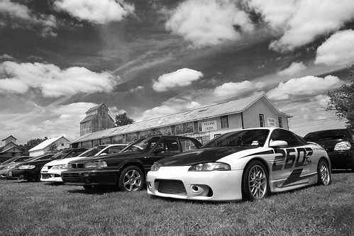
Example R

I like this result a lot! But, just to make sure this is the best one let's check out 100% green:
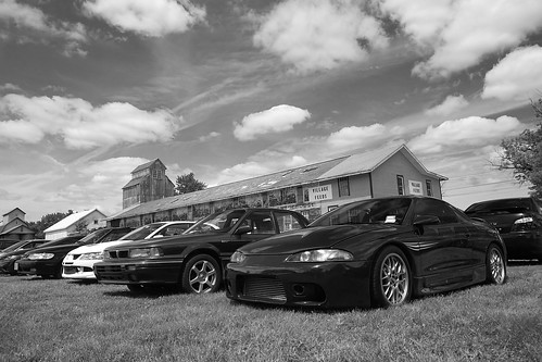
Example G

Check out the difference in the color of the car between these two photos! Pretty impressive, huh? Now let's see what 100% blue looks like:
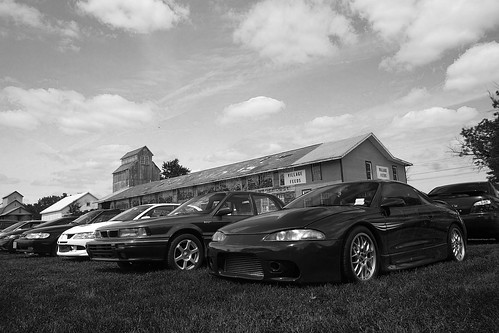
Example B

See the difference in the look of the grass in this one? I think red's my pick for this photo. But, unlike the days of film where you'd have one of the 3 filters to choose from, nowadays you have more flexibility than you may even want! You can choose 75% red, 25% green or 80%-20%-20% or any combination you think looks the best. So, give it a try and gain a lot more control over the outcome of your color to black and white conversions!

Tuesday, January 25, 2011

Creating a twin

Fluid Therapy Math -I just dont get it


This is a fairly easy project to accomplish. You need a camera with manual mode, a tripod (or somewhere steady to place the camera on), and image editing software like Gimp (which is free).

If you aren't familiar with Manual mode, that's ok. You may need your camera's manual, however, if you don't know how to find out and change your ISO, aperture, and shutter speed.

  1. First, find your location and set up your camera.
  2. Put your camera on Aperture Priority mode. For Nikons this is usually marked on your mode dial as "A", for Canons it is "Av". (We'll switch to Manual mode later.)
  3. Decide on your primary ISO. For indoor photography with average lighting you'll need ISO 800, for brightly lit rooms 400 might be okay. We'll talk about adjusting this again a little later.
  4. Decide on your aperture. Aperture controls depth of field or how much of your photo will be in focus in the areas in front of and behind your focus. f/8.0 is a safe choice.
  5. Take a look at the shutter speed that results from your ISO and aperture choice by pressing the shutter button halfway while the camera is pointed at whatever you plan to photograph.
  6. If your shutter speed is 1/15 or slower you might have issues with motion blur in your photo. To get a faster shutter speed, increase your ISO (go from ISO 400 to 800, for example) and/or choose a lower-numbered aperture (go from f/8 to f/4, for example).
  7. If you have a shutter speed of 1/30 or higher you'll probably be okay. The closer you are to 1/30, the more careful you'll have to be to keep still while the photo is taken.
  8. Write down your ISO, shutter speed, and aperture.
  9. Change to Manual mode and dial in the ISO, shutter speed, and aperture that you wrote down.
  10. Change to the white balance that makes sense for the environment you are shooting in. If it's indoor (old-style) light bulbs or "warm" CFLs, use "incandescent" or "tungsten". For "cool" or "daylight-balanced" bulbs use "daylight", etc.
  11. If you have a remote it'll make it easier to get into position and take the photo, but if you do not, then you can use your camera's self timer instead. Experiment and see what works for you.
  12. Make sure your image is framed how you want it.
  13. Dial in the focus on where you will be.
  14. It may help to pre-envision your shot and make mental or actual marks for positions where your first and second photo might interact or in places you want to avoid overlap. These are easy to lose track of and hard to correct later in post.
  15. Either get yourself in position and take the photo with your remote, or press the shutter button and get into position before the self-timer takes the photo.
  16. When you think you have a photo that you want to use, go change outfits if you'd like to, and then get into position for the second photo and take that one the same way you did the first one.
  17. When you have the photos you want to combine, open one of them in Gimp or whatever photo editing software you use.
  18. Open the second photo as a layer "over" the first. (In Gimp, go to "File" > "Open as Layers").
  19. Use the Free Select Tool to roughly cut out your image from the image in the top layer (in Gimp you may need to go to "Windows">"Dockable Dialogs">"Layers" to see what layer you are working on).
  20. Invert your selection to change the selection from your image to everything else but you in the image on the top layer. (In Gimp, click on the "Select" menu and click "Invert".)
  21. Press the "Delete" key on your keyboard to delete everything but you in the image on the top layer.
  22. It should magically appear as if there were two of you in the photo at this point. If it looks good, flatten the image (in Gimp, go to the "Image">"Flatten").
  23. Make any other adjustments you'd like to the image and save as usual. Note that if you don't flatten the image before saving you may get an error or it may just not work. Images with multiple layers cannot usually be saved as a .jpg file.

Wednesday, March 11, 2009

Gimp: Fixing Posterization

The following photo was taken by auntyre1 on Flickr and was used with her permission:


(Click on the photo to view it larger, see the EXIF, etc.)


I love everything about this photo from the perfectly white background to the soft shadows that define it's textures. The only thing wrong with it is the areas of lost detail in the highlights. When this banding and loss of detail occurs in a photo it's called "posterization" and the aim of this article is to help auntyre1 to fix it.

Fixing a photo like this requires talent more akin to painting than to photography, so for many photographers this will take a lot of time and practice, but it's well worth the effort to save a photo like this one, so here's how I'd go about it.

The first thing to do would be to open the photo in Gimp and zoom in to see it at 100%. From there we need to pick an area to start working on and I picked the petals at approximately 1 o'clock.


(Click on the photo to view it full size.)

There are 2 ways of bringing detail into the posterized portion of the image, and I'd probably use them both depending on the area I was working on. The first and probably easiest way is to use the "Smudge" tool (in Gimp this looks like a hand pointing downward). You use this tool by placing it on the photo and dragging it, which will bring a portion of the color from where you started in the direction you drag it, just like smudging paint or pencil on paper. Play with the opacity of the tool (which can be changed on the toolbox window under all those icons when the "Smudge" tool is selected). If your smudges are too obvious, just turn the opacity down until it starts blending smoothly.

The other way of adding detail to the petals is to use the "Clone" tool (which looks like a stamper). With this tool, you hold the "Control" key down (which may be labelled "Ctrl" on your keyboard) and click in the area you want to copy FROM. Then let go of the "Control" key, and use your mouse to click and drag, which will paint what's in one area to the other area. I'd use this in a similar manner as the smudge tool to bring the detail from the part of the petal that's further down up towards the tip of the petal. This is a more effective tool if you have a lot of blank area to fill in with detail. The smudge tool is best for smaller areas.

Here's a screenshot to show where I used these two tools as well as my result with them:


(Click on the photo to view it full size.)

After you get the detail filled in you'll notice that there isn't a clearly defined edge to the 2nd petal I was working on in the example above. Unfortunately, there are no other petals at the same angle that we can use to clone that edge in and making an edge where there wasn't one before is hard to do in a believable manner if you try to paint it in by hand. But there is a pretty easy way to do it...

Look for an edge that's about the right shape elsewhere in the photo. (See screenshot below for the one I chose.):
  • Use the "Free Select" tool (looks like a lasso) to select just that edge.
  • Go to "Edit" > "Copy" (or Ctrl + C)
  • Create a new layer by going to the "Layer" menu and selecting "New Layer". Keep the default of "Transparency" for layer type, and click "OK" to create the new layer.
  • You'll automatically be taken to the new layer, so just go to "Edit" > "Paste" (or Ctrl + V) to paste that petal edge onto the photo.
  • Click and drag that petal over to the place we want to put it (I know the angle's wrong, that's ok)
  • Click on the "Rotate" tool. It looks like a little box with arrows indicating rotation on it.
  • Then click on the petal edge (because that's the part we want to rotate) and a "Rotate" window will appear. Ignore it for now.
  • Click on one side or the other of that petal edge and drag it left or right to rotate it into the position that'll match the edgeless petal. Click "Rotate" when you get it where you want it.
  • Chances are, unless you are REALLY good the petal edge isn't EXACTLY where you want it yet. Click on the "Move Tool" (looks like a "plus sign" made with arrows going up & down and left & right).
  • With the Move Tool selected you can drag the petal edge to get it where you want it.
  • If you're like me you'll have to go back to the Rotate Tool and tweak it a bit more to get it to line up perfectly. Just keep tweaking it until it's right.
  • If you have any areas that look like they'll be hard to blend into the existing petals, use the Eraser Tool to erase them. It won't be perfect, we'll blend the old and new together in a minute...
  • When you have it like you want it, go to the "Image" menu and choose "Flatten Image" to merge the layers together so we can work on making the new and old areas seamless.
  • Use the Smudge Tool to blend the new petal edge into the existing petals around it.
Here's my result:


(Click on the photo to view it full size.)

So, there are the basic techniques for fixing this image and others like it. You just have to keep using those tools and techniques to finish the entire flower. Yes, it'll take some time, especially if you aren't familiar with these tools yet. They all take some practice to use well. But, like I said before, this photo is worth it. If you start getting frustrated, walk away and come back to it later. You'll learn a lot if you stick with it. And, if you get stuck, let me know and I can help you with whatever you are stuck on or expand on some of the tips and techniques to use whatever tool's giving you problems more effectively.

And, please auntyre1, send me an email when you complete your editing. I'd love to see how it comes out!

Tuesday, February 10, 2009

Adjusting curves by a photo's histogram

Because you can adjust the brightness of your monitor, how do you know if your photo is light or dark? Judging exposure on your computer monitor, unless it's calibrated, is not a good idea. Luckily, there's a tool that can help us judge if our photo is too light or too dark -it's called a histogram. If you are unfamiliar with reading histograms, read this article.

So, let's open this photo in Gimp: (feel free to download it to follow along)
http://www.flickr.com/photos/15059459@N02/3269890274/

Then, open the Curves tool:
HistoImageEditing1
(click on image to view it larger)

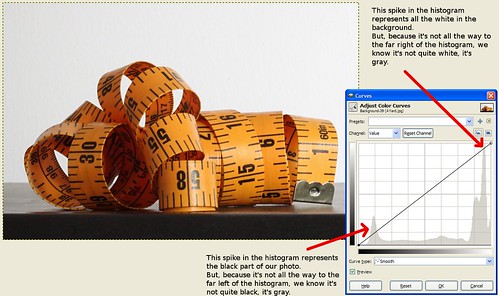
In the background of the Curves tool you can see the image's histogram. For this image, I wanted the white background to be pure white, meaning I wanted it intentionally over-exposed so it lost it's detail. That means, I expected the white spike on the right side of the graph to spill off the right side of the graph instead of being so far into the graph on that side.

I can also see that the spike on the left representing the black parts of the photo is too far in as well.

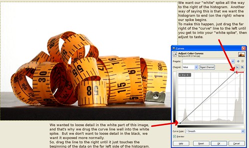
To fix the white, click on the far right hand part of the curves line and drag it to the left until it's in the middle of the "white spike". Essentially what you're doing here is making the histogram end in the middle of that white spike. In this case, to get the far left side of the photo to become pure white you actually need to drag the curve line past the middle of the spike as shown in the final screenshot below.

For the black, we're not aiming to loose the detail like we wanted to do with the white, so we're just going to drag the curve line on that side to the right until it touches the point where the data just begins on the left side of the histogram.

The result should look like this:
HistoImageEditing2

...now the white is pure white instead of gray and the black part at the bottom doesn't look so washed out.

Wednesday, December 3, 2008

Gimp: The Curves Tool

For this exercise we'll be using this photo:

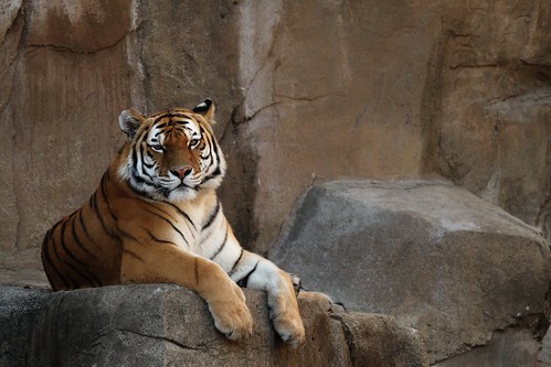
Tiger, before

Feel free to download the photo here if you'd like to follow along with the exercise.

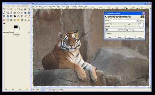
The problem with this photo is that it's dark, so the logical thing we might thing of to do would be to bring up the "Brightness/Contrast" tool (from the "Colors" menu) to fix it like this:


CurvesBrightness

...but notice how increasing the brightness on the photo brightens the WHOLE photo leaving it looking dull and gray?

In this case, we want to brighten the white parts (the highlights) and the tiger's body and the rocks (the mid-tones) without brightening the darkest parts of the photos (like the shadows and his black stripes). The curves tool gives you the ability to brighten or darken the highlights, shadows, and mid-tones seperately. So, let's open it up!

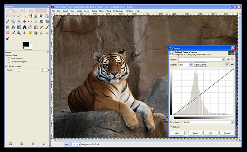
The Curves tool can be found under the "Colors" menu. When you open the tool it'll look like this:

CurvesToolOpened


The Curves tool consists, mainly, of a graph. In the background is the histogram for your photo. If you don't know how to read a histogram, go back and read An Intro To Histograms right now because it's an important part of the curves tool.

Notice that the graph's "x-axis" (the horizontal part) is labelled (on the bottom) with a range of tones than go from black on the left to white on the right. Similarly, the "y-axis" (the vertical part) is labelled with white on the top and black on the bottom.

The histogram shows you the tones that comprise your image. In the case of this tiger photo, we can see that there are some dark tones, lots of mid-tones, and some highlights. Nothing's been over or under-exposed, so no detail is unrecoverable from the shadows or from the hightlights.

When the tool is first opened the line on the "curve" is actually a straight line that runs at a 45-degree angle from the blackest black on the graph to the whitest white. This is where all images start. If you click on this line you can pull it up or down. This is how you use "Curves".


Now, the first thing to consider is the portion of the curve that you want to pull up or down. Clicking towards the left will change the darker tones. Clicking towards the right will change the lighter tones. You can use the histogram to decide where to click or you can use the dropper tool to help you decide.

To use the dropper tool, simply hover your mouse over the photo while the Curves tool is open and click on the area you want to lighten or darken. In this case, click right between the tiger's eyes so we can see where we need to click on the "Curve" to brighten the darker areas of the tiger.

This will put a vertical line on your graph to show you where that tone that you clicked on lies on the x-axis of the graph. So, we now know that we'll need to click in that approximate area of our "Curve" (the 45-degree line).

Next, we need to decide if we're going to move it up or down. According to the label on the side of the graph pulling up will lighten the photo (bring the tones towards white), and pulling down will darken the photo (bring the tones down towards black).

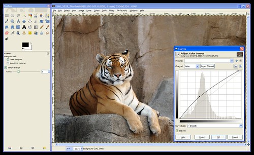
We want to lighten this photo, so click the "Curve" (the 45-degree line) where the vertical line meets it and drag it up until it looks about right to you. When you have it where you want it let go of the mouse button to set that point on the curve.

At this point, your "curve" (graph) should look something like this:

CurvesUse


One more problem remains -notice that the histogram shows the data going down to nothing way before it reaches the right side of the graph? This means that my "whites" (the tiger's face and chest) aren't as white as they could be. To fix this you can either click the whitest part of the tiger to get that vertical line to show you where these tones are on your "curve" or you can just look at where the data ends and click somewhere close to that area on the curve. Then pull that point up to the very top to make it pure white. (This part was already done on the screenshot above.)

Click "OK" to apply the changes to the photo and you're done!


I'm going to go through one more example really quick so you can see another common curve: an "S" curve.

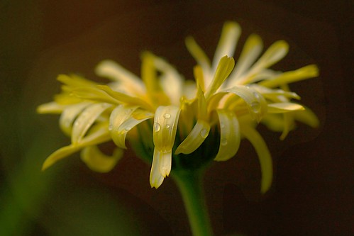
Here's the example photo we'll use for this one:

CurvesFlowerB4

Download full size here.

You'll notice in this photo that the background needs to be darker, and the flower is a bit gray and needs to be made brighter.

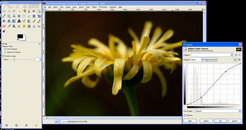
So, we'll open curves and bring the darks down darker and the highlights up brigher. The resulting curve looks like an "S" as shown here:

CurvesFlowerCurved


Hopefully that gives you a good idea about how to use the "Curves" tool. This tool will allow you to manually do what the "Auto-Level" did for our photos in Exercise #4. If Auto-Levels doesn't work for you, you should be able to fix your photo manually in Curves.


As always, feel free to post your questions, tips for using Curves, or the results you've gotten with this tool here.

Monday, December 1, 2008

Using Auto-Level to fix dull, gray-ish photos

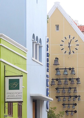
One of the most common issues I see in photos on Flickr is a dullness -a hazy gray look to images. This is often very easy to fix. We'll use Auto Levels to fix the dullness seen in this photo:

CuracaoBellsLevelsExercise

Feel free to download this photo at it's full size here to follow along with the steps to fix it:
www.flickr.com/photos/15059459@N02/3074716327/sizes/o/

After downloading the photo, open it in Gimp. Do you immediately notice the dullness or hazy look to the photo? If not, that's ok. Over time it'll become more obvious to you.

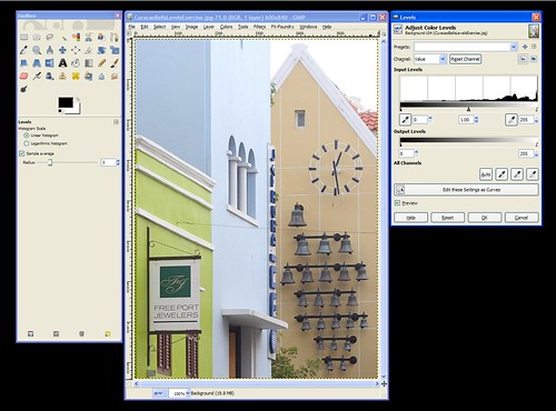
Find and click on the "Colors" menu and then choose the "Levels" tool. This will open up a new window as seen here:

CuracaoBellsLevels

There's a lot of options in the Levels window, and we'll go over them all later. For now, just find the "Preview" checkbox towards the bottom and make sure that it's checked. This will change the look of the photo immediately when we make changes to it with the tool. If "Preview" is not checked you won't see your changes until you apply them by clicking on the "OK" button.

After making sure "Preview" is checked, click on the "Auto" button and watch how the photo changes. If you miss it you can click on the "Reset" button to undo the change so you can redo it.

See how the dullness is immediately fixed with Auto - Levels? The bells in particular go from dull looking to dark, as they should be. Click "OK" to apply the change to the photo permanently (what you see is just a preview, so hitting "Cancel" will cancel the change and the photo will go back to the way it was before you made the Levels change).

That's it for this photo -we're done!


When I first found out about this tool I did an Auto-Level on every photo I took because sometimes it made a huge difference even if I thought the photo looked good before using it. The more I used it the more I became aware of that dull cast in photos and could anticipate whether an Auto-Level was needed or not. I encourage you to try Auto-Levels on your photos to see what a diffence it can make. Sometimes it will make no difference, sometimes it'll make the colors in your photos go wacky and you won't want to use it. But, many times it can have a positive effect, so it's worth a shot!

Friday, November 28, 2008

Gimp Basics

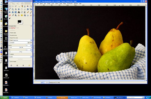
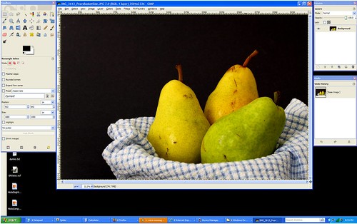
When you open Gimp for the first time you'll get 2 seperate windows, the toolbox window is the one with all the little icons all over it; the image window is the one that's mostly gray with the menus at the top ("File", "Edit", "Select", etc).

GimpOpen

-------------------------------------------------------------------------------------

If you go to the "File" menu and open one of your photos it'll look like this:

GimpImageOpened

---------------------------------------------------------------------------------------

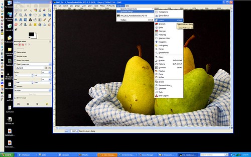
There are many other windows you can open to help you with certain tasks as well. They are usually hidden by default so that they don't get in your way, but you can open them at any time in the "Windows" menu, under "Dockable Dialongs":

GimpWindows

------------------------------------------------------------------------------------------

The optional windows I use most are "Layers" and "Undo". Here's how I arrange all the windows on my screen so I can get to everything easily:

GimpLayersUndo

----------------------------------------------------------------------------------------

All of the windows can be moved around and arranged however you want. To move them, click on the top of the window in the colored area (blue on my screenshots) and drag them wherever you want them. ("Drag" by holding the mouse button down while moving the mouse.)

Sunday, November 9, 2008

How to create a vignette effect in Gimp

Vignette is that effect you sometimes see where the corners of a photo are a little darker than the rest of the photo. Here's an example from Aaron Escobar's photostream on Flickr (click on the photo to go to the Flickr page):


Here are the steps to create this effect in Gimp:
* Go to the "Layer" menu and choose "New Layer" -make sure the default layer type of "Transparency" is selected, then select "Ok".
* In the toolbox, click on the Ellipse Select Tool and set the Feather edges to "100" (push the slider all the way to the right).
* Select the area where you want the vignette effect to end.
* When the area is selected, go to the "Select" menu and click "Invert" -this will select everything OUTSIDE of the circle instead of the circle itself.
* Click on the Bucket Fill Tool from the Toolbox. Make sure black (or whatever color you want your vignette to be) is selected, then click in the selected area to fill in the color.
* Adjust the layer's opacity to make the vignette go from black to more "see through" -by changing the opacity you can make it as dark or light as you choose. (The "Layer" window can be opened by clicking on the "Windows" menu, then going to "Dockable Dialogs" and selecting "Layers".
* Chances are the transition between the vignette and your photo is a bit more abrupt than you'd like it to be. That's ok we can make it more gradual...
* Click on the "Filters" menu, go to "Blur" > "Gaussian Blur".
* Move the blur radius up from the default "5" to somewhere around "150" depending on the transition you are looking for.
* When it looks good, flatten the image and save it and you're done!

Wednesday, October 15, 2008

How bad is Jpg's lossy compression?

My workflow is:
  • Take photo in RAW format
  • Open in DPP
  • Make any large changes to brightness, contrast, saturation and brightness that are necessary in DPP
  • Convert the image to jpg
  • (Optional) Open the jpg in noise reduction software, reduce noise, re-save as jpg.
  • Open the photo in Gimp and make the rest of the changes that are necessary.
As you can see, I often save an image in jpg format 2-3 times (sometimes more). Actually piping up and telling people about it has recently stirred a debate about how bad of an idea my workflow is. Let me be clear: I agree that saving as png or TIFF would be better because they are non-lossy formats, but when I use these formats I loose my EXIF data. Because I've seen no quality loss in my photos as a result of re-saving them as jpg's, I've just adopted this as my workflow. Prints up to 11x14 are done and consistently show no issues with it.

Understanding the risks of using jpg allow me to tailor my workflow to reduce the common issues in jpg quality loss. First, I make all big changes in brightness, etc in DPP where I'm working with the RAW file and not the jpg. And second, I always save the jpg in 100% quality.

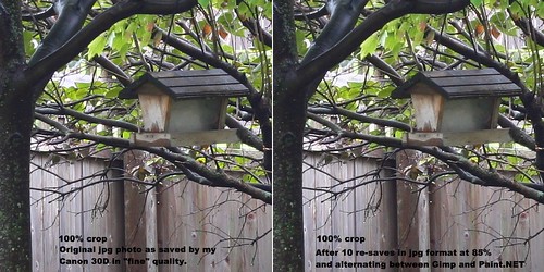
But some people aren't convinced that this workflow can yield good results (even though they can see all my photos at their full size on my Flickr account). So, I took a photo in jpg (fine) format on my Canon 30D, opened it in Gimp and re-saved it as a jpg at 85% quality (remember, I usually save as 100%). Then I opened the image in Paint.NET and re-saved it a 2nd time as a jpg at 85% again. I alternated between Gimp and Paint.NET in case the programs could tell the image was unchanged and out-smarted me by not actually re-running the compression on the image for the next save. In the end I re-saved the image 10 times between the two programs. A 100% crop of the result is shown below along side the same crop from the original jpg for comparison:

Jpg quality loss test
(click on the image to go to the Flickr page where you can see it at it's original size)

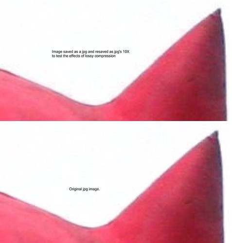
To be sure, there *is* a difference. Here's another comparison -done the exact same way, but at 800% magnification (when viewed at it's original size -click on the photo, then go to "All Sizes" > "Original" to view it at 800%):

Jpg lossy test #2

These tests show why I don't loose sleep over re-saving a jpg at 100% quality (all tests were done at 85% quality) one or two times in my workflow. ...I actually thought the difference would be much greater considering everything I've read via google on the matter!

I welcome discussion about the test itself as well as it's outcome in the comments here, on Flickr, or on the Photography_Beginners yahoogroup.

Thursday, April 10, 2008

Selective Exposure Correction in GIMP

Hello there!

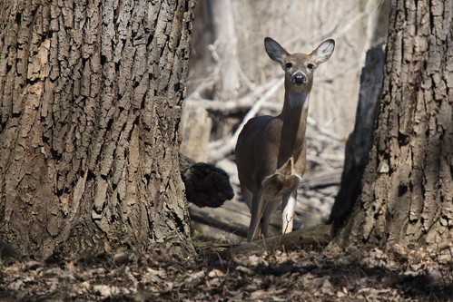
I took this photo in the middle of the afternoon in harsh sunlight so getting the exposure right was difficult. I tried several different exposures using exposure compensation and watching the histogram, but because much of the deer was in shadow compared to the full sunlight that the foreground was getting, I had to choose to expose for the deer and let the rest get a bit blown out. According to the histogram I was getting all the data, so I knew I could fix it in software later.

So, how did I fix it? Well, this is a first for me, but I made a video showing how I did it. I meant to upload it to Flickr to try out their new video upload capability, but it's over 90 seconds, so it went on YouTube instead:


...this was my first video ever and in retrospect I should have said what menus I was using as I clicked on them. Perhaps I'll get better at it over time.

Lasso Select tool: In toolbox window
Invert Selection: Under "Select" menu
Curves Tool: Under "Tools" menu > "Color Tools"

Tuesday, March 25, 2008

Using HDR to overcome harsh mid-day sun and shadows

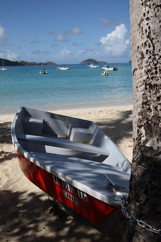
I was on a tour in St Thomas that let us off at Megan's Bay for 2 hours before continuing on to other destinations when I came across a boat chained to a tree near the beach that I really wanted to capture on film. The problem was that the bright caribbean sun was in full force and it was the middle of the afternoon. As a result, there were harsh shadows from the tree all over the boat.

I knew from experience that while the scene was pleasing to my eye it wouldn't be captured in a photo as nicely. This is because the "dynamic range" (or the range of light vs dark) that the eye can see is a lot bigger than the range that the camera can record. The result would be either the areas in full sun being exposed properly or the areas in shadow being exposed properly, but having both areas look right would be impossible. So, I made sure my camera was set to take photos in RAW and I took a kindof middle-of-the-road photo making sure the histogram showed no data loss on the light or dark ends and here's the result without any editing:

Boat "before" picture

Then, when I got home, I opened the photo in my RAW editor of choice (Canon's Digital Photo Pro or "DPP") and I used the brightness tool to make a copy of the photo that was 2 stops brighter than the original, then another that was 1 stop brighter, then another that was exposed normally, then 1 stop darker, and the final one at 2 stops darker.

The above is the "fake" part of "fake HDR" photos. For real HDR photos, you'd take separate shots at each exposure (+2, +1, 0, -1, and -2 or whatever will cover the dynamic range of the scene you are shooting). But, by shooting in RAW, you can record almost all of that data in one shot so you don't have to worry about the camera moving in-between the shots. I take the time to do 3 to 5 shots when the photo is important and I have a tripod handy, but I find that the "fake HDR" technique works just fine most times. (But I'm a relative HDR newbie, so take my advice there for what it's worth.)

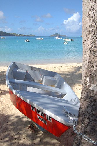
What next? Well, you get some HDR software. I use FDRtools Basic (the free version of FDRtools). There are a lot of different programs available for HDR, so you can google for them to find one that you like. But basically, you feed it your images and the software will spit out a more even-toned version of the photo. You can tweak it if it doesn't automatically come up with what you were looking for. Some prefer a more cartoon-like appearance, others like it to be more subtle, the effect is up to you. But here's my result:

Boat on beach

Better, don't you think? This looks a bit more like what we see with our eyes in mid-day conditions. So, while you should listen to the rule of thumb that says you'll get bad results in mid-day sun, now you know there's a work-around for it! Ahh... technology. :-)

Friday, February 8, 2008

How to create a colorized black and white photo in Gimp

* Open your photo in GIMP
* Go to the "Layers" menu and select "Duplicate Layer". This is like taking two copies of your photo and setting one ontop of the other.
* Go to the "Windows" menu, choose "Dockable Dialogs" and then choose "Layers".
* A new (small) window should open and you should see the two layers you now have in the "Layers" box.
* Click on the top layer in the "Layers" box (it should be called "Background copy") to make that layer the "active" one that you'll be working on, then right-click on it and a bunch of options will appear. Choose "Add Alpha Channel" (near the bottom). This will allow you to erase the top layer and see all the way through to the bottom photo in the next couple steps instead of it being white underneath.
* Go back to the window with your photo on it and click on the "Colors" menu, then choose "Desaturate". In the next window try "Average" -this usually gives a good result; it will make the top layer black and white.
* (Optional) The photo on the bottom is still in color; you just can't see it because it's under the copy we just converted to black kand white. To demonstrate that the original is still under there, click on the little eye next to the "Background" layer in the "Layers" box. That eye tells you that the layer is visible, clicking on it to remove the eye makes it invisible so you can see the layer(s) underneath. Bottom line: If you do this, you'll see the color version re-appear. When you are done, re-check the box so the top layer (the black and white one) is visible again.
* Make sure the "Background copy" layer is "active" by clicking on it in the "Layers" box.
* In the "Toolbox " window (the one with all the icons on it), select the "Eraser" (the little pink square icon).
* Erase the parts of the top layer (the black and white one) where you want to see the bottom layer (the color one) through it. (If it's a large area, you may want to do a rough selection with the lasso tool first and delete a large portion of it that way, then use the eraser tool to just do the fine details around the edges.
* Then go to the "Image" menu and choose "Flatten Image".
* Save the file and you are done!

Saturday, February 2, 2008

How to create a colorized black and white photo in Paint.NET

* Open your photo in Paint.NET
* Go to the "Layers" menu and select "Duplicate Layer". This is like taking two copies of your photo and setting one ontop of the other.
* Now you should see the two layers in the "Layers" box in the lower right hand corner of your Paint.NET workspace. Click on the top layer in the "Layers" box to make that layer the "active" one that you'll be working on.
* Go to the "Adjustments" menu and select "Black and White". This makes the top layer black and white.
* (Optional) The photo on the bottom is still in color; you just can't see it because it's on the bottom. To demonstrate this, uncheck the box next to the top layer in the "Layers" box. Removing the checkmark makes that layer invisible so that you can see the layer(s) underneath. If you do this, you'll see the color version re-appear. When you are done, re-check the box so the top layer (the black and white one) reappears.
* Make sure the top layer is "active" by clicking on it in the "Layers" box.
* In the "Tool" list, select the "Eraser"
* Erase the parts of the top layer (the black and white one) where you want to see the bottom layer (the color one) through it. (If it's a large area, you may want to do a rough selection with the lasso tool first and delete a large portion of it that way, then use the eraser tool to just do the fine details around the edges.
* When you are finished, for safety, you may want to save it as a .pdn file -at least temporarily.
* Then go to the "Layers" menu and choose "Merge Layer Down" -this pastes the two copies of your photos together so it can be saved as one image. BUT BE CAREFUL!!! This step cannot be undone! (This is why saving it as a .pdn file first is a good idea.)
* Save the file as a .jpg or whatever to upload to the web (.jpg files don't support layers, so you have to merge it down first).

Tuesday, January 15, 2008

File type choices once the photos are on your computer.

If you read my previous article, you know that one of the advantages of having the camera save your files as .jpg's instead of RAW is the size of .jepg's are much smaller. That comes with the downside of loosing some of the detail that you get with RAW files, though, because jpeg's use what's called "lossy compression". The size difference is substantial because RAW files record exactly what the sensor sees, pixel by pixel, all 8 million of them (on my Canon 30D). Jpeg's take shortcuts by recording blocks of the same or very similar colors together -like instead of "pixel 1, red; pixel 2, red; pixel 3, red" , jpeg's record "pixels 1 through 3, red". Sounds like a good thing, right? But, with 65,000 possible colors that can be recorded, it's likely that even a block of color that looks all red will have slightly different colors pixel-to-pixel. So, jpeg's fudge it a bit. Where RAW would see "pixel 1, red#12,433; pixel 2, red#12,632; pixel 3, red#12, 548", Jpeg might still record it as "pixels 1-3, red#12,548" to save space. Generally there's no problems with this. After all, most of us convert our photos to jpg to upload them to the internet anyway and we could probably never see a difference between a RAW original and a jpeg conversion.

But, you've probably heard horror stories about saving in jpeg format and loosing detail in your photos. It's true that when you save a photo as a jpeg over and over again it'll being loosing detail. That's because each time it says "well, these pixels are close enough to record as the same color" it'll include more and more pixels in that "close enough" category, which means where there were details before, after a lot of re-saving, you'll eventually loose it.

So, how many times can you re-save a .jpeg file? It depends on how many pixels you have to start with. ("Megapixels" describe how many MILLIONS of pixels your camera has.) But, with my 8 Megapixel camera, I often convert my RAW files to jpg, then de-noise and save it as a jpg again, then edit it in Gimp and save it once or twice more. That's up to 4 times for those who are counting and I've yet to see any ill effects, either on-screen at 100% or printed at up to 14x11, so I think some people are a bit over-dramatic about how much you loose. Still, though, if you can save in a "non-lossy" format you should.

Alternatives -I save as .jpg because it's the only way I can retain my EXIF data, but it's definitely recommended that you save as TIFF or .png instead if you can. TIFF is much like RAW -the files are big, but they record everything pixel-by-pixel. On the other hand, .png files are smaller because they record blocks of the same color together to save space just like .jpegs. BUT! unlike .jpg's, they don't loose data by recording blocks of similar colors as "close enough" to be recorded as being the same color

So, to summarize, try to save your photos as .png or as TIFF's while editing, especially if you tend to save and re-save a lot. TIFF's are larger, so you may want to stick with .png's since they have the best of both worlds -they are smaller, but you don't loose any data when saving the file over and over again.


Jpeg myth-busting:
  • Jpeg's do not loose quality each time they are opened. They only loose quality when they are re-saved.
  • Saving a file under a new name each time will not prevent data loss.
  • Saving a file under a new name will not cause data loss on the original file.
  • Renaming a jpeg will not cause data loss.
  • Saving jpeg's at 100% quality does not mean you won't loose any data (or detail), you just won't loose as much.

Thursday, July 12, 2007

Removing the gray cast or "flatness" in your photos

**UPDATE**
This article uses an old version of Gimp so the instructions are no longer valid due to some menus changes. An updated article was written here for the new version of Gimp (2.6.x): Using Auto-Level to fix dull gray-ish photos.


Last post I showed you a photo that was awesome except it had a slightly gray or "flat" look to it and hopefully you saw how dramatically you can improve a photo by removing it. I also told you that the real reason for that gray look is the lack of a "true" or 100% black and/or white area in the photo. So, now we'll talk about how to go about fixing this issue with photos you may have that suffer from the same problem...

Did you download Gimp? If so, awesome, you can follow along with me here. If not, I'm guessing you have Photoshop or some other software that you use and you've decided to stick with what you have. That's cool, your program will probably have the same tools, you'll just have to find where they are in your menus on your own. ...ready?

Step 1. Find a photo with a gray cast that you'd like to remove, then open it in Gimp.
(if you can't find one, download this one to use as practice by right-clicking on the photo and choosing "Save Picture As")

Once you have the photo you want to use, right-click on it and choose "Open With" > "The Gimp".

**NOTE:** If "Gimp" isn't on the list of programs, click on "Choose Program" and find "Gimp". Or you can also just find "Gimp" in your Start Menu under "Programs" and open it from there, then go to "File" > "Open" and browse to the photo you want to open.

You'll notice that Gimp doesn't quite work like Word or other programs you are used to. It has 2 different parts that open in separate windows -one is a toolbox that has a bunch of icons in it, and the other window has your photo in it. Don't worry about the window with all the icons in it, we won't be using it this time around.

Step 2. Using "Auto Levels" to remove the gray cast.

In the window that has the photo in it, click on the "Layer" menu. When it opens, click on "Colors" > "Levels". The "Levels" window will then be displayed. -We'll go into Levels more in-depth later, but for now, just click on the button that says "Auto".

If you're using the photo I linked to in Step 1, you'll notice that doing just that improved the image greatly. If you are using your own photo, there's a good chance it fixed it, but sometimes "Auto Levels" can make it worse. No biggie. If you like it, click "OK", if not, click "Cancel".

That's it! You're done!
Assuming you like the result, just go to the "File" menu and choose "Save As" in order to save the changes you've made to the photo. If you didn't like what "Auto Levels" did to this particular photo, stay tuned, we'll talk about other ways to fix such problems soon.


For simple, minor gray-cast or "flatness" issues, the "Auto" button in "Levels" works great! It's definitely something you should try whenever you have an image that seems to suffer from this problem.


If you don't understand something or have trouble with any of my tips, feel free to contact me via a comment on this (or any) article, or see my website for my email address and I'll be happy to help you out!

Wednesday, July 11, 2007

Photo Critique #1: An unsuspecting contributor, my Mom!

My Mom has never really been into photography. It's always been my Dad's hobby and my interest. To my Mom, it's never really been more than a way to document a period in time. Until recently...

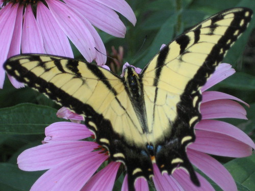
Out of the blue, she asked me for advice in buying a camera. She ended up with a Canon Powershot A530. Shortly after purchasing it, she wondered out loud why she had spent the money. She's pretty much tied to the house taking care of my disabled father, so she doesn't have any trips coming up where she'd want to take pictures... So, the camera sat there for a few months. Then, she sends me this: (click on the photo to view a larger version , EXIF data, etc).


My Mom has a beautiful garden in her backyard. She told me that she was out in the garden when she spotted this butterfly, and ran inside, got her camera and took this picture. It's beautiful!

Because I know the submitter, I can tell you that this photo is uncropped and hasn't been touched up in software because, well, she just got the hang of transferring photos from her camera to her computer, and then uploading them to Flickr. -All that's still a challenge for her, so we're going to wait awhile before teaching her about photo editing. But people with her experience level is exactly who I'm targeting with this blog, so I figured this would be perfect.

The photo itself, as is, is absolutely fabulous. I'd consider hanging it on my wall if I were her. The framing is excellent -the butterfly fills the frame from one side to the other, and the background is simple, but colorful -it doesn't overwhelm the subject (the butterfly), but rather compliments it. -I think my mom has an advantage since she's an excellent painter. She probably knows that purple and yellow are opposite colors on the artist's painting wheel, and setting one upon the other in this way adds a lot of interest to the photo.

I have 2 minor things that in a perfect world might be different in this photo. #1 is that I wish the butterfly's left wing "tail" hadn't been cut off. -It's not too big of a deal because the other one doesn't stand out much anyway being black on purple, but still... I said "perfect world", so I had to mention it. The other thing I'd do is get rid of the slight gray cast in the photo.

This happens a lot. Photos come out just slightly "gray" looking. Many times if you were shooting film, the developer would automatically adjust to get rid of the gray, but in the age of digital you have to do it yourself.

The real cause of this "greyness" -what some people refer to as the photo looking like it has a film on it that makes it look "muddy" or "flat". Areas in the image that should be black fall short of being 100% (or "true") black and/or "true white" in the photo. In this case, it's the fact that we don't quite have an area of true black in that butterfly that makes the photo seem a bit dull.

So, how do you fix it? Well, we can't all afford the $600 for Photoshop -me included. But, that's fine. There's a FREE program that does almost everything Photo$hop does, it's called "Gimp" and you can download it here: http://gimp.org

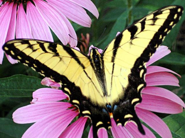
After some minor touch-ups, which I'll teach you tomorrow, the photo looks like this:


So, go download and install Gimp, and tomorrow I'll teach you how to use it to get rid of that "gray" cast that you get in some photos!

Monday, May 7, 2007

Colored Smoke How-To


This isn't the greatest example ever, see Jameela's Flickr site to see some better smoke photos, but here's how you achieve the effect:

You need:
  • Any camera in any mode (having your flash on is recomended, though)
  • Something non-reflective and black to use as a background
  • Incense (to create the smoke)
  • A light source (I used my Canon 30D's on-camera flash and the darkness of my backyard as my light source and background, and it resulted in a kindof flat photo in comparison to Jameela's which was taken indoors with a light source in addition to her on-camera flash).
What to do:
  • Set up the incense infront of the black background
  • Take tons of photos being careful that autofocus isn't focusing on the background rather than the smoke and that your shutter speed is high enough that the smoke isn't blurry)
  • Download your images to your computer and open one of the "good ones" in an image editing program of your choice.
  • Find the "Invert" option. This will invert the colors, giving you the white background.
  • There are many different ways to create the colored smoke. Gimp has a "Colorize" tool, saturation adjustments can help too, experiment to find what works for you.