Showing posts with label Gimp. Show all posts

Monday, July 5, 2010

How to combine fireworks photos in Gimp

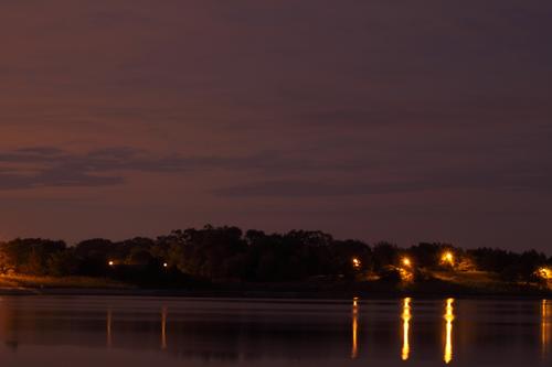
I took my first attempt at fireworks photos last night. I did okay with them, but I couldn't balance the light so that the fireworks came out looking good along with the foreground. Either the foreground was exposed well and the fireworks were blown out, or the foreground was all black and the fireworks came out nice. So, I went home a little disappointed.

While going through my photos I had an idea -combine 3 of the photos: the foreground, and some individual firework shots, and then I'd get something closer to what I had hoped for.

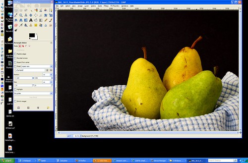
So, I opened a shot of the foreground that I had taken for test purposes in order to get a starting point for my exposure settings:


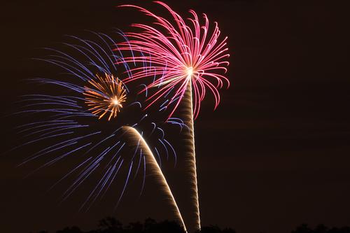
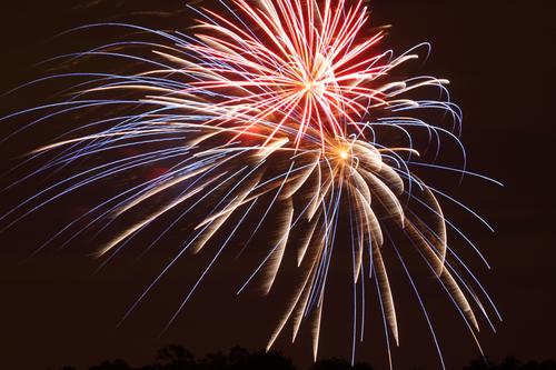
And two separate fireworks photos that I had taken:


And I opened them in Gimp in different layers (with the background being the first or "background" layer).

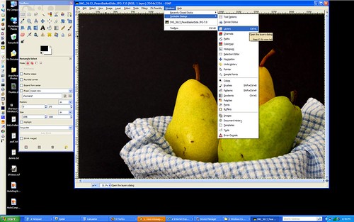
I then set the Layer Mode to "Lighten Only" (you do this in the "Layers" window which you can open by clicking on the "Windows" menu > "Dockable Dialogs" > "Layers"). This is the key. "Lighten Only" means that only the parts of the firework layers that are brighter than the background layer will show up. This means the black sky is automatically ignored and just the fireworks show up in the image. No cutting or selecting required -neat huh?

After that it was just a matter of resizing and positioning the fireworks where I wanted them in the image and erasing the parts of the trails that overlapped the tree line so it'd look like they were coming from behind the trees.

When that all looked good, I flattened the image and then created a duplicate layer that I flipped and positioned so I'd get the reflection in the water of the fireworks. I erased the tree line in the new layer since I only wanted the fireworks to be reflected, then applied a "Motion Blur" to the layer so the reflection of the fireworks would be blurred just like the lights on the water.

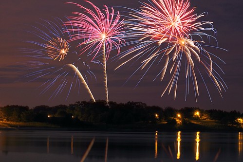
After that I was done. Here's the result:
What?  Your fireworks photos didn't turn out like this?

Wednesday, March 11, 2009

Gimp: Fixing Posterization

The following photo was taken by auntyre1 on Flickr and was used with her permission:


(Click on the photo to view it larger, see the EXIF, etc.)


I love everything about this photo from the perfectly white background to the soft shadows that define it's textures. The only thing wrong with it is the areas of lost detail in the highlights. When this banding and loss of detail occurs in a photo it's called "posterization" and the aim of this article is to help auntyre1 to fix it.

Fixing a photo like this requires talent more akin to painting than to photography, so for many photographers this will take a lot of time and practice, but it's well worth the effort to save a photo like this one, so here's how I'd go about it.

The first thing to do would be to open the photo in Gimp and zoom in to see it at 100%. From there we need to pick an area to start working on and I picked the petals at approximately 1 o'clock.


(Click on the photo to view it full size.)

There are 2 ways of bringing detail into the posterized portion of the image, and I'd probably use them both depending on the area I was working on. The first and probably easiest way is to use the "Smudge" tool (in Gimp this looks like a hand pointing downward). You use this tool by placing it on the photo and dragging it, which will bring a portion of the color from where you started in the direction you drag it, just like smudging paint or pencil on paper. Play with the opacity of the tool (which can be changed on the toolbox window under all those icons when the "Smudge" tool is selected). If your smudges are too obvious, just turn the opacity down until it starts blending smoothly.

The other way of adding detail to the petals is to use the "Clone" tool (which looks like a stamper). With this tool, you hold the "Control" key down (which may be labelled "Ctrl" on your keyboard) and click in the area you want to copy FROM. Then let go of the "Control" key, and use your mouse to click and drag, which will paint what's in one area to the other area. I'd use this in a similar manner as the smudge tool to bring the detail from the part of the petal that's further down up towards the tip of the petal. This is a more effective tool if you have a lot of blank area to fill in with detail. The smudge tool is best for smaller areas.

Here's a screenshot to show where I used these two tools as well as my result with them:


(Click on the photo to view it full size.)

After you get the detail filled in you'll notice that there isn't a clearly defined edge to the 2nd petal I was working on in the example above. Unfortunately, there are no other petals at the same angle that we can use to clone that edge in and making an edge where there wasn't one before is hard to do in a believable manner if you try to paint it in by hand. But there is a pretty easy way to do it...

Look for an edge that's about the right shape elsewhere in the photo. (See screenshot below for the one I chose.):
  • Use the "Free Select" tool (looks like a lasso) to select just that edge.
  • Go to "Edit" > "Copy" (or Ctrl + C)
  • Create a new layer by going to the "Layer" menu and selecting "New Layer". Keep the default of "Transparency" for layer type, and click "OK" to create the new layer.
  • You'll automatically be taken to the new layer, so just go to "Edit" > "Paste" (or Ctrl + V) to paste that petal edge onto the photo.
  • Click and drag that petal over to the place we want to put it (I know the angle's wrong, that's ok)
  • Click on the "Rotate" tool. It looks like a little box with arrows indicating rotation on it.
  • Then click on the petal edge (because that's the part we want to rotate) and a "Rotate" window will appear. Ignore it for now.
  • Click on one side or the other of that petal edge and drag it left or right to rotate it into the position that'll match the edgeless petal. Click "Rotate" when you get it where you want it.
  • Chances are, unless you are REALLY good the petal edge isn't EXACTLY where you want it yet. Click on the "Move Tool" (looks like a "plus sign" made with arrows going up & down and left & right).
  • With the Move Tool selected you can drag the petal edge to get it where you want it.
  • If you're like me you'll have to go back to the Rotate Tool and tweak it a bit more to get it to line up perfectly. Just keep tweaking it until it's right.
  • If you have any areas that look like they'll be hard to blend into the existing petals, use the Eraser Tool to erase them. It won't be perfect, we'll blend the old and new together in a minute...
  • When you have it like you want it, go to the "Image" menu and choose "Flatten Image" to merge the layers together so we can work on making the new and old areas seamless.
  • Use the Smudge Tool to blend the new petal edge into the existing petals around it.
Here's my result:


(Click on the photo to view it full size.)

So, there are the basic techniques for fixing this image and others like it. You just have to keep using those tools and techniques to finish the entire flower. Yes, it'll take some time, especially if you aren't familiar with these tools yet. They all take some practice to use well. But, like I said before, this photo is worth it. If you start getting frustrated, walk away and come back to it later. You'll learn a lot if you stick with it. And, if you get stuck, let me know and I can help you with whatever you are stuck on or expand on some of the tips and techniques to use whatever tool's giving you problems more effectively.

And, please auntyre1, send me an email when you complete your editing. I'd love to see how it comes out!

Wednesday, December 10, 2008

Gimp: Levels (beyond the Auto button)

Okay, so we're going back to the Levels tool today to experiment with different ways to use this tool beyond just the "Auto" button.

To start, this where you can download the photo I'll be using in this tutorial if you want to use it to follow along:
www.flickr.com/photos/15059459@N02/3097360115/sizes/l/

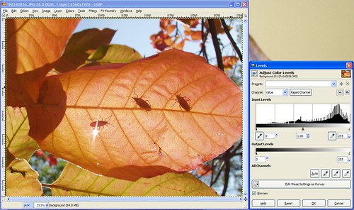
After opening the sample photo (or your own), the next step is to open the Levels tool from the "Colors" menu. It'll look like this:

LevelsLeavesB4

Notice we're working with the photo's histogram again, much like the Curves tool. Under the histogram is a tonal graph showing black on the left and white on the right. For this photo we see that there's a big gap between where "true black" is and where this histogram starts, which matches what we see in the photo -it's kinda gray looking and needs to be darkened a bit.

Below the tonal graph are 3 trianglular sliders -one's all the way left at "true black", one's all the way right at "true white", and one's right in the middle. If you click on those triangles you can slide them left or right and it'll change the brightness of the dark tones, light tones, or mid-tones (depending on which slider you move) in your photo accordingly.

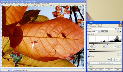
Since we want to make the dark tones darker, we can think of that as wanting to shift the histogram left. To do that, we move the "true black" slider to the right where we want "true black" to be for our histogram. So, go ahead and move the slider on the far left until you get it where the data begins on the left side of the histogram. It should look like this:

LevelsLeavesAfter

That's good enough for me, but I encourage you to play with the mid-tone and "true white" slider to see the effect they have on the photo as well.


To be completely honest, I rarely use Levels this way. Curves will achieve the same result, just in a different way. Most people like either Curves or Levels (usually Curves I think because it's a little more granular) and they stick with the one tool the majority of the time.


Now, there's another way to use Levels, and I use this more often than I do the manual adjustment I went through before.

Next to that "Auto" button that we used in Exercise #4 there are three buttons with icons that look like eye droppers. One is black, one's gray, and one's white. The idea here is that you can click on the black dropper and then click on an area in your photo that should be 100% black and it'll automatically adjust your photo to make that so. White works the same way -click on the white dropper, then an area that should be 100% white in your photo, and whallah! The gray dropper is used when you're using a gray card -you'd click on the gray dropper, then the gray card, and you'd get good results that way (I never use a gray card, so I don't use that dropper at all).


So try this tool out all three ways -the "Auto" button, the droppers, and the manual adjustment and please post any questions you have about anything you don't understand about the Levels tool. Also feel free to post your results using this tool, I enjoy knowing if these tutorials are useful for you!

Wednesday, December 3, 2008

Gimp: The Curves Tool

For this exercise we'll be using this photo:
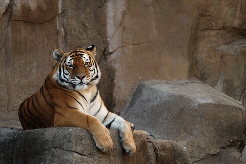
Tiger, before

Feel free to download the photo here if you'd like to follow along with the exercise.

The problem with this photo is that it's dark, so the logical thing we might thing of to do would be to bring up the "Brightness/Contrast" tool (from the "Colors" menu) to fix it like this:
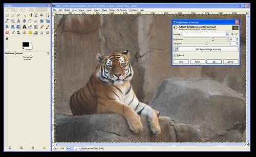

CurvesBrightness

...but notice how increasing the brightness on the photo brightens the WHOLE photo leaving it looking dull and gray?

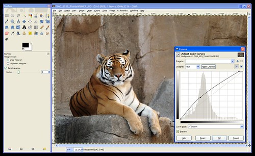
In this case, we want to brighten the white parts (the highlights) and the tiger's body and the rocks (the mid-tones) without brightening the darkest parts of the photos (like the shadows and his black stripes). The curves tool gives you the ability to brighten or darken the highlights, shadows, and mid-tones seperately. So, let's open it up!

The Curves tool can be found under the "Colors" menu. When you open the tool it'll look like this:
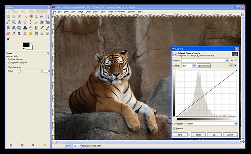
CurvesToolOpened


The Curves tool consists, mainly, of a graph. In the background is the histogram for your photo. If you don't know how to read a histogram, go back and read An Intro To Histograms right now because it's an important part of the curves tool.

Notice that the graph's "x-axis" (the horizontal part) is labelled (on the bottom) with a range of tones than go from black on the left to white on the right. Similarly, the "y-axis" (the vertical part) is labelled with white on the top and black on the bottom.

The histogram shows you the tones that comprise your image. In the case of this tiger photo, we can see that there are some dark tones, lots of mid-tones, and some highlights. Nothing's been over or under-exposed, so no detail is unrecoverable from the shadows or from the hightlights.

When the tool is first opened the line on the "curve" is actually a straight line that runs at a 45-degree angle from the blackest black on the graph to the whitest white. This is where all images start. If you click on this line you can pull it up or down. This is how you use "Curves".


Now, the first thing to consider is the portion of the curve that you want to pull up or down. Clicking towards the left will change the darker tones. Clicking towards the right will change the lighter tones. You can use the histogram to decide where to click or you can use the dropper tool to help you decide.

To use the dropper tool, simply hover your mouse over the photo while the Curves tool is open and click on the area you want to lighten or darken. In this case, click right between the tiger's eyes so we can see where we need to click on the "Curve" to brighten the darker areas of the tiger.

This will put a vertical line on your graph to show you where that tone that you clicked on lies on the x-axis of the graph. So, we now know that we'll need to click in that approximate area of our "Curve" (the 45-degree line).

Next, we need to decide if we're going to move it up or down. According to the label on the side of the graph pulling up will lighten the photo (bring the tones towards white), and pulling down will darken the photo (bring the tones down towards black).

We want to lighten this photo, so click the "Curve" (the 45-degree line) where the vertical line meets it and drag it up until it looks about right to you. When you have it where you want it let go of the mouse button to set that point on the curve.

At this point, your "curve" (graph) should look something like this:
CurvesUse


One more problem remains -notice that the histogram shows the data going down to nothing way before it reaches the right side of the graph? This means that my "whites" (the tiger's face and chest) aren't as white as they could be. To fix this you can either click the whitest part of the tiger to get that vertical line to show you where these tones are on your "curve" or you can just look at where the data ends and click somewhere close to that area on the curve. Then pull that point up to the very top to make it pure white. (This part was already done on the screenshot above.)

Click "OK" to apply the changes to the photo and you're done!


I'm going to go through one more example really quick so you can see another common curve: an "S" curve.

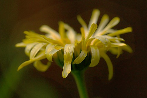
Here's the example photo we'll use for this one:
CurvesFlowerB4

Download full size here.

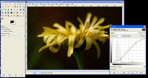
You'll notice in this photo that the background needs to be darker, and the flower is a bit gray and needs to be made brighter.

So, we'll open curves and bring the darks down darker and the highlights up brigher. The resulting curve looks like an "S" as shown here:
CurvesFlowerCurved


Hopefully that gives you a good idea about how to use the "Curves" tool. This tool will allow you to manually do what the "Auto-Level" did for our photos in Exercise #4. If Auto-Levels doesn't work for you, you should be able to fix your photo manually in Curves.


As always, feel free to post your questions, tips for using Curves, or the results you've gotten with this tool here.
Monday, December 1, 2008

Using Auto-Level to fix dull, gray-ish photos

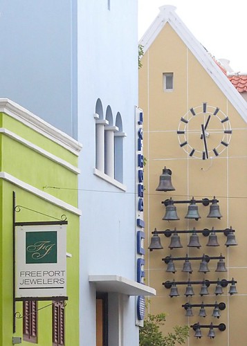
One of the most common issues I see in photos on Flickr is a dullness -a hazy gray look to images. This is often very easy to fix. We'll use Auto Levels to fix the dullness seen in this photo:

CuracaoBellsLevelsExercise

Feel free to download this photo at it's full size here to follow along with the steps to fix it:
www.flickr.com/photos/15059459@N02/3074716327/sizes/o/

After downloading the photo, open it in Gimp. Do you immediately notice the dullness or hazy look to the photo? If not, that's ok. Over time it'll become more obvious to you.

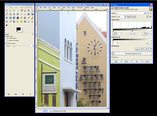
Find and click on the "Colors" menu and then choose the "Levels" tool. This will open up a new window as seen here:

CuracaoBellsLevels

There's a lot of options in the Levels window, and we'll go over them all later. For now, just find the "Preview" checkbox towards the bottom and make sure that it's checked. This will change the look of the photo immediately when we make changes to it with the tool. If "Preview" is not checked you won't see your changes until you apply them by clicking on the "OK" button.

After making sure "Preview" is checked, click on the "Auto" button and watch how the photo changes. If you miss it you can click on the "Reset" button to undo the change so you can redo it.

See how the dullness is immediately fixed with Auto - Levels? The bells in particular go from dull looking to dark, as they should be. Click "OK" to apply the change to the photo permanently (what you see is just a preview, so hitting "Cancel" will cancel the change and the photo will go back to the way it was before you made the Levels change).

That's it for this photo -we're done!


When I first found out about this tool I did an Auto-Level on every photo I took because sometimes it made a huge difference even if I thought the photo looked good before using it. The more I used it the more I became aware of that dull cast in photos and could anticipate whether an Auto-Level was needed or not. I encourage you to try Auto-Levels on your photos to see what a diffence it can make. Sometimes it will make no difference, sometimes it'll make the colors in your photos go wacky and you won't want to use it. But, many times it can have a positive effect, so it's worth a shot!

Friday, November 28, 2008

Gimp Basics

When you open Gimp for the first time you'll get 2 seperate windows, the toolbox window is the one with all the little icons all over it; the image window is the one that's mostly gray with the menus at the top ("File", "Edit", "Select", etc).

GimpOpen

-------------------------------------------------------------------------------------

If you go to the "File" menu and open one of your photos it'll look like this:

GimpImageOpened

---------------------------------------------------------------------------------------

There are many other windows you can open to help you with certain tasks as well. They are usually hidden by default so that they don't get in your way, but you can open them at any time in the "Windows" menu, under "Dockable Dialongs":

GimpWindows

------------------------------------------------------------------------------------------

The optional windows I use most are "Layers" and "Undo". Here's how I arrange all the windows on my screen so I can get to everything easily:

GimpLayersUndo

----------------------------------------------------------------------------------------

All of the windows can be moved around and arranged however you want. To move them, click on the top of the window in the colored area (blue on my screenshots) and drag them wherever you want them. ("Drag" by holding the mouse button down while moving the mouse.)

Sunday, November 9, 2008

How to create a vignette effect in Gimp

Vignette is that effect you sometimes see where the corners of a photo are a little darker than the rest of the photo. Here's an example from Aaron Escobar's photostream on Flickr (click on the photo to go to the Flickr page):


Here are the steps to create this effect in Gimp:
* Go to the "Layer" menu and choose "New Layer" -make sure the default layer type of "Transparency" is selected, then select "Ok".
* In the toolbox, click on the Ellipse Select Tool and set the Feather edges to "100" (push the slider all the way to the right).
* Select the area where you want the vignette effect to end.
* When the area is selected, go to the "Select" menu and click "Invert" -this will select everything OUTSIDE of the circle instead of the circle itself.
* Click on the Bucket Fill Tool from the Toolbox. Make sure black (or whatever color you want your vignette to be) is selected, then click in the selected area to fill in the color.
* Adjust the layer's opacity to make the vignette go from black to more "see through" -by changing the opacity you can make it as dark or light as you choose. (The "Layer" window can be opened by clicking on the "Windows" menu, then going to "Dockable Dialogs" and selecting "Layers".
* Chances are the transition between the vignette and your photo is a bit more abrupt than you'd like it to be. That's ok we can make it more gradual...
* Click on the "Filters" menu, go to "Blur" > "Gaussian Blur".
* Move the blur radius up from the default "5" to somewhere around "150" depending on the transition you are looking for.
* When it looks good, flatten the image and save it and you're done!

Thursday, April 10, 2008

Selective Exposure Correction in GIMP

Hello there!

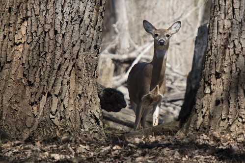
I took this photo in the middle of the afternoon in harsh sunlight so getting the exposure right was difficult. I tried several different exposures using exposure compensation and watching the histogram, but because much of the deer was in shadow compared to the full sunlight that the foreground was getting, I had to choose to expose for the deer and let the rest get a bit blown out. According to the histogram I was getting all the data, so I knew I could fix it in software later.

So, how did I fix it? Well, this is a first for me, but I made a video showing how I did it. I meant to upload it to Flickr to try out their new video upload capability, but it's over 90 seconds, so it went on YouTube instead:


...this was my first video ever and in retrospect I should have said what menus I was using as I clicked on them. Perhaps I'll get better at it over time.

Lasso Select tool: In toolbox window
Invert Selection: Under "Select" menu
Curves Tool: Under "Tools" menu > "Color Tools"

Friday, February 8, 2008

How to create a colorized black and white photo in Gimp

* Open your photo in GIMP
* Go to the "Layers" menu and select "Duplicate Layer". This is like taking two copies of your photo and setting one ontop of the other.
* Go to the "Windows" menu, choose "Dockable Dialogs" and then choose "Layers".
* A new (small) window should open and you should see the two layers you now have in the "Layers" box.
* Click on the top layer in the "Layers" box (it should be called "Background copy") to make that layer the "active" one that you'll be working on, then right-click on it and a bunch of options will appear. Choose "Add Alpha Channel" (near the bottom). This will allow you to erase the top layer and see all the way through to the bottom photo in the next couple steps instead of it being white underneath.
* Go back to the window with your photo on it and click on the "Colors" menu, then choose "Desaturate". In the next window try "Average" -this usually gives a good result; it will make the top layer black and white.
* (Optional) The photo on the bottom is still in color; you just can't see it because it's under the copy we just converted to black kand white. To demonstrate that the original is still under there, click on the little eye next to the "Background" layer in the "Layers" box. That eye tells you that the layer is visible, clicking on it to remove the eye makes it invisible so you can see the layer(s) underneath. Bottom line: If you do this, you'll see the color version re-appear. When you are done, re-check the box so the top layer (the black and white one) is visible again.
* Make sure the "Background copy" layer is "active" by clicking on it in the "Layers" box.
* In the "Toolbox " window (the one with all the icons on it), select the "Eraser" (the little pink square icon).
* Erase the parts of the top layer (the black and white one) where you want to see the bottom layer (the color one) through it. (If it's a large area, you may want to do a rough selection with the lasso tool first and delete a large portion of it that way, then use the eraser tool to just do the fine details around the edges.
* Then go to the "Image" menu and choose "Flatten Image".
* Save the file and you are done!

Wednesday, July 11, 2007

Photo Critique #1: An unsuspecting contributor, my Mom!

My Mom has never really been into photography. It's always been my Dad's hobby and my interest. To my Mom, it's never really been more than a way to document a period in time. Until recently...

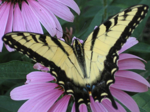
Out of the blue, she asked me for advice in buying a camera. She ended up with a Canon Powershot A530. Shortly after purchasing it, she wondered out loud why she had spent the money. She's pretty much tied to the house taking care of my disabled father, so she doesn't have any trips coming up where she'd want to take pictures... So, the camera sat there for a few months. Then, she sends me this: (click on the photo to view a larger version , EXIF data, etc).


My Mom has a beautiful garden in her backyard. She told me that she was out in the garden when she spotted this butterfly, and ran inside, got her camera and took this picture. It's beautiful!

Because I know the submitter, I can tell you that this photo is uncropped and hasn't been touched up in software because, well, she just got the hang of transferring photos from her camera to her computer, and then uploading them to Flickr. -All that's still a challenge for her, so we're going to wait awhile before teaching her about photo editing. But people with her experience level is exactly who I'm targeting with this blog, so I figured this would be perfect.

The photo itself, as is, is absolutely fabulous. I'd consider hanging it on my wall if I were her. The framing is excellent -the butterfly fills the frame from one side to the other, and the background is simple, but colorful -it doesn't overwhelm the subject (the butterfly), but rather compliments it. -I think my mom has an advantage since she's an excellent painter. She probably knows that purple and yellow are opposite colors on the artist's painting wheel, and setting one upon the other in this way adds a lot of interest to the photo.

I have 2 minor things that in a perfect world might be different in this photo. #1 is that I wish the butterfly's left wing "tail" hadn't been cut off. -It's not too big of a deal because the other one doesn't stand out much anyway being black on purple, but still... I said "perfect world", so I had to mention it. The other thing I'd do is get rid of the slight gray cast in the photo.

This happens a lot. Photos come out just slightly "gray" looking. Many times if you were shooting film, the developer would automatically adjust to get rid of the gray, but in the age of digital you have to do it yourself.

The real cause of this "greyness" -what some people refer to as the photo looking like it has a film on it that makes it look "muddy" or "flat". Areas in the image that should be black fall short of being 100% (or "true") black and/or "true white" in the photo. In this case, it's the fact that we don't quite have an area of true black in that butterfly that makes the photo seem a bit dull.

So, how do you fix it? Well, we can't all afford the $600 for Photoshop -me included. But, that's fine. There's a FREE program that does almost everything Photo$hop does, it's called "Gimp" and you can download it here: http://gimp.org

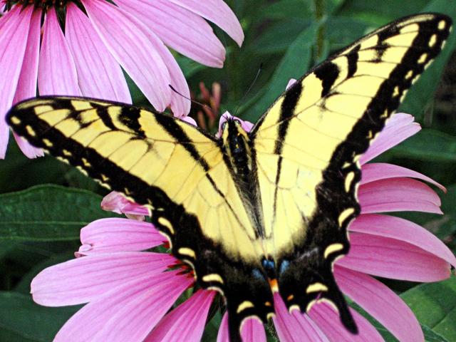
After some minor touch-ups, which I'll teach you tomorrow, the photo looks like this:


So, go download and install Gimp, and tomorrow I'll teach you how to use it to get rid of that "gray" cast that you get in some photos!

Monday, May 7, 2007

Colored Smoke How-To


This isn't the greatest example ever, see Jameela's Flickr site to see some better smoke photos, but here's how you achieve the effect:

You need:
  • Any camera in any mode (having your flash on is recomended, though)
  • Something non-reflective and black to use as a background
  • Incense (to create the smoke)
  • A light source (I used my Canon 30D's on-camera flash and the darkness of my backyard as my light source and background, and it resulted in a kindof flat photo in comparison to Jameela's which was taken indoors with a light source in addition to her on-camera flash).
What to do:
  • Set up the incense infront of the black background
  • Take tons of photos being careful that autofocus isn't focusing on the background rather than the smoke and that your shutter speed is high enough that the smoke isn't blurry)
  • Download your images to your computer and open one of the "good ones" in an image editing program of your choice.
  • Find the "Invert" option. This will invert the colors, giving you the white background.
  • There are many different ways to create the colored smoke. Gimp has a "Colorize" tool, saturation adjustments can help too, experiment to find what works for you.