Getting critique on your work is the only way to find out how others perceive your work. But, beginners are often hesitant to join in with critiquing because they don't think they have the skills to judge a photo yet. I strongly disagree. Many of us aim to one day be good enough to have their photo in a newspaper or hanging on someone's wall. But the people who will be buying your art for their wall or looking at your photo in the newspaper will not be photographers -they'll be normal, everyday people. So, when giving critique don't worry if you could do better or not, it makes no difference -it's your opinion matters. And don't be concerned about being "right" or "wrong" -your opinion is just one opinion and the photographer should only take it as such. Just remember -there is no right or wrong when it comes to your own personal opinion!
So, with this in mind, here's a little cheat-sheet to give you some inspiration on what to look at when giving critique.
Here are the some basic areas to focus on:
1. As a whole, do you like the image? Does it look like someone spent time on it? Is it eye-catching? Could you see it on a wall, in an advertisement, or newspaper?
2. Exposure Overall is the photo too dark or too bright? Does it look dull and grayish?
3. Lighting: Is the lighting even? Are the shadows too dark or the highlights too bright? Are there distracting shadows?
4. Sharpness: Is the subject of the photo in focus? How much of the photo is in focus? Would the photo benefit from the background being more or less in focus?
5. Framing: Are there parts of the photo that were included, but don't add to the photo? Or is something missing or cut off that would have added to the photo?
6. Contrast: Does the subject stand out from the background, or does it get somewhat lost in it?
7. Noise: Does the image have a grainy appearance? Does it add to the image or negatively impact it?
Other areas of critique:
8. Rule of Thirds: Is the subject and/or horizon centered? Would the rule of thirds help make the photo more interesting?
9. Balance: Does your eye tend to ignore parts of the photo due to subject placement, bright spots, or certain colors?
10. Perspective: Is the angle that the photo was taken at effective? Would another angle be more interesting or appropriate?
11. Effects: Is the use of vignette (making the outside of the photo dark), adding of frames, selective colorization, etc effective or distracting? Does it add to the photo?
12. B&W vs Color: Was the use of color or black and white appropriate? Might it look better the other way?
Showing posts with label critique. Show all posts
Showing posts with label critique. Show all posts
Tuesday, January 4, 2011

Tuesday, January 27, 2009
Photos to learn from: Day 223 - O Brother
The poses for both children are perfect here. As a "big sister" to a "little brother" this really conveys what I felt many times in childhood -annoyance at my little brother!
The lighting is suberb. Just like the flower photo, there's enough definition with shadow to show contours, but no sharp shadow lines -they are all very soft and not distracting.
The background is simple. The low perspective helps with that. It also lets us connect with the girl better. Generally, shooting at eye-level with your subject will help your photos a lot.
The wide-angle gives a lot of depth to the photo and the fact that the line from the corner of the 2 walls divides the children adds to the photo in a subtle way as well.
...I'm not usually a big fan of "kid" photos because most people just try to capture their kids as they are, but this one is creative and really strikes me (personally) emotionally with memories of my own childhood. Thinking of capturing an emotion in addition to a photo will bring your work to the next level and make it more interesting to a general audience.

The lighting is suberb. Just like the flower photo, there's enough definition with shadow to show contours, but no sharp shadow lines -they are all very soft and not distracting.
The background is simple. The low perspective helps with that. It also lets us connect with the girl better. Generally, shooting at eye-level with your subject will help your photos a lot.
The wide-angle gives a lot of depth to the photo and the fact that the line from the corner of the 2 walls divides the children adds to the photo in a subtle way as well.
...I'm not usually a big fan of "kid" photos because most people just try to capture their kids as they are, but this one is creative and really strikes me (personally) emotionally with memories of my own childhood. Thinking of capturing an emotion in addition to a photo will bring your work to the next level and make it more interesting to a general audience.
Photos to learn from: A cala copout
This is a simple flower shot, but what makes it exceptional in my mind is the fact that most of us would never think to let such so much of the flower fall outside the frame like the photographer has done here.
The reason that cropping the flower is okay here is that the flower isn't so much the subject as is shape. -It's almost an abstract. That gentle S-curve that's accentuated by the plain and contrasting black background is what makes this shot -and (IMO) is what the shot is about.
The lighting is also superb. There are shadows to show 3-dimensional shape, but they are very soft -there are no sharp lines where they begin or end. It's all very subtle and perfect.
Exercise: Take a simple subject like a flower, a fork, a shoe -whatever you have lying around and take at least 50 shots of it from different angles. Aspire to 50, and push yourself. You'll be surprised how creative you can be if you push yourself!
...feel free to post photos that you find to be exceptional on Flickr here for us all to see & we can discuss what makes them great and the lessons we can take from them. Explore is a great place to go to find inspirational photos.
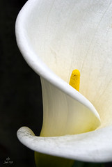




The reason that cropping the flower is okay here is that the flower isn't so much the subject as is shape. -It's almost an abstract. That gentle S-curve that's accentuated by the plain and contrasting black background is what makes this shot -and (IMO) is what the shot is about.
The lighting is also superb. There are shadows to show 3-dimensional shape, but they are very soft -there are no sharp lines where they begin or end. It's all very subtle and perfect.
Exercise: Take a simple subject like a flower, a fork, a shoe -whatever you have lying around and take at least 50 shots of it from different angles. Aspire to 50, and push yourself. You'll be surprised how creative you can be if you push yourself!
...feel free to post photos that you find to be exceptional on Flickr here for us all to see & we can discuss what makes them great and the lessons we can take from them. Explore is a great place to go to find inspirational photos.
Thursday, July 31, 2008
A trick to getting honest critique from friends and family
I find it really interesting to take two photos and ask friends / family which they like better and why. Photos I throw out because of technical problems or distractions, etc are sometimes overwhelmingly the favorites of my non-photographer viewers. I've learned a lot from those kinds of discussions. It's a great way to find your weak spots as far as composition goes. The secret is to present photos in two's so that your friends / family can more easily give critique -they can say something bad about one by saying what's better about the other ;-). That usually breaks the critique ice and can get a real discussion going that's more likely to lead to better insights.
Friday, February 29, 2008
What is a "good photo"?
Let's say you took the following photo:
http://www.flickr.com/photos/38517801@N00/2300096065/
Would you consider this to be a good photo? Why or why not? Seriously consider this photo as if you had taken it. What would you try to improve on your next try?
Let's say this is your second try:
http://www.flickr.com/photos/russeth/2300846140/
How do you think you did this time?
And your third try?
http://www.flickr.com/photos/paul139/2300109685/
What about this one?
http://www.flickr.com/photos/23922206@N07/2300128769/
Do you consider any of the 4 to be "good"? On what basis?
Most of us decide what's "good" based on two things: What we've produced in the past, and what we've seen of other people's work. But how often do you seriously look at other people's work? Seeking out popular photos can not only give you ideas on things to try, but they'll also give you a more realistic idea of where you are at artistically with your photography. This is much more honest and easy to come by than most critique.
I find all of the above photos to be technically very good. I do, however, find a few minor issues in them: The first photo is nice, but the flower's a bit overexposed due to mid-day sun and the fence in the background definitely detracts from the flower. The second one was framed so that the flowers in the background create a purple backdrop that the subject just gets lost in. The third, is getting there, I like the feeling of it, but it's a bit underexposed and once again the background is distracting. I wish the leaves weren't cut off at the bottom as well. The fourth photo is pretty good. The color is great, the exposure is good, the background is not distracting, but it still lacks "wow factor".
Check out the photos below. Are they better? Why? What in particular do you like or dislike about them? Does looking at these change your opinions about the photos above?
http://www.flickr.com/photos/backbe/2300120953/
http://www.flickr.com/photos/marcgutierrez/88704477/
http://www.flickr.com/photos/valanne/432271395/
http://www.flickr.com/photos/daveward/24233971/
This post, of course, is based on my own opinions. It would be much more meaningful for you to search Flickr yourself for images to use for ideas and inspiration or just browse Flickr Explore occasionally to see some random popular photos.
To sum up: I don't believe people are born with an eye for photography. It think it is developed by critically examining a few of the many images you come across every day. Even advertisements can be analyzed. This is a great way to practice when you don't have time to pick up your camera.
http://www.flickr.com/photos/38517801@N00/2300096065/
Would you consider this to be a good photo? Why or why not? Seriously consider this photo as if you had taken it. What would you try to improve on your next try?
Let's say this is your second try:
http://www.flickr.com/photos/russeth/2300846140/
How do you think you did this time?
And your third try?
http://www.flickr.com/photos/paul139/2300109685/
What about this one?
http://www.flickr.com/photos/23922206@N07/2300128769/
Do you consider any of the 4 to be "good"? On what basis?
Most of us decide what's "good" based on two things: What we've produced in the past, and what we've seen of other people's work. But how often do you seriously look at other people's work? Seeking out popular photos can not only give you ideas on things to try, but they'll also give you a more realistic idea of where you are at artistically with your photography. This is much more honest and easy to come by than most critique.
I find all of the above photos to be technically very good. I do, however, find a few minor issues in them: The first photo is nice, but the flower's a bit overexposed due to mid-day sun and the fence in the background definitely detracts from the flower. The second one was framed so that the flowers in the background create a purple backdrop that the subject just gets lost in. The third, is getting there, I like the feeling of it, but it's a bit underexposed and once again the background is distracting. I wish the leaves weren't cut off at the bottom as well. The fourth photo is pretty good. The color is great, the exposure is good, the background is not distracting, but it still lacks "wow factor".
Check out the photos below. Are they better? Why? What in particular do you like or dislike about them? Does looking at these change your opinions about the photos above?
http://www.flickr.com/photos/backbe/2300120953/
http://www.flickr.com/photos/marcgutierrez/88704477/
http://www.flickr.com/photos/valanne/432271395/
http://www.flickr.com/photos/daveward/24233971/
This post, of course, is based on my own opinions. It would be much more meaningful for you to search Flickr yourself for images to use for ideas and inspiration or just browse Flickr Explore occasionally to see some random popular photos.
To sum up: I don't believe people are born with an eye for photography. It think it is developed by critically examining a few of the many images you come across every day. Even advertisements can be analyzed. This is a great way to practice when you don't have time to pick up your camera.
Wednesday, July 11, 2007
Photo Critique #1: An unsuspecting contributor, my Mom!
My Mom has never really been into photography. It's always been my Dad's hobby and my interest. To my Mom, it's never really been more than a way to document a period in time. Until recently...
Out of the blue, she asked me for advice in buying a camera. She ended up with a Canon Powershot A530. Shortly after purchasing it, she wondered out loud why she had spent the money. She's pretty much tied to the house taking care of my disabled father, so she doesn't have any trips coming up where she'd want to take pictures... So, the camera sat there for a few months. Then, she sends me this: (click on the photo to view a larger version , EXIF data, etc).
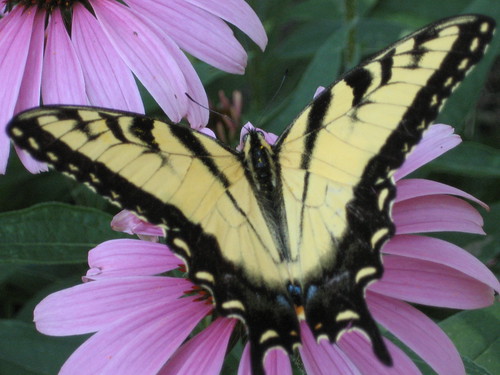
My Mom has a beautiful garden in her backyard. She told me that she was out in the garden when she spotted this butterfly, and ran inside, got her camera and took this picture. It's beautiful!
Because I know the submitter, I can tell you that this photo is uncropped and hasn't been touched up in software because, well, she just got the hang of transferring photos from her camera to her computer, and then uploading them to Flickr. -All that's still a challenge for her, so we're going to wait awhile before teaching her about photo editing. But people with her experience level is exactly who I'm targeting with this blog, so I figured this would be perfect.
The photo itself, as is, is absolutely fabulous. I'd consider hanging it on my wall if I were her. The framing is excellent -the butterfly fills the frame from one side to the other, and the background is simple, but colorful -it doesn't overwhelm the subject (the butterfly), but rather compliments it. -I think my mom has an advantage since she's an excellent painter. She probably knows that purple and yellow are opposite colors on the artist's painting wheel, and setting one upon the other in this way adds a lot of interest to the photo.
I have 2 minor things that in a perfect world might be different in this photo. #1 is that I wish the butterfly's left wing "tail" hadn't been cut off. -It's not too big of a deal because the other one doesn't stand out much anyway being black on purple, but still... I said "perfect world", so I had to mention it. The other thing I'd do is get rid of the slight gray cast in the photo.
This happens a lot. Photos come out just slightly "gray" looking. Many times if you were shooting film, the developer would automatically adjust to get rid of the gray, but in the age of digital you have to do it yourself.
The real cause of this "greyness" -what some people refer to as the photo looking like it has a film on it that makes it look "muddy" or "flat". Areas in the image that should be black fall short of being 100% (or "true") black and/or "true white" in the photo. In this case, it's the fact that we don't quite have an area of true black in that butterfly that makes the photo seem a bit dull.
So, how do you fix it? Well, we can't all afford the $600 for Photoshop -me included. But, that's fine. There's a FREE program that does almost everything Photo$hop does, it's called "Gimp" and you can download it here: http://gimp.org
After some minor touch-ups, which I'll teach you tomorrow, the photo looks like this:
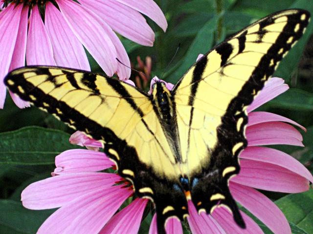
So, go download and install Gimp, and tomorrow I'll teach you how to use it to get rid of that "gray" cast that you get in some photos!
Out of the blue, she asked me for advice in buying a camera. She ended up with a Canon Powershot A530. Shortly after purchasing it, she wondered out loud why she had spent the money. She's pretty much tied to the house taking care of my disabled father, so she doesn't have any trips coming up where she'd want to take pictures... So, the camera sat there for a few months. Then, she sends me this: (click on the photo to view a larger version , EXIF data, etc).
My Mom has a beautiful garden in her backyard. She told me that she was out in the garden when she spotted this butterfly, and ran inside, got her camera and took this picture. It's beautiful!
Because I know the submitter, I can tell you that this photo is uncropped and hasn't been touched up in software because, well, she just got the hang of transferring photos from her camera to her computer, and then uploading them to Flickr. -All that's still a challenge for her, so we're going to wait awhile before teaching her about photo editing. But people with her experience level is exactly who I'm targeting with this blog, so I figured this would be perfect.
The photo itself, as is, is absolutely fabulous. I'd consider hanging it on my wall if I were her. The framing is excellent -the butterfly fills the frame from one side to the other, and the background is simple, but colorful -it doesn't overwhelm the subject (the butterfly), but rather compliments it. -I think my mom has an advantage since she's an excellent painter. She probably knows that purple and yellow are opposite colors on the artist's painting wheel, and setting one upon the other in this way adds a lot of interest to the photo.
I have 2 minor things that in a perfect world might be different in this photo. #1 is that I wish the butterfly's left wing "tail" hadn't been cut off. -It's not too big of a deal because the other one doesn't stand out much anyway being black on purple, but still... I said "perfect world", so I had to mention it. The other thing I'd do is get rid of the slight gray cast in the photo.
This happens a lot. Photos come out just slightly "gray" looking. Many times if you were shooting film, the developer would automatically adjust to get rid of the gray, but in the age of digital you have to do it yourself.
The real cause of this "greyness" -what some people refer to as the photo looking like it has a film on it that makes it look "muddy" or "flat". Areas in the image that should be black fall short of being 100% (or "true") black and/or "true white" in the photo. In this case, it's the fact that we don't quite have an area of true black in that butterfly that makes the photo seem a bit dull.
So, how do you fix it? Well, we can't all afford the $600 for Photoshop -me included. But, that's fine. There's a FREE program that does almost everything Photo$hop does, it's called "Gimp" and you can download it here: http://gimp.org
After some minor touch-ups, which I'll teach you tomorrow, the photo looks like this:
So, go download and install Gimp, and tomorrow I'll teach you how to use it to get rid of that "gray" cast that you get in some photos!
Tuesday, July 3, 2007
Getting Critique
(Click on image to see the larger sizes and EXIF data.)
Getting critique on your photos is one of the best things you can do to improve your photography. It helps you take a more critical eye to your work, which can be difficult, but it also helps you see what you are doing right. Eventually the good outweighs the bad, and you'll be amazed at how far you've come. It's important to take critique in the right light, though.
You know how they say "Opinions are like ___ -everyone's got one"? It's no less true in photography. That's why it's important that you always evaluate the critique you get. A good way to do this is to become an active member in a group or forum where you can get to know your fellow member's personalities as well as their work. Then, if Bob says he doesn't like your photo, you'll know that he's hard on everyone, and you can just ignore him. But if John says he doesn't like it, maybe you'll listen because you love his work and respect the advice he's given to others. And although Mary says it's the best photo she's ever seen, you know she said the same thing 2 minutes ago to Bob about his photo of his dog licking his backside. Point is, it helps to know your audience.
On the other hand, random critique is fine too as long as you don't put too much weight on one person's opinion. If you don't agree with someone's advice -even if you consider them a better photographer then you, it comes down to your photo being your OWN art. Take only the advice that works for you, and leave the rest behind.
Sometimes it helps, though, to wait a week or so before posting a photo for critique. You know that "high" you get from capturing a great image? There's nothing worse than reading critique on that image while you're still caught up in the attachment of how you took it and what it means to you. It may be best to wait until you're not as attached to the photo so you can consider the negative things about the image in order to learn from it and improve your skills for next time. In short, critique is about learning what you did wrong, so you have to be willing to hear it.
Finally, don't be afraid to post bad photos. In my experience, you learn more from your bad photos than you do from your good ones. Posting a "why didn't this work?" image can lead to leaps in learning that can save you weeks or months of experimenting and learning on your own.
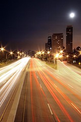
My personal story about the photo attached to this post:
I posted this image in two different places for critique. I ended up with a lot of positive feedback, and the following 3 responses that offered advice for improvement:
1.) One person said the photo broke the rule of thirds and I should have put the horizon line 1/3 of the way from the top of the photo. This was well intentioned, but bad advice. I'll explain the rule of thirds tomorrow, and then why I broke it in this image on Thursday.
2.) Another person suggested I move the moon to the left side of the photo for better balance in the image. Others agreed with him, and I think his advice may have merit, but after careful consideration I've decided that I like the moon as-is. So, I have taken his critique as a lesson on balance, but I will not be altering this particular photo as a result.
3.) The last person suggested I try making the image a bit darker and removing a couple of dust spots near the moon. This advice was definitely helpful. I removed the spots that I had missed before and I also tried darkening the shot a bit. The result was subtle, but definitely better so I kept it.
So, in the end only subtle changes were made to this particular image, but I've benefited from posting it because person #2 really got me thinking about the use of balance in an image. Not every photo you post will lead to you learning something, but it's more probable than if you never post anything at all. -If you don't belong to a photo group and you consider yourself a beginner, try joining my Photography_Beginners yahoogroup here!
Of course, if you aren't that brave yet or if you have nothing to post, you can learn from looking at other people's images and watching the critique they get. A great place to do that is by watching a Pro (Craig Tanner) critique a new photo every weekday via the Radiant Vista's Daily Critique.
You know how they say "Opinions are like ___ -everyone's got one"? It's no less true in photography. That's why it's important that you always evaluate the critique you get. A good way to do this is to become an active member in a group or forum where you can get to know your fellow member's personalities as well as their work. Then, if Bob says he doesn't like your photo, you'll know that he's hard on everyone, and you can just ignore him. But if John says he doesn't like it, maybe you'll listen because you love his work and respect the advice he's given to others. And although Mary says it's the best photo she's ever seen, you know she said the same thing 2 minutes ago to Bob about his photo of his dog licking his backside. Point is, it helps to know your audience.
On the other hand, random critique is fine too as long as you don't put too much weight on one person's opinion. If you don't agree with someone's advice -even if you consider them a better photographer then you, it comes down to your photo being your OWN art. Take only the advice that works for you, and leave the rest behind.
Sometimes it helps, though, to wait a week or so before posting a photo for critique. You know that "high" you get from capturing a great image? There's nothing worse than reading critique on that image while you're still caught up in the attachment of how you took it and what it means to you. It may be best to wait until you're not as attached to the photo so you can consider the negative things about the image in order to learn from it and improve your skills for next time. In short, critique is about learning what you did wrong, so you have to be willing to hear it.
Finally, don't be afraid to post bad photos. In my experience, you learn more from your bad photos than you do from your good ones. Posting a "why didn't this work?" image can lead to leaps in learning that can save you weeks or months of experimenting and learning on your own.
My personal story about the photo attached to this post:
I posted this image in two different places for critique. I ended up with a lot of positive feedback, and the following 3 responses that offered advice for improvement:
1.) One person said the photo broke the rule of thirds and I should have put the horizon line 1/3 of the way from the top of the photo. This was well intentioned, but bad advice. I'll explain the rule of thirds tomorrow, and then why I broke it in this image on Thursday.
2.) Another person suggested I move the moon to the left side of the photo for better balance in the image. Others agreed with him, and I think his advice may have merit, but after careful consideration I've decided that I like the moon as-is. So, I have taken his critique as a lesson on balance, but I will not be altering this particular photo as a result.
3.) The last person suggested I try making the image a bit darker and removing a couple of dust spots near the moon. This advice was definitely helpful. I removed the spots that I had missed before and I also tried darkening the shot a bit. The result was subtle, but definitely better so I kept it.
So, in the end only subtle changes were made to this particular image, but I've benefited from posting it because person #2 really got me thinking about the use of balance in an image. Not every photo you post will lead to you learning something, but it's more probable than if you never post anything at all. -If you don't belong to a photo group and you consider yourself a beginner, try joining my Photography_Beginners yahoogroup here!
Of course, if you aren't that brave yet or if you have nothing to post, you can learn from looking at other people's images and watching the critique they get. A great place to do that is by watching a Pro (Craig Tanner) critique a new photo every weekday via the Radiant Vista's Daily Critique.
Subscribe to:
Posts (Atom)