This is a nice graphical manual mode cheat sheet. It's much like my previous Manual Mode Cheat Sheet post, but prettier:
http://livinginthestills.tumblr.com/day/2011/06/12
Saturday, December 17, 2011
Tuesday, September 13, 2011
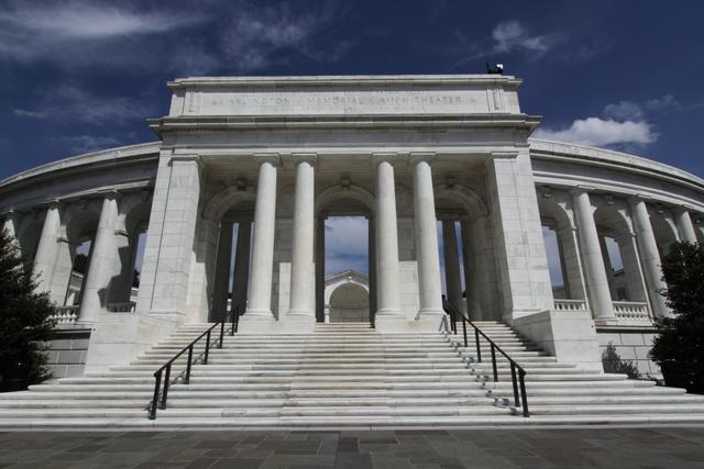
Getting everything in-focus in an image.
Let's start by defining two terms:
-Shallow depth of field: when only a small portion of the photo is in focus and everything in front of or behind the focus point is blurred. Example: http://www.flickr.com/photos/
-Deep depth of field: when a lot (or all of) the photo is in-focus and nothing is blurred due to being in front of or behind the focus point.
Two things work together to determine your depth of field: where you focus, and your aperture.
-Low-numbered (aka "large" or f/4 rather than f/16) apertures give you a more shallow depth of field.
-High-numbered (aka "small" or f/16 rather than f/4) apertures give you a deeper depth of field.
But, the distance from the camera to where you focus also matters.
-The closer to the camera that you focus, the shallower the depth of field at a given aperture.
-The farther away from the camera that you focus, the deeper the depth of field at a given aperture.
So, to get an infinity focus (or close to it) you need to focus far from the camera and use a high-numbered aperture. If you aren't using Manual modes yet, then choosing the "Landscape" Auto mode on your camera (icon usually looks like mountains) and a distant focus point will get you similar results.
The sweet spot seems to be about a third of the way into the distance in your image -if you focus there (in a landscape) you should get about infinity focus. But please note that macros and studio shots are different since the focus point is so much closer to the camera, it is often impossible to get infinity focus without taking several pictures with different areas in focus and then stacking them in software after the fact.
Wednesday, June 8, 2011
Black and white conversion
The easiest way to convert a photo to black and white is to choose the menu item or button in your imaging software that just converts it for you. In Gimp 2.6.3 you find this under the "Colors" menu and it's called "Desaturate". But like many other things in photography, the easy way isn't always the best way to go about things.
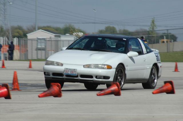
I'm going to use this photo as an example for two different ways to do black and white conversions. I use Gimp, but these different techniques will work in Photoshop and many other programs as well. Here's the photo we'll be working with for this article
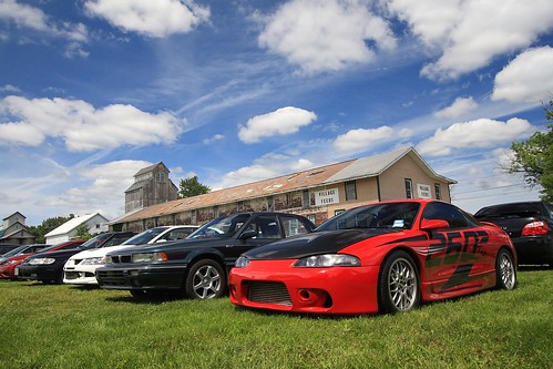
First, I'll show you what you get when you just "Desaturate" or do an auto color to black and white conversion
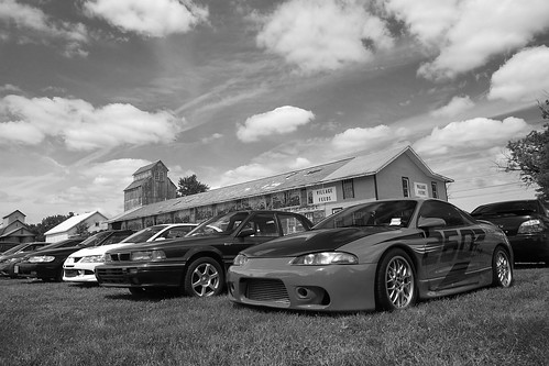
This isn't a bad black and white conversion, but the car ends up being a shade of gray that's very close to that of the grass, so it doesn't stand out well. The barn is a lighter shade too that blends in with the sky rather than standing out. So, let's talk about how Channels can help us get a better result.
Back in the day black and white photographers would carry filters with them that were red, green, or blue to adjust what colors would appear darker or lighter. Channels works in much the same way. This requires a little thought at first, but with some practice it becomes second nature. (And it's always fine to just play with the Channel controls until you like the way it looks too.)
If you put a red filter on the camera it blocks red from being recorded on the black and white film. This means that red blotchy skin is much less noticeable when a red filter is used. A red filter also darkens the color blue, so if you are shooting landscapes and you want a dramatic dark sky you can use a red filter as well. Let's make a table of the filters' effects to make this easier to use as a reference:
Red:
-makes red lighter
-makes blue darker
Blue:
-makes blue lighter
-makes green darker
Green:
-makes green lighter
-makes red darker
So, how does this relate to Channels? Channels adjust the amount of red, green, and blue used in the photo. This means that, effectively, Channels work like a filter does in black and white film photography. In fact, in Gimp (and I assume in Photoshop and other software), Channels will also convert to black and white at the same time that you adjust the amount of red, green, or blue. In Gimp this is done via a "convert to monochrome" checkbox. (The Channels tool in Gimp is under the "Colors" menu, then "Components", then "Channel Mixer".)
On to examples! Here is the photo using 100% red (the equivalent of using a red filter in black and white photography):

I like this result a lot! But, just to make sure this is the best one let's check out 100% green:
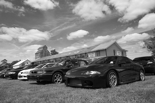
Check out the difference in the color of the car between these two photos! Pretty impressive, huh? Now let's see what 100% blue looks like:
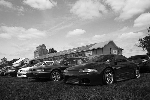
See the difference in the look of the grass in this one? I think red's my pick for this photo. But, unlike the days of film where you'd have one of the 3 filters to choose from, nowadays you have more flexibility than you may even want! You can choose 75% red, 25% green or 80%-20%-20% or any combination you think looks the best. So, give it a try and gain a lot more control over the outcome of your color to black and white conversions!
I'm going to use this photo as an example for two different ways to do black and white conversions. I use Gimp, but these different techniques will work in Photoshop and many other programs as well. Here's the photo we'll be working with for this article
First, I'll show you what you get when you just "Desaturate" or do an auto color to black and white conversion
This isn't a bad black and white conversion, but the car ends up being a shade of gray that's very close to that of the grass, so it doesn't stand out well. The barn is a lighter shade too that blends in with the sky rather than standing out. So, let's talk about how Channels can help us get a better result.
Back in the day black and white photographers would carry filters with them that were red, green, or blue to adjust what colors would appear darker or lighter. Channels works in much the same way. This requires a little thought at first, but with some practice it becomes second nature. (And it's always fine to just play with the Channel controls until you like the way it looks too.)
If you put a red filter on the camera it blocks red from being recorded on the black and white film. This means that red blotchy skin is much less noticeable when a red filter is used. A red filter also darkens the color blue, so if you are shooting landscapes and you want a dramatic dark sky you can use a red filter as well. Let's make a table of the filters' effects to make this easier to use as a reference:
Red:
-makes red lighter
-makes blue darker
Blue:
-makes blue lighter
-makes green darker
Green:
-makes green lighter
-makes red darker
So, how does this relate to Channels? Channels adjust the amount of red, green, and blue used in the photo. This means that, effectively, Channels work like a filter does in black and white film photography. In fact, in Gimp (and I assume in Photoshop and other software), Channels will also convert to black and white at the same time that you adjust the amount of red, green, or blue. In Gimp this is done via a "convert to monochrome" checkbox. (The Channels tool in Gimp is under the "Colors" menu, then "Components", then "Channel Mixer".)
On to examples! Here is the photo using 100% red (the equivalent of using a red filter in black and white photography):
I like this result a lot! But, just to make sure this is the best one let's check out 100% green:
Check out the difference in the color of the car between these two photos! Pretty impressive, huh? Now let's see what 100% blue looks like:
See the difference in the look of the grass in this one? I think red's my pick for this photo. But, unlike the days of film where you'd have one of the 3 filters to choose from, nowadays you have more flexibility than you may even want! You can choose 75% red, 25% green or 80%-20%-20% or any combination you think looks the best. So, give it a try and gain a lot more control over the outcome of your color to black and white conversions!
Monday, February 14, 2011
New quicklinks!
For those who subscribe to this blog, I apologize for the last few posts tonight, but they are part of a huge improvement for navigating the articles here on the Muddyboots Photography Blog!
For the last 6 months or so it's become more and more obvious that finding the information you want on this blog can be frustrating at times, but I think I made great strides tonight with my "Quicklinks"!
Now you can simply click on your topic of interest on the top right side of this blog (under the donate button -hint, hint!) and get all the articles on that subject right away. No sifting through labels or tags required. It should be quick and easy!
So, check them out, let me know what you think, and stay tuned as I fill in some of the gaps of knowledge that I found while compiling these quicklinks. More articles will be coming soon!
Quicklinks for: Photography Equipment
Cameras:
Lenses:
DIY
- My cameras (including reviews)
- Infrared converted camera rental, Part 1
- Infrared converted camera rental, Part 2
- Choosing a camera, what does "crop sensor" or "cropped sensor" mean?
- What kind of camera should I get?
Lenses:
- Help when shopping for a new lens
- My lenses (including reviews)
- Researching a budget all-around zoom lens
- Canon 50mm f/1.8 II "Fantastic Plastic" lens
- Sigma 30mm f/1.4 and Canon 100mm f/2.8 reviews
- Choosing a normal prime lens
- Examples of what focal lengths actually mean
DIY
Quicklinks for: Image Editing
Many of the following are written for Gimp because it's free, but the steps are the same for Photoshop, PSE, Elements, Paint.NET, and any other image editing software that has layers.
- Gimp basics
- Adjusting Curves based on a photo's histogram
- Using Auto-Levels
- Using Levels (beyond the Auto button)
- Using Curves
- Combining firework photos
- Creating a twin
- Color to black and white conversion (with Channels)
- Fixing posterization (or color bands)
- Fixing "dullness" or a grey cast in your photo
- Using HDR to overcome large exposure differences due to mid-day sun
- Creating a vignette effect
- Panorama how-to
- Selective colorization (Making a B&W photo with an area of color) for Gimp
- Selective colorization for Paint.NET
- Stacking photos to produce long star trails
Quicklinks for: Composition tips
- The importance of focusing on the eyes
- Getting everything in-focus in an image.
- Best time of day to take photos
- Light and it's direction
- Unusual = eye-catching
- Sometimes simple is better
- 1 minute Rule of Thirds tutorial
- Full Rule of Thirds tutorial
- DIY stock-type images
- Giving directional subjects "room to move"
Quicklinks for: SLR and Manual Mode Tutorials
Tutorials on using Manual Mode:
Tutorials on using your SLR more effectively:
- Manual Mode Cheat Sheet
- Reasons to learn Manual Mode
- How I taught myself Manual Mode
- About "Stops"of light
- About ISO
- How aperture & shutter speed relate
- Calculating for long exposures
Tutorials on using your SLR more effectively:
- Avoiding blurry photos
- Metering modes explained
- Making backgrounds blurry
- How to determine your depth of field
- White balance
- How to read a histogram
- Another post on reading histograms
Quicklinks for: Point and shoot tutorials
Tutorials on using your camera more effectively:
- Avoiding blurry photos
- Auto mode cheat sheet
- Making backgrounds blurry
- Metering modes explained
- White balance
- How to read a histogram
- Another post on reading histograms
Saturday, February 5, 2011
Blurry Photos
Whether you have a point and shoot or a big expensive DSLR, everyone has to battle blur in their photos from time to time. So, here's a short discussion on why you get blur, how to avoid it, and then some ideas on how you can use blur to your advantage creatively in case you want to experiment or if you get stuck in a situation where you just have to work with it.
Why you get blur:
Photos are made of light, it's as simple as that. You've seen photos that were too dark -they just didn't have enough light. And photos that were too bright -they had too much light. So, you can imagine that in bright sunlight it's easy to get enough light to make a photograph, but in dim light it's harder to get the same amount of light. The camera has a few different ways to increase the amount of light in your photo, but they are all limited, and eventually all it can do is keep the shutter open longer which effectively just means it takes longer to record your photo. If anything moves while the shutter is open (while the photo is being recorded) it results in blur.
I want to mention too that dim light is sometimes tricky to recognize because our eyes adjust so well to poor lighting conditions, but most indoor light is considered quite dim for photography and even an overcast day can result in blurry photos especially when shooting subjects that move fast like sports or cars or if you are using a telephoto lens or zooming in a lot.
How to avoid blur in dim light:
Tripod: Like I said above, blur is a result of low light and movement. The movement can come from your subject (the people or items in your photo) or from the camera itself. If items that were not moving are blurred in your photo (tables, goal posts, etc) then at least some of your blur was coming from movement of the camera. This is easily corrected with a tripod. If you don't have a tripod you can set the camera on something steady or use one of these steady shooting techniques.
Use flash: Usually cameras will automatically use flash to try to increase the amount of light in the photo. This works well when your subject is within about 15 feet of the camera. So, make sure your flash is turned on. If your camera has a mount for an external flash you can look into getting a flash that has a higher light output to get a larger range or the flexibility to bounce the light off the ceiling or use accessories like diffusers to make the light less harsh than what comes out of the flash that comes with your camera.
ISO: Read your manual or look for a button or menu item that's labelled "ISO". It's possible that you may not be able to change it in "Auto" mode, so if you can't find it in the menu, try changing to "P" or "Program" mode instead (it's an Auto mode with a little more control).
ISO is a setting that controls how sensitive the camera's sensor is to light. When using lower ISO's like ISO 100 and 200 the sensor is less sensitive to light, but more accurate. With higher ISO's like 400, 800, or even 1600 and higher the sensor is more sensitive to light, but less accurate. If you are familiar with film at all, ISO is a lot like film speed.
So, the result of making the sensor more sensitive by setting the ISO higher is that your shutter speed (the amount of time your shutter is open) will be faster. When the shutter opens and closes faster, the chance of blur is less. ...so that's good! But, that "lack of accuracy" I spoke of earlier results in "noise" or a grainy or spotty appearance in your photo, so it's best to choose the lowest ISO possible for your shooting conditions.
Here's a general guide for choosing an ISO:
-ISO 100: bright sunlight (you can see well defined shadows on the ground)
-ISO 200: bright sun, but overcast (strong shadows can be seen, but their edges are fuzzy)
-ISO 400: overcast or bright shade (shadows are difficult to see or absent)
-ISO 800: dark shade or bright indoor light
I recommend grabbing your camera, finding your ISO setting, and taking some test shots at different ISO's to see the noise that results from higher ISO's and to see where that grainy appearance gets too bad for the photos to be considered usable. Every camera's different as far as noise goes, but noise is usually visible at ISO 400-800 and usually quite obvious at 1600 and above.
Try zooming out: Sometimes your camera can use a third setting called "aperture" to get a faster shutter speed. Sometimes the apertures your camera can achieve are limited when you are zoomed in on something. If possible you can try zooming out and getting closer to your subject instead to try to lessen the amount of blur that you are getting.
Flash: See the above advice on flash.
ISO: See the above advice on ISO.
Aperture: When blur is an issue I tend to set my camera to aperture priority mode and set it to the lowest-numbered aperture that I can. Lower-numbered apertures (like f/4) allow more light into your camera than higher-numbered apertures (like f/20). Setting your aperture as low as it will go will ensure that you'll be using the fastest shutter speed you possibly can.
The lowest-numbered aperture available is determined by the lens you are using. So, if you need to get higher shutter speeds you may want to look into buying a "faster" lens. Typical lenses go down to about f/4, but "fast" lenses will go down to f/2.8, f/1.8, f/1.4, or even as low as f/1.0! Of course, the "faster" the lens, the more expensive! Canon and Nikon both make 50mm f/1.8 (non-zoom or "prime") lenses for between $100-$150. Because aperture also controls depth of field, these lenses will also give you a really shallow area of focus, so they are also great for portraits and other photography
Using blur creatively:
If you can't beat it, sometimes a little bit of blur can be a good thing...
It can show movement:
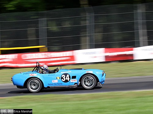
Here's a how to on this "panning" technique.
Or blur can be used for light painting:

Here's a how to on this "light painting" techinique.
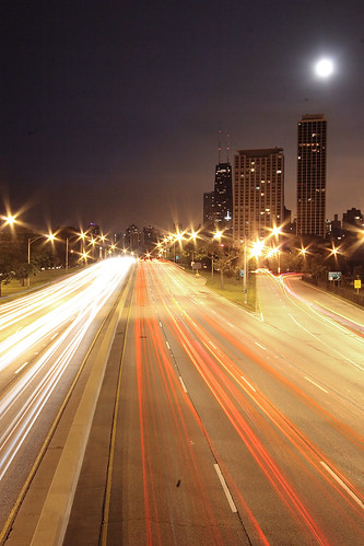
Blur can look quite cool when there's traffic!
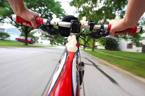
Or can convey motion:
Why you get blur:
Photos are made of light, it's as simple as that. You've seen photos that were too dark -they just didn't have enough light. And photos that were too bright -they had too much light. So, you can imagine that in bright sunlight it's easy to get enough light to make a photograph, but in dim light it's harder to get the same amount of light. The camera has a few different ways to increase the amount of light in your photo, but they are all limited, and eventually all it can do is keep the shutter open longer which effectively just means it takes longer to record your photo. If anything moves while the shutter is open (while the photo is being recorded) it results in blur.
I want to mention too that dim light is sometimes tricky to recognize because our eyes adjust so well to poor lighting conditions, but most indoor light is considered quite dim for photography and even an overcast day can result in blurry photos especially when shooting subjects that move fast like sports or cars or if you are using a telephoto lens or zooming in a lot.
How to avoid blur in dim light:
For Auto Mode:
Tripod: Like I said above, blur is a result of low light and movement. The movement can come from your subject (the people or items in your photo) or from the camera itself. If items that were not moving are blurred in your photo (tables, goal posts, etc) then at least some of your blur was coming from movement of the camera. This is easily corrected with a tripod. If you don't have a tripod you can set the camera on something steady or use one of these steady shooting techniques.
Use flash: Usually cameras will automatically use flash to try to increase the amount of light in the photo. This works well when your subject is within about 15 feet of the camera. So, make sure your flash is turned on. If your camera has a mount for an external flash you can look into getting a flash that has a higher light output to get a larger range or the flexibility to bounce the light off the ceiling or use accessories like diffusers to make the light less harsh than what comes out of the flash that comes with your camera.
ISO: Read your manual or look for a button or menu item that's labelled "ISO". It's possible that you may not be able to change it in "Auto" mode, so if you can't find it in the menu, try changing to "P" or "Program" mode instead (it's an Auto mode with a little more control).
ISO is a setting that controls how sensitive the camera's sensor is to light. When using lower ISO's like ISO 100 and 200 the sensor is less sensitive to light, but more accurate. With higher ISO's like 400, 800, or even 1600 and higher the sensor is more sensitive to light, but less accurate. If you are familiar with film at all, ISO is a lot like film speed.
So, the result of making the sensor more sensitive by setting the ISO higher is that your shutter speed (the amount of time your shutter is open) will be faster. When the shutter opens and closes faster, the chance of blur is less. ...so that's good! But, that "lack of accuracy" I spoke of earlier results in "noise" or a grainy or spotty appearance in your photo, so it's best to choose the lowest ISO possible for your shooting conditions.
Here's a general guide for choosing an ISO:
-ISO 100: bright sunlight (you can see well defined shadows on the ground)
-ISO 200: bright sun, but overcast (strong shadows can be seen, but their edges are fuzzy)
-ISO 400: overcast or bright shade (shadows are difficult to see or absent)
-ISO 800: dark shade or bright indoor light
I recommend grabbing your camera, finding your ISO setting, and taking some test shots at different ISO's to see the noise that results from higher ISO's and to see where that grainy appearance gets too bad for the photos to be considered usable. Every camera's different as far as noise goes, but noise is usually visible at ISO 400-800 and usually quite obvious at 1600 and above.
Try zooming out: Sometimes your camera can use a third setting called "aperture" to get a faster shutter speed. Sometimes the apertures your camera can achieve are limited when you are zoomed in on something. If possible you can try zooming out and getting closer to your subject instead to try to lessen the amount of blur that you are getting.
For Manual Mode:
Tripod: See the above advice on using a tripod or try some of these steady shooting techniques.Flash: See the above advice on flash.
ISO: See the above advice on ISO.
Aperture: When blur is an issue I tend to set my camera to aperture priority mode and set it to the lowest-numbered aperture that I can. Lower-numbered apertures (like f/4) allow more light into your camera than higher-numbered apertures (like f/20). Setting your aperture as low as it will go will ensure that you'll be using the fastest shutter speed you possibly can.
The lowest-numbered aperture available is determined by the lens you are using. So, if you need to get higher shutter speeds you may want to look into buying a "faster" lens. Typical lenses go down to about f/4, but "fast" lenses will go down to f/2.8, f/1.8, f/1.4, or even as low as f/1.0! Of course, the "faster" the lens, the more expensive! Canon and Nikon both make 50mm f/1.8 (non-zoom or "prime") lenses for between $100-$150. Because aperture also controls depth of field, these lenses will also give you a really shallow area of focus, so they are also great for portraits and other photography
Using blur creatively:
If you can't beat it, sometimes a little bit of blur can be a good thing...
It can show movement:
Or blur can be used for light painting:
Here's a how to on this "light painting" techinique.
Blur can look quite cool when there's traffic!
Or can convey motion:
Tuesday, January 25, 2011
Creating a twin
This is a fairly easy project to accomplish. You need a camera with manual mode, a tripod (or somewhere steady to place the camera on), and image editing software like Gimp (which is free).
If you aren't familiar with Manual mode, that's ok. You may need your camera's manual, however, if you don't know how to find out and change your ISO, aperture, and shutter speed.
- First, find your location and set up your camera.
- Put your camera on Aperture Priority mode. For Nikons this is usually marked on your mode dial as "A", for Canons it is "Av". (We'll switch to Manual mode later.)
- Decide on your primary ISO. For indoor photography with average lighting you'll need ISO 800, for brightly lit rooms 400 might be okay. We'll talk about adjusting this again a little later.
- Decide on your aperture. Aperture controls depth of field or how much of your photo will be in focus in the areas in front of and behind your focus. f/8.0 is a safe choice.
- Take a look at the shutter speed that results from your ISO and aperture choice by pressing the shutter button halfway while the camera is pointed at whatever you plan to photograph.
- If your shutter speed is 1/15 or slower you might have issues with motion blur in your photo. To get a faster shutter speed, increase your ISO (go from ISO 400 to 800, for example) and/or choose a lower-numbered aperture (go from f/8 to f/4, for example).
- If you have a shutter speed of 1/30 or higher you'll probably be okay. The closer you are to 1/30, the more careful you'll have to be to keep still while the photo is taken.
- Write down your ISO, shutter speed, and aperture.
- Change to Manual mode and dial in the ISO, shutter speed, and aperture that you wrote down.
- Change to the white balance that makes sense for the environment you are shooting in. If it's indoor (old-style) light bulbs or "warm" CFLs, use "incandescent" or "tungsten". For "cool" or "daylight-balanced" bulbs use "daylight", etc.
- If you have a remote it'll make it easier to get into position and take the photo, but if you do not, then you can use your camera's self timer instead. Experiment and see what works for you.
- Make sure your image is framed how you want it.
- Dial in the focus on where you will be.
- It may help to pre-envision your shot and make mental or actual marks for positions where your first and second photo might interact or in places you want to avoid overlap. These are easy to lose track of and hard to correct later in post.
- Either get yourself in position and take the photo with your remote, or press the shutter button and get into position before the self-timer takes the photo.
- When you think you have a photo that you want to use, go change outfits if you'd like to, and then get into position for the second photo and take that one the same way you did the first one.
- When you have the photos you want to combine, open one of them in Gimp or whatever photo editing software you use.
- Open the second photo as a layer "over" the first. (In Gimp, go to "File" > "Open as Layers").
- Use the Free Select Tool to roughly cut out your image from the image in the top layer (in Gimp you may need to go to "Windows">"Dockable Dialogs">"Layers" to see what layer you are working on).
- Invert your selection to change the selection from your image to everything else but you in the image on the top layer. (In Gimp, click on the "Select" menu and click "Invert".)
- Press the "Delete" key on your keyboard to delete everything but you in the image on the top layer.
- It should magically appear as if there were two of you in the photo at this point. If it looks good, flatten the image (in Gimp, go to the "Image">"Flatten").
- Make any other adjustments you'd like to the image and save as usual. Note that if you don't flatten the image before saving you may get an error or it may just not work. Images with multiple layers cannot usually be saved as a .jpg file.
Tuesday, January 11, 2011
Growth comes from overcoming frustration
With the funds I received from a rare and generous donation I was able to buy a Pullip doll that I intend on using for photography. That might sound really stupid, but as you can see from the examples of Pullip photos here, they really can make great subjects.
So, the doll arrived the other day and I immediately started to think about how to photograph her. My first thought was to make it animal-oriented. I bought her because she looks a little like me, and so I thought about posing her with all of my Vet Tech books (for school) in the background.
I arranged the books and the doll and this was my best shot out of the first shoot:

That wasn't nearly as effective as I thought it would be. So, I re-assessed the situation and decided to focus more on the doll. Here's my best shot from the 2nd round:

That's better, but still not a very good photo. I started getting frustrated. Why did I spend all that money on this stupid doll? Why can't I do this? Maybe I should stick with the still life genre or macros -things I'm good at.
I took a deep breath and thought about the advice I'd give to someone else in my situation -take a look at other people's photos of the same subject. That's when I found this photo. THAT's what I wanted to produce!
What's the difference? No background. They got in much closer. I decided to forgo the background and start working on the kitchen table. I propped my doll's head up and positioned her, then took some photos shooting down at the doll at various angles. And that's how I came up with this:

Much better. Postable. I'm glad I stuck with it. The trick of searching Flickr for inspiring photos has helped me out of similar situations in the past and it's one of my favorite pieces of advice for frustrated photographers. The other lesson to be learned (or re-learned) here is that even though our instincts often lead us to want to include more in a photograph, it's often more effective to get closer instead. Zooming in can eliminate distractions and create more intimacy with your subject. I think that's where I was going wrong with the first couple of shots.
So, the doll arrived the other day and I immediately started to think about how to photograph her. My first thought was to make it animal-oriented. I bought her because she looks a little like me, and so I thought about posing her with all of my Vet Tech books (for school) in the background.
I arranged the books and the doll and this was my best shot out of the first shoot:
That wasn't nearly as effective as I thought it would be. So, I re-assessed the situation and decided to focus more on the doll. Here's my best shot from the 2nd round:
That's better, but still not a very good photo. I started getting frustrated. Why did I spend all that money on this stupid doll? Why can't I do this? Maybe I should stick with the still life genre or macros -things I'm good at.
I took a deep breath and thought about the advice I'd give to someone else in my situation -take a look at other people's photos of the same subject. That's when I found this photo. THAT's what I wanted to produce!
What's the difference? No background. They got in much closer. I decided to forgo the background and start working on the kitchen table. I propped my doll's head up and positioned her, then took some photos shooting down at the doll at various angles. And that's how I came up with this:
Much better. Postable. I'm glad I stuck with it. The trick of searching Flickr for inspiring photos has helped me out of similar situations in the past and it's one of my favorite pieces of advice for frustrated photographers. The other lesson to be learned (or re-learned) here is that even though our instincts often lead us to want to include more in a photograph, it's often more effective to get closer instead. Zooming in can eliminate distractions and create more intimacy with your subject. I think that's where I was going wrong with the first couple of shots.
Tuesday, January 4, 2011
Critique guide for beginners
Getting critique on your work is the only way to find out how others perceive your work. But, beginners are often hesitant to join in with critiquing because they don't think they have the skills to judge a photo yet. I strongly disagree. Many of us aim to one day be good enough to have their photo in a newspaper or hanging on someone's wall. But the people who will be buying your art for their wall or looking at your photo in the newspaper will not be photographers -they'll be normal, everyday people. So, when giving critique don't worry if you could do better or not, it makes no difference -it's your opinion matters. And don't be concerned about being "right" or "wrong" -your opinion is just one opinion and the photographer should only take it as such. Just remember -there is no right or wrong when it comes to your own personal opinion!
So, with this in mind, here's a little cheat-sheet to give you some inspiration on what to look at when giving critique.
Here are the some basic areas to focus on:
1. As a whole, do you like the image? Does it look like someone spent time on it? Is it eye-catching? Could you see it on a wall, in an advertisement, or newspaper?
2. Exposure Overall is the photo too dark or too bright? Does it look dull and grayish?
3. Lighting: Is the lighting even? Are the shadows too dark or the highlights too bright? Are there distracting shadows?
4. Sharpness: Is the subject of the photo in focus? How much of the photo is in focus? Would the photo benefit from the background being more or less in focus?
5. Framing: Are there parts of the photo that were included, but don't add to the photo? Or is something missing or cut off that would have added to the photo?
6. Contrast: Does the subject stand out from the background, or does it get somewhat lost in it?
7. Noise: Does the image have a grainy appearance? Does it add to the image or negatively impact it?
Other areas of critique:
8. Rule of Thirds: Is the subject and/or horizon centered? Would the rule of thirds help make the photo more interesting?
9. Balance: Does your eye tend to ignore parts of the photo due to subject placement, bright spots, or certain colors?
10. Perspective: Is the angle that the photo was taken at effective? Would another angle be more interesting or appropriate?
11. Effects: Is the use of vignette (making the outside of the photo dark), adding of frames, selective colorization, etc effective or distracting? Does it add to the photo?
12. B&W vs Color: Was the use of color or black and white appropriate? Might it look better the other way?
Subscribe to:
Posts (Atom)