This show is on at 10:30 CST on WTTW where I live (near Chicago). Art Wolfe is a professional wildlife and nature photographer and this show follows him on his outtings. He doesn't go into technical details about settings or anything, but rather allows you to explore the chosen location with him. For non-photographers, there's plenty to interest them in the landscapes or wildlife that is being talked about (usually by him through a local guide). But, for photographers, you get to see his process of looking for photos and he speaks about why he's chosen a certain location or lens once in awhile. He also talks about the quality of light, texture, color, etc. -Like I said, it's more of a nature program with photography thrown in rather than the other way around, but I get a lot of inspiration and the occasional idea from this program, so I wanted to share it with you.
Here's a link to the show's website.
Saturday, July 28, 2007
Thursday, July 26, 2007
Studio photography on the cheap

(Click on the photo to see a better version of it. Blogger is re-sizing it poorly, so it looks a little funky here...)
For "proper" studio photography, most people purchase light tents and photography lighting in order to get that soft light that eliminates harsh reflections as well as harsh shadows. But, I want to demonstrate how I get studio shots without any special equipment.
For those who are not interested in studio photography, note that the goals in studio work are the same as for portraits. It's just that for portraits, the subject's a bit bigger...
So, here's a walkthrough of how I took the above studio shot McGyver-style.
Equipment and supplies that I used:
* Camera
* Tripod
* Shutter release cable (a self-timer works if you don't have one)
* 2 pieces of copy paper
* A white plastic garbage bag
* A 5-foot piece of wire, bent
* A paper towel
* A drinking glass and empty boxes for propping stuff up.
* A bright lamp (a halogen desk lamp is perfect)
* At least one other lamp (another desk lamp, a clamp light, or a floor lamp -whatever you have around)
I set up under a halogen spot-light that's in the ceiling above my kitchen counter. (I've also set up in the bathroom successfully -under the lights above my sink.)
I propped the copy paper up against the drinking glass so it was sitting at a 90* angle. This created the white below the bottle and pills in the picture as well as the white in the background without creating a "seam" between the two. (This works well with white poster board as well when you're shooting larger items.)
I then set the bottle on the paper, and arranged the pills around it in a non-centered way so the overall shape of the subject was more interesting -it also gave the pills a more hap-hazard look I think.
Next I needed something to filter the light through to spread it around. This is what the walls of a light tent do, so I looked around for something that'd work similar to that. What I ended up doing is taking a white plastic trash bag and some wire to make a frame to keep it flat. You could just as easily tape the corners of the bag to 4 boxes or something to keep it flat. It doesn't have to be perfect, and you don't need to cut the bag either -double-thickness (at least for the brand I'm using -regular Hefty bags) seems to work just fine. (Of course, if your light is significantly brighter or more dim, this may not be the case.
I propped my trash bag light filter up so it's middle would be over the bottle and under my halogen desk lamp. -I then turned the lamp on and checked how the lighting looked from the perspective I'd be shooting it from.
I ended up with a lot of glare on the label because it's glossy and I also had 2 bright spots on the bottle. This meant that the light was too bright. I placed a paper towel on top of the trash bag and moved it around until the highlights and hot-spots were gone.
The next thing I noticed was that, while my "trash bag light filter" made the shadows fuzzier, the shadows were still more noticeable than I liked. I grabbed a fairly dim floor lamp and propped it at a 45* angle against a chair, and aimed it directly at the bottle (from the front so that it eliminated the shadows in the front where they'd be visible in the photo).
I checked the view through my camera once again and found that this created more hot-spots, so I lowered the floor lamp until it's harshest light was below my subject, leaving it's softer (more diffused light) to fall on my subject and eliminate much of the shadows that I had a problem with earlier.
At this point, the setup was done. I was happy with how the scene looked, and the next thing to think about was exposure. -I had a fairly dark subject on a very light background which is always tricky. I knew the camera's light meter would see all that white and would try to tone it down, which would my my photo darker than it should be. -On top of that, my goal was to over-expose the background so it ended up looking all white! (but not so much that it over-exposed the white label on the bottle.) I decided I'd start with exposing the scene 1 stop above normal or at +1.
Next, I had to decide what setting to use on the camera. For studio shots I tend to go with Aperture Priority so that I can control the depth of field without worrying about the shutter speed because it really doesn't matter much in still-life photos like this one. Generally, an aperture of f/8 to f/16 is the sharpest part of any lens, so I try to keep within that range if I can. -I wanted a fairly shallow depth of field, though, so I decided to try f/8 to start with.
Last, I turned on mirror lockup. -Not all cameras have this option, but if yours does (on my Canon 30D it's Custom Function 12, for other makes and models, check your manual). Mirror lockup can help you get sharper photos when you're using slow shutter speeds and here's how it works: When you take a photo what happens is the mirror that allows you to see the image through the viewfinder flips out of the way so that the image can get through to your film or sensor. When the mirror flips up it causes the camera to vibrate ever so slightly. Mirror lockup creates a delay between when you click the shutter the first time (and the mirror flips up), then you wait and click the shutter a 2nd time to take the picture (after those micro-vibrations have probably stopped). You can get sharp photos either way, so if your camera doesn't have mirror lockup, don't worry about it; but if you do, I think it's worth playing with.
At this point I was ready to take my first shot. From start to finish I arranged the photo 2 different ways and I took about 25 shots total. -I had to play with the exposure compensation and aperture just a little bit each time before I got it to come out how I wanted.
After I was pretty sure I got a "keeper", I connected the camera to my computer, downloaded the photos, and opened it in Gimp. I used the "Levels" tool (Auto) to fix the white balance (I compensated for the warmth of the incandescent lights in the camera, but not quite enough.). After that, I used curves to just slightly adjust the darkest and lightest portions of the photo. Then, I cloned out the dust that was on the bottle. (I'm a dork -I missed the most important part of studio photography -preparing your subject to be photographed!) When I was done cloning, I applied a slight Unsharp Mask, cropped the photo to a square, and saved it.
I am pretty happy with the above photo as it stands right now except that I think as a result of editing it on my LCD laptop screen, it appears that it looks a little washed out on my CRT (work) monitor. If this were a commissioned work, I'd go back and fix that, but...
Monday, July 23, 2007
ISO -What it is and when to change it.
If you owned a film camera, you may remember going into the camera shop and having a bunch of different film speeds to choose from. Most of the time people stuck with 400, or turned the package over to find out which one was right for the conditions they'd be shooting in. There was 100 speed film for "sunny days", 200 for outdoors/cloudy, 400 indoor with flash, and 800 was for "low light". Digital cameras retained the idea of film speed in a setting called "ISO".
Either way, "film speed" or "ISO" is a measurement of how fast the film (or your digital camera's sensor) will record the light that makes up your photo. The faster it records, the higher the number, and the better it'll perform in low-light situations. -Have you ever tried taking photos inside and they came out blurry? If you would have used a faster speed film or a higher ISO, you'd get less of that blur because the camera would have been able to record the image faster.
Of course, you don't get something for nothing. There's a tradeoff for choosing a higher ISO, and that's image quality. With film, you get graininess. With digital, you get noise (those grainy, multi-colored specks that you sometimes see in digital photos). There are programs out there, like Noise Ninja or Neat Image that can help reduce the noise in your photos, but generally it's best to keep the ISO as low as you can for the conditions you are in.
(Below is an example of a noisy image:)
So, if you see that your low-light photos are coming out blurry on your camera, try raising the ISO number to the lowest number that gets you clear, unblurred photos. (Then remember to put it back to 100 when you're done so you don't end up taking photos in daylight at ISO 800 and get unnecessarily noisy photos as a result).
This is one of the 3 things you can adjust when using your camera in Manual Mode. So, if you are wanting to learn Manual Mode, this is an important concept to understand. -With ISO, a bigger number means more light can be recorded in a given amount of time.
**NOTE** Film speed and ISO are not exactly the same, but they are close enough that for our purposes and, especially in this intro, you can treat them as if they are 1 to 1.
If you don't understand something or have trouble with any of my tips, feel free to contact me via a comment on this (or any) article, or see my website for my email address and I'll be happy to help you out!
Friday, July 20, 2007
An introduction to histograms...
Does your camera have an option to show a photo's histogram? (If you aren't sure, check your manual.) If so, and you don't know what it is, read on! You're missing out on a very powerful tool!
It's nearly impossible to tell if a photo you've just taken is too light or too dark (or "exposed properly") on your camera's LCD screen. In bright sunlight you have to shade the screen with your hand, then squint and zoom and in the end you really have no idea until you view it full size on a screen. Even under the best lighting conditions it's difficult to evaluate exposure on the LCD screen because the brightness on the screen itself can be adjusted -so is it right? or just right on your tiny LCD screen? This is where your histogram comes in handy!
Before we get to what the histogram is, let me break down the term "tone" for you (sometimes people get confused by what a color's "tone" really is). By tone, I mean how dark or light a color is. Any color. In other words, if you converted the photo to black and white, it's all the shades of gray between black and white.
So, your histogram will show all the tones in your photo in a graph that goes from black (usually on the left) to white (on the right). You can think about it like this: it converts your photo to black and white, then takes all the pixels and lines them up on the graph -all the black ones are on the far right, then 99% black, 98% black, etc all the way down the line to pure white on the right. ...it's an interesting but abstract thing to do, right?
So, here's why it's useful... If your graph shows a lot of data on the far left (black) side of the graph, you have no detail there. That means, no matter how much you lighten it in post-processing you'll never be able to get anything out of those areas -they are pure black.
Of course, a lot of black isn't bad for all photos. -If we're talking about a photo of a person with a pure black background a lot of pure black would be expected. But, if it's a photo of a bird up in a tree, it's probably under-exposed.
Likewise, if the histogram shows a lot of data on the far right side (towards white), then you have very little detail in the highlights of the photo. But, again, if you took a photo with a pure white background that would be expected. If you wanted detail in the white areas of the photo, however, you'd want to re-take the photo so the data doesn't run off the right side of the graph. (It should peak, then go back down before the graph ends on the right-side.)
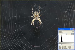
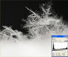
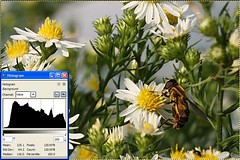
It's difficult to understand the idea of using these graphs unless you see them, so here are a few examples of some photos and their histograms. The first 3 are kindof extreme examples, the 4th is a more normal photo. Note that on that one the data runs off the right-side of the graph (I overexposed it a bit!).
(Click on the photo for a larger version and an explanation of what the histogram shows.)

If you don't understand something or have trouble with any of my tips, feel free to contact me via a comment on this (or any) article, or see my website for my email address and I'll be happy to help you out!
It's nearly impossible to tell if a photo you've just taken is too light or too dark (or "exposed properly") on your camera's LCD screen. In bright sunlight you have to shade the screen with your hand, then squint and zoom and in the end you really have no idea until you view it full size on a screen. Even under the best lighting conditions it's difficult to evaluate exposure on the LCD screen because the brightness on the screen itself can be adjusted -so is it right? or just right on your tiny LCD screen? This is where your histogram comes in handy!
Before we get to what the histogram is, let me break down the term "tone" for you (sometimes people get confused by what a color's "tone" really is). By tone, I mean how dark or light a color is. Any color. In other words, if you converted the photo to black and white, it's all the shades of gray between black and white.
So, your histogram will show all the tones in your photo in a graph that goes from black (usually on the left) to white (on the right). You can think about it like this: it converts your photo to black and white, then takes all the pixels and lines them up on the graph -all the black ones are on the far right, then 99% black, 98% black, etc all the way down the line to pure white on the right. ...it's an interesting but abstract thing to do, right?
So, here's why it's useful... If your graph shows a lot of data on the far left (black) side of the graph, you have no detail there. That means, no matter how much you lighten it in post-processing you'll never be able to get anything out of those areas -they are pure black.
Of course, a lot of black isn't bad for all photos. -If we're talking about a photo of a person with a pure black background a lot of pure black would be expected. But, if it's a photo of a bird up in a tree, it's probably under-exposed.
Likewise, if the histogram shows a lot of data on the far right side (towards white), then you have very little detail in the highlights of the photo. But, again, if you took a photo with a pure white background that would be expected. If you wanted detail in the white areas of the photo, however, you'd want to re-take the photo so the data doesn't run off the right side of the graph. (It should peak, then go back down before the graph ends on the right-side.)
It's difficult to understand the idea of using these graphs unless you see them, so here are a few examples of some photos and their histograms. The first 3 are kindof extreme examples, the 4th is a more normal photo. Note that on that one the data runs off the right-side of the graph (I overexposed it a bit!).
(Click on the photo for a larger version and an explanation of what the histogram shows.)
If you don't understand something or have trouble with any of my tips, feel free to contact me via a comment on this (or any) article, or see my website for my email address and I'll be happy to help you out!
Wednesday, July 18, 2007
Giving directional subjects "room to move"
There's a general rule that when you have a subject that could be said to be facing left or right, you should leave some space in front of it so it has "someplace to go". This goes for any person, animal, car, flower, etc that you shoot in "profile" (or from the side).
The effects of this should be fairly obvious in the photos below:

The photo above makes most viewers a bit uncomfortable although they may not be conscious of why. Most of the time this is not a good way to crop or frame a subject that you've shot in profile. It's much more desirable to leave some empty space in the direction that the subject is facing so they don't seem "trapped" in the frame. The photo below seems more "comfortable" to most viewers.

Like most "rules" in photography, this one can be broken effectively from time-to-time. When framing a photo in a way that breaks this rule, just make sure you know why you are doing it. Sometimes backing up or zooming out a bit so you can get space on both sides of the subject (especially if it's moving) is a good idea so you can play with the crop later in software.
If you don't understand something or have trouble with any of my tips, feel free to contact me via a comment on this (or any) article, or see my website for my email address and I'll be happy to help you out!
The effects of this should be fairly obvious in the photos below:
The photo above makes most viewers a bit uncomfortable although they may not be conscious of why. Most of the time this is not a good way to crop or frame a subject that you've shot in profile. It's much more desirable to leave some empty space in the direction that the subject is facing so they don't seem "trapped" in the frame. The photo below seems more "comfortable" to most viewers.
Like most "rules" in photography, this one can be broken effectively from time-to-time. When framing a photo in a way that breaks this rule, just make sure you know why you are doing it. Sometimes backing up or zooming out a bit so you can get space on both sides of the subject (especially if it's moving) is a good idea so you can play with the crop later in software.
If you don't understand something or have trouble with any of my tips, feel free to contact me via a comment on this (or any) article, or see my website for my email address and I'll be happy to help you out!
Monday, July 16, 2007
Making backgrounds blurry
Intro:
Sometimes, when we want to take pictures of something, the background is rather ugly or maybe it's too complex and overwhelms the viewer. In these cases, if we can get the background blurred, the subject stands out better and the photo looks more professional. Some examples: Taking a picture of a person in front of a city street or taking a closeup of a flower without having mud or weeds showing in the background. A blurred background will lead to a much nicer photo in both of these cases as well as many others.
For Beginners:
If you are using auto modes, try the two below. They'll both lead to blurred backgrounds in most cases.
Aperture is the setting that controls "depth of field" or how much of the photo is in-focus. Low numbers (up to about "8.0") will create more background blur than higher numbers (around "16" and above). Try putting your camera in "Aperture Priority Mode" (usually marked with an "A" or "Av"), select an aperture, and the camera will automatically choose the shutter speed to match it so your photos will come out properly exposed. (This mode may take some experimenting with to get used to, but it's really quite easy and it's a great way to get familiar with aperture before moving into learning full Manual Mode!)
Some things to watch out for:
For Advanced Photographers:
Once you spend a little time using different apertures in different conditions, you'll notice that using an aperture of "8.0" might result in a lot of blur in a flower photo, but almost no blur in a photo of a mountain range. This is because aperture isn't the only thing that determines depth of field. The other conditions that effect how much blur you'll get are:
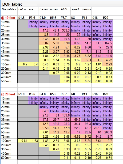
For more information, see my depth of field tables below:
(* Again, by "subject", I mean "what you are focusing on".)
You can print those tables and keep them with you to get an idea for how much blur you'll get with a given lens, and a subject a given distance away, or you can just experiment. An interesting thing to note is that the change in distance and focal length go hand-in-hand. In other words, if you want a photo framed a certain way, you can't use a longer lens to get more background blur -you'll have to back away too far and those two changed conditions will cancel each other out so that you'll get about the same amount of background blur either way. The only way to get more blur in these situations is to use a smaller aperture.
Conclusion:
This is one of the secrets of pro photographers -be aware of your background. If it's ugly or busy and you can't change it, do what you can to take the viewer's attention away from it by blurring it (or in more technical language, using a shallow depth of field). ...and (hopefully) now you know how to do it too!
If you don't understand something or have trouble with any of my tips, feel free to contact me via a comment on this (or any) article, or see my website for my email address and I'll be happy to help you out!
Sometimes, when we want to take pictures of something, the background is rather ugly or maybe it's too complex and overwhelms the viewer. In these cases, if we can get the background blurred, the subject stands out better and the photo looks more professional. Some examples: Taking a picture of a person in front of a city street or taking a closeup of a flower without having mud or weeds showing in the background. A blurred background will lead to a much nicer photo in both of these cases as well as many others.
For Beginners:
If you are using auto modes, try the two below. They'll both lead to blurred backgrounds in most cases.
- Portrait Mode: For people pictures, monuments, and other work where your subject will be fairly large ("person-sized" plus or minus a few feet), "Portrait Mode" works well. The icon for this mode usually looks like a woman's head.
- Macro Mode: For smaller subjects, like flowers, where you'll be pretty close to the subject when you take the picture (within a foot or so), use Macro Mode. The icon usually looks like a flower.
Aperture is the setting that controls "depth of field" or how much of the photo is in-focus. Low numbers (up to about "8.0") will create more background blur than higher numbers (around "16" and above). Try putting your camera in "Aperture Priority Mode" (usually marked with an "A" or "Av"), select an aperture, and the camera will automatically choose the shutter speed to match it so your photos will come out properly exposed. (This mode may take some experimenting with to get used to, but it's really quite easy and it's a great way to get familiar with aperture before moving into learning full Manual Mode!)
Some things to watch out for:
- Overly dark photos: This will happen if there's not enough light and you're trying to use too big of a number for the aperture. You can lower the aperture number or increase your ISO number (for example, if you were using ISO 200, turn it up to 400 or 800), or move to an area where there's more light (if possible).
- Overly bright photos: This will happen if there's too much light and you're trying to use too small of a number for the aperture. You can increase the aperture number, or decrease your ISO number (for example, if you were using ISO 400, try turning it all the way down to 100), or move to a less bright area (if possible).
- Weird or blurry photos: This happens when you choose a high numbered aperture in conditions that are too dark. The camera had to use a slow shutter speed, so if you move the camera at all you get a blurry mess. Either put your camera on a tripod or use one of the tips for an overly dark photo: choose a smaller aperture number, increase the ISO number, or you'll need to find a way to get more light on your subject.
For Advanced Photographers:
Once you spend a little time using different apertures in different conditions, you'll notice that using an aperture of "8.0" might result in a lot of blur in a flower photo, but almost no blur in a photo of a mountain range. This is because aperture isn't the only thing that determines depth of field. The other conditions that effect how much blur you'll get are:
- Distance to subject: The closer that you are to your subject (the thing you are focusing on), the more blurred your background will be.
- Your lens: The longer your lens is, the more blur you'll get. (A "long lens" means one with more "zoom" -more technically, a long focal length, as in a 300mm lens rather than a 28mm lens)
For more information, see my depth of field tables below:
(* Again, by "subject", I mean "what you are focusing on".)
You can print those tables and keep them with you to get an idea for how much blur you'll get with a given lens, and a subject a given distance away, or you can just experiment. An interesting thing to note is that the change in distance and focal length go hand-in-hand. In other words, if you want a photo framed a certain way, you can't use a longer lens to get more background blur -you'll have to back away too far and those two changed conditions will cancel each other out so that you'll get about the same amount of background blur either way. The only way to get more blur in these situations is to use a smaller aperture.
Conclusion:
This is one of the secrets of pro photographers -be aware of your background. If it's ugly or busy and you can't change it, do what you can to take the viewer's attention away from it by blurring it (or in more technical language, using a shallow depth of field). ...and (hopefully) now you know how to do it too!
If you don't understand something or have trouble with any of my tips, feel free to contact me via a comment on this (or any) article, or see my website for my email address and I'll be happy to help you out!
Thursday, July 12, 2007
Removing the gray cast or "flatness" in your photos
**UPDATE**
This article uses an old version of Gimp so the instructions are no longer valid due to some menus changes. An updated article was written here for the new version of Gimp (2.6.x): Using Auto-Level to fix dull gray-ish photos.
Last post I showed you a photo that was awesome except it had a slightly gray or "flat" look to it and hopefully you saw how dramatically you can improve a photo by removing it. I also told you that the real reason for that gray look is the lack of a "true" or 100% black and/or white area in the photo. So, now we'll talk about how to go about fixing this issue with photos you may have that suffer from the same problem...
Did you download Gimp? If so, awesome, you can follow along with me here. If not, I'm guessing you have Photoshop or some other software that you use and you've decided to stick with what you have. That's cool, your program will probably have the same tools, you'll just have to find where they are in your menus on your own. ...ready?
Step 1. Find a photo with a gray cast that you'd like to remove, then open it in Gimp.
(if you can't find one, download this one to use as practice by right-clicking on the photo and choosing "Save Picture As")
Once you have the photo you want to use, right-click on it and choose "Open With" > "The Gimp".
**NOTE:** If "Gimp" isn't on the list of programs, click on "Choose Program" and find "Gimp". Or you can also just find "Gimp" in your Start Menu under "Programs" and open it from there, then go to "File" > "Open" and browse to the photo you want to open.
You'll notice that Gimp doesn't quite work like Word or other programs you are used to. It has 2 different parts that open in separate windows -one is a toolbox that has a bunch of icons in it, and the other window has your photo in it. Don't worry about the window with all the icons in it, we won't be using it this time around.
Step 2. Using "Auto Levels" to remove the gray cast.
In the window that has the photo in it, click on the "Layer" menu. When it opens, click on "Colors" > "Levels". The "Levels" window will then be displayed. -We'll go into Levels more in-depth later, but for now, just click on the button that says "Auto".
If you're using the photo I linked to in Step 1, you'll notice that doing just that improved the image greatly. If you are using your own photo, there's a good chance it fixed it, but sometimes "Auto Levels" can make it worse. No biggie. If you like it, click "OK", if not, click "Cancel".
That's it! You're done!
Assuming you like the result, just go to the "File" menu and choose "Save As" in order to save the changes you've made to the photo. If you didn't like what "Auto Levels" did to this particular photo, stay tuned, we'll talk about other ways to fix such problems soon.
For simple, minor gray-cast or "flatness" issues, the "Auto" button in "Levels" works great! It's definitely something you should try whenever you have an image that seems to suffer from this problem.
If you don't understand something or have trouble with any of my tips, feel free to contact me via a comment on this (or any) article, or see my website for my email address and I'll be happy to help you out!
Wednesday, July 11, 2007
Photo Critique #1: An unsuspecting contributor, my Mom!
My Mom has never really been into photography. It's always been my Dad's hobby and my interest. To my Mom, it's never really been more than a way to document a period in time. Until recently...
Out of the blue, she asked me for advice in buying a camera. She ended up with a Canon Powershot A530. Shortly after purchasing it, she wondered out loud why she had spent the money. She's pretty much tied to the house taking care of my disabled father, so she doesn't have any trips coming up where she'd want to take pictures... So, the camera sat there for a few months. Then, she sends me this: (click on the photo to view a larger version , EXIF data, etc).
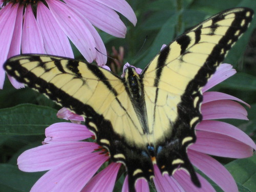
My Mom has a beautiful garden in her backyard. She told me that she was out in the garden when she spotted this butterfly, and ran inside, got her camera and took this picture. It's beautiful!
Because I know the submitter, I can tell you that this photo is uncropped and hasn't been touched up in software because, well, she just got the hang of transferring photos from her camera to her computer, and then uploading them to Flickr. -All that's still a challenge for her, so we're going to wait awhile before teaching her about photo editing. But people with her experience level is exactly who I'm targeting with this blog, so I figured this would be perfect.
The photo itself, as is, is absolutely fabulous. I'd consider hanging it on my wall if I were her. The framing is excellent -the butterfly fills the frame from one side to the other, and the background is simple, but colorful -it doesn't overwhelm the subject (the butterfly), but rather compliments it. -I think my mom has an advantage since she's an excellent painter. She probably knows that purple and yellow are opposite colors on the artist's painting wheel, and setting one upon the other in this way adds a lot of interest to the photo.
I have 2 minor things that in a perfect world might be different in this photo. #1 is that I wish the butterfly's left wing "tail" hadn't been cut off. -It's not too big of a deal because the other one doesn't stand out much anyway being black on purple, but still... I said "perfect world", so I had to mention it. The other thing I'd do is get rid of the slight gray cast in the photo.
This happens a lot. Photos come out just slightly "gray" looking. Many times if you were shooting film, the developer would automatically adjust to get rid of the gray, but in the age of digital you have to do it yourself.
The real cause of this "greyness" -what some people refer to as the photo looking like it has a film on it that makes it look "muddy" or "flat". Areas in the image that should be black fall short of being 100% (or "true") black and/or "true white" in the photo. In this case, it's the fact that we don't quite have an area of true black in that butterfly that makes the photo seem a bit dull.
So, how do you fix it? Well, we can't all afford the $600 for Photoshop -me included. But, that's fine. There's a FREE program that does almost everything Photo$hop does, it's called "Gimp" and you can download it here: http://gimp.org
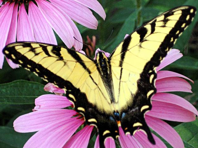
After some minor touch-ups, which I'll teach you tomorrow, the photo looks like this:
So, go download and install Gimp, and tomorrow I'll teach you how to use it to get rid of that "gray" cast that you get in some photos!
Out of the blue, she asked me for advice in buying a camera. She ended up with a Canon Powershot A530. Shortly after purchasing it, she wondered out loud why she had spent the money. She's pretty much tied to the house taking care of my disabled father, so she doesn't have any trips coming up where she'd want to take pictures... So, the camera sat there for a few months. Then, she sends me this: (click on the photo to view a larger version , EXIF data, etc).
My Mom has a beautiful garden in her backyard. She told me that she was out in the garden when she spotted this butterfly, and ran inside, got her camera and took this picture. It's beautiful!
Because I know the submitter, I can tell you that this photo is uncropped and hasn't been touched up in software because, well, she just got the hang of transferring photos from her camera to her computer, and then uploading them to Flickr. -All that's still a challenge for her, so we're going to wait awhile before teaching her about photo editing. But people with her experience level is exactly who I'm targeting with this blog, so I figured this would be perfect.
The photo itself, as is, is absolutely fabulous. I'd consider hanging it on my wall if I were her. The framing is excellent -the butterfly fills the frame from one side to the other, and the background is simple, but colorful -it doesn't overwhelm the subject (the butterfly), but rather compliments it. -I think my mom has an advantage since she's an excellent painter. She probably knows that purple and yellow are opposite colors on the artist's painting wheel, and setting one upon the other in this way adds a lot of interest to the photo.
I have 2 minor things that in a perfect world might be different in this photo. #1 is that I wish the butterfly's left wing "tail" hadn't been cut off. -It's not too big of a deal because the other one doesn't stand out much anyway being black on purple, but still... I said "perfect world", so I had to mention it. The other thing I'd do is get rid of the slight gray cast in the photo.
This happens a lot. Photos come out just slightly "gray" looking. Many times if you were shooting film, the developer would automatically adjust to get rid of the gray, but in the age of digital you have to do it yourself.
The real cause of this "greyness" -what some people refer to as the photo looking like it has a film on it that makes it look "muddy" or "flat". Areas in the image that should be black fall short of being 100% (or "true") black and/or "true white" in the photo. In this case, it's the fact that we don't quite have an area of true black in that butterfly that makes the photo seem a bit dull.
So, how do you fix it? Well, we can't all afford the $600 for Photoshop -me included. But, that's fine. There's a FREE program that does almost everything Photo$hop does, it's called "Gimp" and you can download it here: http://gimp.org
After some minor touch-ups, which I'll teach you tomorrow, the photo looks like this:
So, go download and install Gimp, and tomorrow I'll teach you how to use it to get rid of that "gray" cast that you get in some photos!
Monday, July 9, 2007
To take great photos, you must know what great photos look like!
If the only music you ever heard was "Yankee Doodle" played one note at a time, "Chopsticks" would seem like a revolution in music and the works of Mozart would be inconceivable! The same thing goes for photos.
I run a yahoogroup called Photography_Beginners. Having a place for beginners to get together to share their photos and ask beginner questions without being put down by more advanced photographers is an amazing thing. The downside, though, is that some members look no further than this one group and they have a distorted view of what a "good" photograph is. -Instead of reaching to bring their photos to the next level, they are happy to hear the accolades from their fellow beginning photographers. Their growth is therefore stunted, and I find this to be unfortunate.
It's important to look at really good photographs so you can better gauge your own work. Enjoy the art as a viewer, find works you like, then try to figure out how the photographer achieved their results. Copying other's work is usually fine -its how most of us learn! But, more than that, just seeing work that's better than your own will inspire you to keep working and hone your skills. -Find a group or forum to ask questions about techniques you can't figure out or just can't seem to master. There's always a few people who are willing to share their tricks.
A couple of good places to look for inspiration:
- Flickr Explore
- DPChallenge.com
- Got other sources? Leave them in the comments section!
Friday, July 6, 2007
Take a photo a day.

(click on the photo to view it on my Flickr page where larger sizes are available)
There's a growing number of people subscribing to the thought that having a goal of taking and posting a photo a day to your web gallery can help your photography improve by leaps and bounds. When I heard about this, I realized that I tend to be a person who drives past photo opportunities because I don't like stopping the car, or I don't pull out the camera because I only have a half hour until I have to do something. So, I thought I'd give it a try.
On "Day 2" of my quest for a photo-a-day, I got back from dinner late and only had an hour before I planned to be in bed, so I thought "Great, I failed "photo-a-day" on Day 2"! ...I started getting ready for my shower while thinking of something photo-worthy that I could either get quickly tonight or at least get as a photo for tomorrow. Several things crossed my mind, but nothing good until...
While washing my hair, I looked up at the cracking paint on the ceiling of our bathroom. The stupid guys who flipped our house used cheap paint in the bathroom and the steam from the shower has it coming off in sheets. Blah, I thought -I hate painting. Seeing it cracking and peeling cheeses me off. Showers used to be my little retreat, a place where I could relax, but that paint and the future work it symbolizes stresses me out every time I take a shower. But this time I smiled...
A few weeks ago I noticed this heart-shaped patch of bare ceiling where the paint was peeled completely off. What was frustrating before, though, had become really interesting now. -I had my photo op! -I quickly finished my shower so I could grab my camera.
I only took about 8 photos because I was running out of space on my memory card and didn't have time to go through and delete stuff. (I'm really militant about getting my 8 hours of sleep!) But, I framed it 4 different ways and exposed it a couple different ways for each to ensure I'd get a good shot. Then, satisfied with having at least attempted to get a photo that day, I went to bed.
When I got to work, I downloaded the photos and they were a little "blah". -I opened them in my photo editor of choice (Gimp) and couldn't get the balance right between getting the paint a warm white-ish tone, but leaving the ceiling (the inside of the heart) warm like the incandescent lighting made it look. I played and played with it, but in the end I had to make 2 layers in Gimp and use the erase tool where I wanted the warmer color to appear. -It took me about 4 hours in software playing with it before I got a result I was happy enough with to upload.
In the end, I love the photo and it made it to Flickr Explore!. -The lesson learned is that it doesn't take a lot of time to take a good photo or a magnificent place to find a good opportunity. Just keep your eyes open, and having a goal of a photo a day can be a helpful way of motivating yourself to take more photos, which through forced practice, can speed up your learning curve by a lot!
Thursday, July 5, 2007
The "Rule" of Thirds
Most beginning photographers frame their photos so that their subject is in the very center of the photo. It's the most natural way to do it, especially when you're using a camera with just one autofocus point in the center. But, what the rule of thirds says, is that framing your subject differently can help your composition, resulting in a more interesting photo.
Here's how it works:
When you are looking through your camera, imagine a tic-tac-toe board drawn evenly across the entire frame. Instead of putting your subject in that center box, put them at one of the points where the tic-tac-toe lines cross.
Here are a few examples:
(Click on the photo to see a larger version without the lines.)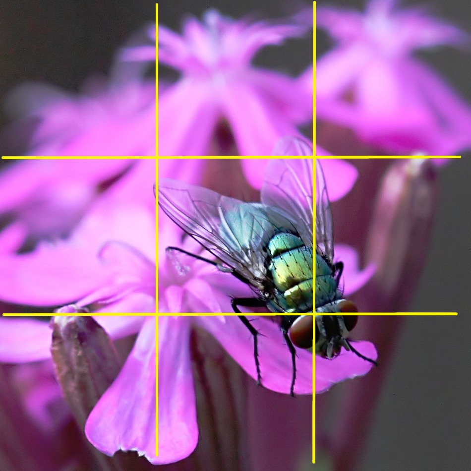
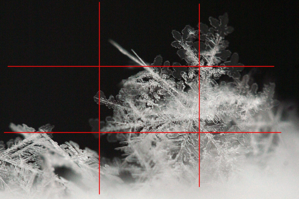
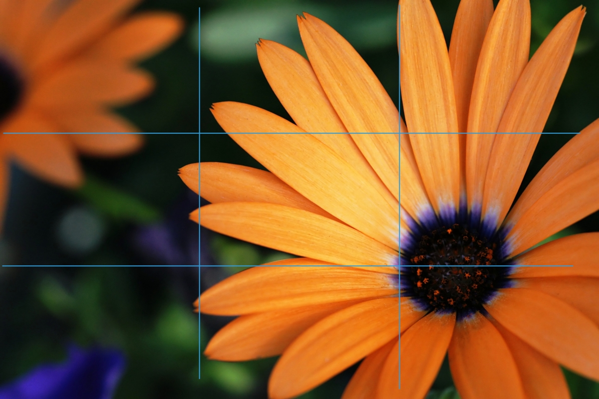
As you can see from the examples above, you don't have to be 100% accurate about placing your subject exactly at the intersection of the lines, but I hope you're seeing how effective off-center framing can be.
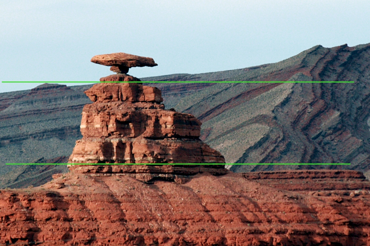
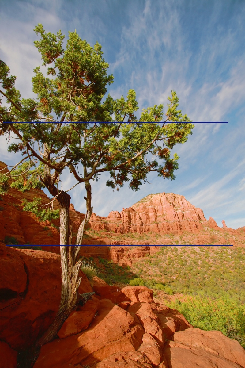
Horizons:
The Rule of Thirds applies to horizons as well. When it comes to horizons, our tendancy is often to place it right in the middle of the photo -effectively splitting the photo into 50% sky, 50% land. But if you place the horizon at one of the 2 horizontal tic-tac-toe lines, it will often lead to a more nicely composed photo.
Again, here are some examples:
(And again, you can click on the photos for larger versions without the lines.)
More of a suggestion than a rule?:
It's important to experiment with this rule to get a feel for it and to overcome the natural tendency to put either the subject or the horizon in the middle of the frame. But, after you've gotten over your bad center-of-the-frame habits, you may find situations where it's difficult to follow the rule of thirds, or times when you just think framing a subject in the center works for you. If you know why you're doing it -feel free! As you excel, you'll come to see that the rule of thirds is more a suggestion than a rule, but when you're first starting out it's a good idea to try to follow it whenever you can.
If you don't understand something or have trouble with any of my tips, feel free to contact me via a comment on this (or any) article, or see my website for my email address and I'll be happy to help you out!
Here's how it works:
When you are looking through your camera, imagine a tic-tac-toe board drawn evenly across the entire frame. Instead of putting your subject in that center box, put them at one of the points where the tic-tac-toe lines cross.
Here are a few examples:
(Click on the photo to see a larger version without the lines.)
As you can see from the examples above, you don't have to be 100% accurate about placing your subject exactly at the intersection of the lines, but I hope you're seeing how effective off-center framing can be.
Horizons:
The Rule of Thirds applies to horizons as well. When it comes to horizons, our tendancy is often to place it right in the middle of the photo -effectively splitting the photo into 50% sky, 50% land. But if you place the horizon at one of the 2 horizontal tic-tac-toe lines, it will often lead to a more nicely composed photo.
Again, here are some examples:
(And again, you can click on the photos for larger versions without the lines.)
More of a suggestion than a rule?:
It's important to experiment with this rule to get a feel for it and to overcome the natural tendency to put either the subject or the horizon in the middle of the frame. But, after you've gotten over your bad center-of-the-frame habits, you may find situations where it's difficult to follow the rule of thirds, or times when you just think framing a subject in the center works for you. If you know why you're doing it -feel free! As you excel, you'll come to see that the rule of thirds is more a suggestion than a rule, but when you're first starting out it's a good idea to try to follow it whenever you can.
If you don't understand something or have trouble with any of my tips, feel free to contact me via a comment on this (or any) article, or see my website for my email address and I'll be happy to help you out!
Tuesday, July 3, 2007
Getting Critique
(Click on image to see the larger sizes and EXIF data.)
Getting critique on your photos is one of the best things you can do to improve your photography. It helps you take a more critical eye to your work, which can be difficult, but it also helps you see what you are doing right. Eventually the good outweighs the bad, and you'll be amazed at how far you've come. It's important to take critique in the right light, though.
You know how they say "Opinions are like ___ -everyone's got one"? It's no less true in photography. That's why it's important that you always evaluate the critique you get. A good way to do this is to become an active member in a group or forum where you can get to know your fellow member's personalities as well as their work. Then, if Bob says he doesn't like your photo, you'll know that he's hard on everyone, and you can just ignore him. But if John says he doesn't like it, maybe you'll listen because you love his work and respect the advice he's given to others. And although Mary says it's the best photo she's ever seen, you know she said the same thing 2 minutes ago to Bob about his photo of his dog licking his backside. Point is, it helps to know your audience.
On the other hand, random critique is fine too as long as you don't put too much weight on one person's opinion. If you don't agree with someone's advice -even if you consider them a better photographer then you, it comes down to your photo being your OWN art. Take only the advice that works for you, and leave the rest behind.
Sometimes it helps, though, to wait a week or so before posting a photo for critique. You know that "high" you get from capturing a great image? There's nothing worse than reading critique on that image while you're still caught up in the attachment of how you took it and what it means to you. It may be best to wait until you're not as attached to the photo so you can consider the negative things about the image in order to learn from it and improve your skills for next time. In short, critique is about learning what you did wrong, so you have to be willing to hear it.
Finally, don't be afraid to post bad photos. In my experience, you learn more from your bad photos than you do from your good ones. Posting a "why didn't this work?" image can lead to leaps in learning that can save you weeks or months of experimenting and learning on your own.
My personal story about the photo attached to this post:
I posted this image in two different places for critique. I ended up with a lot of positive feedback, and the following 3 responses that offered advice for improvement:
1.) One person said the photo broke the rule of thirds and I should have put the horizon line 1/3 of the way from the top of the photo. This was well intentioned, but bad advice. I'll explain the rule of thirds tomorrow, and then why I broke it in this image on Thursday.
2.) Another person suggested I move the moon to the left side of the photo for better balance in the image. Others agreed with him, and I think his advice may have merit, but after careful consideration I've decided that I like the moon as-is. So, I have taken his critique as a lesson on balance, but I will not be altering this particular photo as a result.
3.) The last person suggested I try making the image a bit darker and removing a couple of dust spots near the moon. This advice was definitely helpful. I removed the spots that I had missed before and I also tried darkening the shot a bit. The result was subtle, but definitely better so I kept it.
So, in the end only subtle changes were made to this particular image, but I've benefited from posting it because person #2 really got me thinking about the use of balance in an image. Not every photo you post will lead to you learning something, but it's more probable than if you never post anything at all. -If you don't belong to a photo group and you consider yourself a beginner, try joining my Photography_Beginners yahoogroup here!
Of course, if you aren't that brave yet or if you have nothing to post, you can learn from looking at other people's images and watching the critique they get. A great place to do that is by watching a Pro (Craig Tanner) critique a new photo every weekday via the Radiant Vista's Daily Critique.
Sunday, July 1, 2007
What I did this weekend
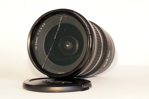
The photo above can also be seen here: http://www.flickr.com/photos/erica_marshall/425731394/
So, Ed and I had a small dinner party yesterday. While I was finishing up the last of the cooking so we could get the meal on the table, Ed's talking to Mike about my new lens. Then, he asks me to go get it and show it to him... So, I stop stirring the rice in the frying pan, and go get my Sigma 50-500mm lens. (It is an impressive looking lens.) ...I took my photo backpack out of the closet, grabbed the "Bigma" out of it, mounted it on my 30D, and handed it to Mike so he could check it out while I continued to stir the rice.
When Mike was ready to unload the 8lb beast, I took it back from him and tried to slip it back into the bag... Oh yeah, this is the one lens that won't fit in the bag while it's mounted to the camera. Grr... Rice burning... I remember the cap for the back of the lens is in the laundry room where I swapped the lens earlier, so I grab the backpack and head towards the laundry room to get everything put away. When I reach the laundry room, I start to swing the backpack up towards the top of the dryer and something flies out...
**Crack!**
Oh no. I look on the floor and see my brand new Canon 10-22mm f/3.5-4.5 rolling away across the linoleum floor!!! :-( Of course it couldn't be one of my cheap lenses...
No time to check it out, I needed to get back to the rice. The truth -I didn't want to know. I finished up the meal, ate, chatted, then cleaned up after dinner before getting a chance to take a quick peek at it.
I only got a quick glance at it, then put it back in the bag. I was just sickened by it, but I went back to our guests to talk a bit before bringing out dessert. Of course, all I could think of was that lens... Ed bought it for me for Xmas and I've been so excited to put it to use! So far I haven't done much with it since it's been so cold, but we're planning a trip to Arizona (Lake Powell, Sedona, maybe the Grand Canyon, and I was SO happy I'd have this lens for that trip! ...My next widest lens is a 28mm which, on my 30D, because of the crop factor, is actually something like a 42mm lens. In other words, not wide at all. I complained about this all last summer, and after finally getting my 10-20mm lens ...this happens.
When our guests left for the night, I contemplated not telling Ed about what happened. I looked up how much it'd cost to replace, etc while cleaning up the kitchen. In the middle of doing dishes and beating myself up about it, a thought occurred to me. There was a UV filter on the lens wasn't there? Could I have been lucky enough to have dropped this lens 4 feet onto a linoleum floor and have it survive? I tried to keep my excitement at bay as the thought occurred to me. Surely it was wishful thinking, but I went to go see it once more anyway ...now that I had some time to get a better look at it.
...I was right, it had a UV filter and I got lucky -just the filter was cracked. I gingerly removed the filter, blew the glass particles off the lens, and mounted it to my camera. I tested the manual focus and it was fine, Autofocus worked as well. Upon close inspection I see absolutely no damage resulting from the fall. Luck? Good construction from Canon? I don't know, but that was a bit more excitement than I needed.
Subscribe to:
Posts (Atom)