About a month ago I started looking for volunteer work since it looked like finding a new job would probably be difficult until after the holidays and I was going crazy being at home all day with nothing but soaps and court shows on TV all day. While trying to find volunteer work like I've done in the past -maybe preparing or serving food for the homeless or cleaning kennels at the humane society I met a woman who was absolutely thrilled that I did photography. The dog rescue organization she worked for needed photography done for petfinder.com as well as for their own website, flyers, articles they'd send to the newspaper, etc. But her day-job needed a photographer even more!
It turns out she works for a local Children's Museum and they were so desperate for photography that with no volunteers they had bought a Nikon SLR, 2 lenses and a flash for staff to use. They were using it on Auto in a poorly lit environment and hadn't gotten the best results with it, as you can imagine (their flash was on Manual and they had no idea why it looked so bad when they used it!) But, they've had ongoing problems finding photographers to take photos of children interacting with their exhibits. In fact, they've been using some photos over and over in their promotional material and website for over 10 years and are SO happy to get a chance for some new photos to use! So, I went down there to talk to them about volunteering my photography skills and WOW! were they excited. (And I was scared to death!)
My first assignment would be to attend the volunteer holiday party to take photos of the donated food and door prizes to send to the donor companies as a "thank you" and to show how their products were promoted as part of the event. I was also to take candids of the attendees, set up shots of all door prize winners, and photos of a play that was to happen. I showed up with my 30D, flash, $5 cap diffuser, Canon 50mm f/1.8 II, Sigma 30mm f/1.4, and Canon 100mm f/2.8. Here's what I learned from that first shoot:
1. Shadows from flash: They staged the door prize winners right in front of a door and because I was shooting vertically, my flash was sticking out to the right instead of coming from above. This resulted in deep, well defined shadows to the left of each person even with the diffuser on the flash. (Bouncing the flash off the ceiling was not possible because the ceiling was bare beams painted a different bright color in each room).
Solution: Next time I'll take along my camera/flash bracket so that when I'm taking photos vertically the flash can still be coming from above the lens rather than from the side (which gave harsh shadows on walls behind the subject).
2. Lack of preparation / say: Everything was done in a rush at the party, so I didn't have an opportunity to think about positioning people away from the door to minimize their shadows. And I was only told that there would be a play "over there" later. Someone came and grabbed me just after the play started and the place I had scoped out to stand and take photos ended up being used by some dancers that were part of the play, so many of my shots contained the tops of the audience's heads because places for me to stand were very limited.
Solution: I'll ask if I can get there earlier to get an idea of what will be going on and so I can suggest changes to the room setup and decor to help with photography. For example, the place where they wanted door prize winners to stand -I would have moved a snowflake decoration that seemed to grow out of some people's heads and also put gaffers tape on the floor where I wanted them to stand so they wouldn't be so close to the door. Seeing any rehearsals for the play would have really helped as well, or time to talk to the people who organized it about the space they'd be using and possibly setting aside a place for me up front to take photos from.
3. Candids vs Set-up Shots: Candids are nice, but the set-up shots I took of most adults ended up looking better.
Solution: I should either jump in more and try to get shots set up (which is hard for me, I'm a little too shy for people photography) or find an assistant to do that.
4. Not remembering what I've already shot. One of the main things the client wanted was shots of the food table to send to the sponsor, Jason's Deli, who provided all the delicious food for the party. I only ended up with 4 photos! I started there, took a few photos, then got pulled away. And when I went back to take a few more photos of the food and found
the table to be a little messy, I decided (or more accurately "thought") I had gotten enough photos of the table before. When I got home and realized I had only gotten 1 decent shot and only 3 others I was mortified!
Solution: Next time I'll be sure to take a few breaks to review the shots I've taken to get an idea of how well I've been adhering to the client's wants while I can still do something about it!
5. Watch your focus! Many shots were not in clear focus. There were only a couple that are really as sharp as they could have been. Being in a very dim, cluttered, and cramped environment, I sat at about f/2.8 most of the time. I have my AF set on the "*" button on my Canon 30D. It's possible that in the time it takes me to go from the "*" button to the
shutter button to take the photo I moved slightly or the subject moved slightly and that resulted in less than sharp photos.
Solutions: Be careful to not focus before people are ready and smiling, but afterwards and right before taking the shot. I'm also toying with the idea of maybe putting focus back on the shutter button (half-press) so I can't screw it up next time. ...we'll see.
In the end, the client was happy with the shots, so I'm lucky that they aren't as picky as I am. But, if I can put all the lessons I took from this first shoot and apply them to the next one I think they'll be even happier.
If you have the equipment and knowledge to try something like this, I highly recommend that you contact some non-profits in your area. Humane societies, children's museums, etc all seem to need photographers to volunteer their skills. In return you get some great practice and often publicity when your photos are used in their printed materials. It's a win-win; I've learned a TON already. It's well worth stepping outside of your comfort zone for!
Wednesday, December 17, 2008
Monday, December 15, 2008
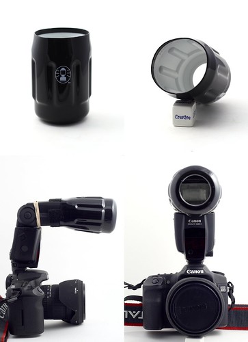
38¢ Can Cooler Snoot
My local hardware store had these can cozies on sale for thirty-eight cents and, since the inside is white, I figured that I might be able to make a snoot for my flash out of one of them, so I picked one up. It ended up fitting on my Canon 580EX perfectly and works well without modification since it has a hole in the bottom already. Here's some photos of the setup:
(click on photo for larger versions)
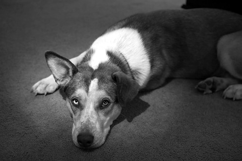
And here's a sample shot taken with it:
(click on photo for larger versions)
(click on photo for larger versions)
And here's a sample shot taken with it:
(click on photo for larger versions)
Wednesday, December 10, 2008
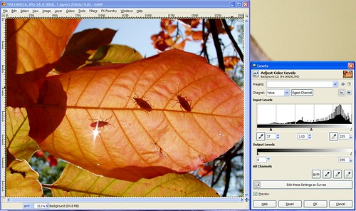
Gimp: Levels (beyond the Auto button)
Okay, so we're going back to the Levels tool today to experiment with different ways to use this tool beyond just the "Auto" button.
To start, this where you can download the photo I'll be using in this tutorial if you want to use it to follow along:
www.flickr.com/photos/15059459@N02/3097360115/sizes/l/
After opening the sample photo (or your own), the next step is to open the Levels tool from the "Colors" menu. It'll look like this:

Notice we're working with the photo's histogram again, much like the Curves tool. Under the histogram is a tonal graph showing black on the left and white on the right. For this photo we see that there's a big gap between where "true black" is and where this histogram starts, which matches what we see in the photo -it's kinda gray looking and needs to be darkened a bit.
Below the tonal graph are 3 trianglular sliders -one's all the way left at "true black", one's all the way right at "true white", and one's right in the middle. If you click on those triangles you can slide them left or right and it'll change the brightness of the dark tones, light tones, or mid-tones (depending on which slider you move) in your photo accordingly.
Since we want to make the dark tones darker, we can think of that as wanting to shift the histogram left. To do that, we move the "true black" slider to the right where we want "true black" to be for our histogram. So, go ahead and move the slider on the far left until you get it where the data begins on the left side of the histogram. It should look like this:
That's good enough for me, but I encourage you to play with the mid-tone and "true white" slider to see the effect they have on the photo as well.
To be completely honest, I rarely use Levels this way. Curves will achieve the same result, just in a different way. Most people like either Curves or Levels (usually Curves I think because it's a little more granular) and they stick with the one tool the majority of the time.
Now, there's another way to use Levels, and I use this more often than I do the manual adjustment I went through before.
Next to that "Auto" button that we used in Exercise #4 there are three buttons with icons that look like eye droppers. One is black, one's gray, and one's white. The idea here is that you can click on the black dropper and then click on an area in your photo that should be 100% black and it'll automatically adjust your photo to make that so. White works the same way -click on the white dropper, then an area that should be 100% white in your photo, and whallah! The gray dropper is used when you're using a gray card -you'd click on the gray dropper, then the gray card, and you'd get good results that way (I never use a gray card, so I don't use that dropper at all).
So try this tool out all three ways -the "Auto" button, the droppers, and the manual adjustment and please post any questions you have about anything you don't understand about the Levels tool. Also feel free to post your results using this tool, I enjoy knowing if these tutorials are useful for you!
To start, this where you can download the photo I'll be using in this tutorial if you want to use it to follow along:
www.flickr.com/photos/15059459@N02/3097360115/sizes/l/
After opening the sample photo (or your own), the next step is to open the Levels tool from the "Colors" menu. It'll look like this:
Notice we're working with the photo's histogram again, much like the Curves tool. Under the histogram is a tonal graph showing black on the left and white on the right. For this photo we see that there's a big gap between where "true black" is and where this histogram starts, which matches what we see in the photo -it's kinda gray looking and needs to be darkened a bit.
Below the tonal graph are 3 trianglular sliders -one's all the way left at "true black", one's all the way right at "true white", and one's right in the middle. If you click on those triangles you can slide them left or right and it'll change the brightness of the dark tones, light tones, or mid-tones (depending on which slider you move) in your photo accordingly.
Since we want to make the dark tones darker, we can think of that as wanting to shift the histogram left. To do that, we move the "true black" slider to the right where we want "true black" to be for our histogram. So, go ahead and move the slider on the far left until you get it where the data begins on the left side of the histogram. It should look like this:
That's good enough for me, but I encourage you to play with the mid-tone and "true white" slider to see the effect they have on the photo as well.
To be completely honest, I rarely use Levels this way. Curves will achieve the same result, just in a different way. Most people like either Curves or Levels (usually Curves I think because it's a little more granular) and they stick with the one tool the majority of the time.
Now, there's another way to use Levels, and I use this more often than I do the manual adjustment I went through before.
Next to that "Auto" button that we used in Exercise #4 there are three buttons with icons that look like eye droppers. One is black, one's gray, and one's white. The idea here is that you can click on the black dropper and then click on an area in your photo that should be 100% black and it'll automatically adjust your photo to make that so. White works the same way -click on the white dropper, then an area that should be 100% white in your photo, and whallah! The gray dropper is used when you're using a gray card -you'd click on the gray dropper, then the gray card, and you'd get good results that way (I never use a gray card, so I don't use that dropper at all).
So try this tool out all three ways -the "Auto" button, the droppers, and the manual adjustment and please post any questions you have about anything you don't understand about the Levels tool. Also feel free to post your results using this tool, I enjoy knowing if these tutorials are useful for you!
Wednesday, December 3, 2008
Gimp: The Curves Tool
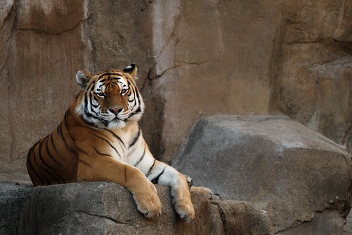
For this exercise we'll be using this photo:
Feel free to download the photo here if you'd like to follow along with the exercise.
The problem with this photo is that it's dark, so the logical thing we might thing of to do would be to bring up the "Brightness/Contrast" tool (from the "Colors" menu) to fix it like this:
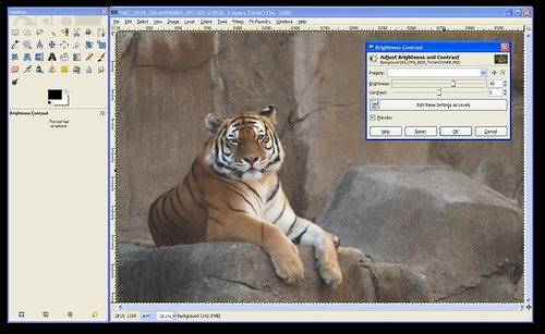
...but notice how increasing the brightness on the photo brightens the WHOLE photo leaving it looking dull and gray?
In this case, we want to brighten the white parts (the highlights) and the tiger's body and the rocks (the mid-tones) without brightening the darkest parts of the photos (like the shadows and his black stripes). The curves tool gives you the ability to brighten or darken the highlights, shadows, and mid-tones seperately. So, let's open it up!
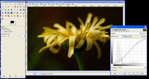
The Curves tool can be found under the "Colors" menu. When you open the tool it'll look like this:
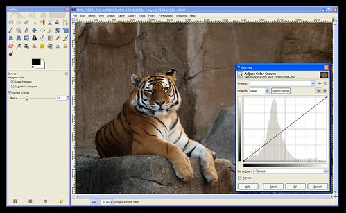
The Curves tool consists, mainly, of a graph. In the background is the histogram for your photo. If you don't know how to read a histogram, go back and read An Intro To Histograms right now because it's an important part of the curves tool.
Notice that the graph's "x-axis" (the horizontal part) is labelled (on the bottom) with a range of tones than go from black on the left to white on the right. Similarly, the "y-axis" (the vertical part) is labelled with white on the top and black on the bottom.
The histogram shows you the tones that comprise your image. In the case of this tiger photo, we can see that there are some dark tones, lots of mid-tones, and some highlights. Nothing's been over or under-exposed, so no detail is unrecoverable from the shadows or from the hightlights.
When the tool is first opened the line on the "curve" is actually a straight line that runs at a 45-degree angle from the blackest black on the graph to the whitest white. This is where all images start. If you click on this line you can pull it up or down. This is how you use "Curves".
Now, the first thing to consider is the portion of the curve that you want to pull up or down. Clicking towards the left will change the darker tones. Clicking towards the right will change the lighter tones. You can use the histogram to decide where to click or you can use the dropper tool to help you decide.
To use the dropper tool, simply hover your mouse over the photo while the Curves tool is open and click on the area you want to lighten or darken. In this case, click right between the tiger's eyes so we can see where we need to click on the "Curve" to brighten the darker areas of the tiger.
This will put a vertical line on your graph to show you where that tone that you clicked on lies on the x-axis of the graph. So, we now know that we'll need to click in that approximate area of our "Curve" (the 45-degree line).
Next, we need to decide if we're going to move it up or down. According to the label on the side of the graph pulling up will lighten the photo (bring the tones towards white), and pulling down will darken the photo (bring the tones down towards black).
We want to lighten this photo, so click the "Curve" (the 45-degree line) where the vertical line meets it and drag it up until it looks about right to you. When you have it where you want it let go of the mouse button to set that point on the curve.
At this point, your "curve" (graph) should look something like this:
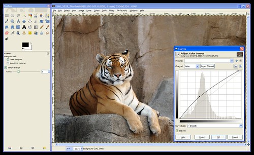
One more problem remains -notice that the histogram shows the data going down to nothing way before it reaches the right side of the graph? This means that my "whites" (the tiger's face and chest) aren't as white as they could be. To fix this you can either click the whitest part of the tiger to get that vertical line to show you where these tones are on your "curve" or you can just look at where the data ends and click somewhere close to that area on the curve. Then pull that point up to the very top to make it pure white. (This part was already done on the screenshot above.)
Click "OK" to apply the changes to the photo and you're done!
I'm going to go through one more example really quick so you can see another common curve: an "S" curve.
Here's the example photo we'll use for this one:
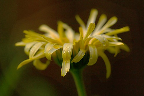
Download full size here.
You'll notice in this photo that the background needs to be darker, and the flower is a bit gray and needs to be made brighter.
So, we'll open curves and bring the darks down darker and the highlights up brigher. The resulting curve looks like an "S" as shown here:
Hopefully that gives you a good idea about how to use the "Curves" tool. This tool will allow you to manually do what the "Auto-Level" did for our photos in Exercise #4. If Auto-Levels doesn't work for you, you should be able to fix your photo manually in Curves.
As always, feel free to post your questions, tips for using Curves, or the results you've gotten with this tool here.
Feel free to download the photo here if you'd like to follow along with the exercise.
The problem with this photo is that it's dark, so the logical thing we might thing of to do would be to bring up the "Brightness/Contrast" tool (from the "Colors" menu) to fix it like this:
...but notice how increasing the brightness on the photo brightens the WHOLE photo leaving it looking dull and gray?
In this case, we want to brighten the white parts (the highlights) and the tiger's body and the rocks (the mid-tones) without brightening the darkest parts of the photos (like the shadows and his black stripes). The curves tool gives you the ability to brighten or darken the highlights, shadows, and mid-tones seperately. So, let's open it up!
The Curves tool can be found under the "Colors" menu. When you open the tool it'll look like this:
The Curves tool consists, mainly, of a graph. In the background is the histogram for your photo. If you don't know how to read a histogram, go back and read An Intro To Histograms right now because it's an important part of the curves tool.
Notice that the graph's "x-axis" (the horizontal part) is labelled (on the bottom) with a range of tones than go from black on the left to white on the right. Similarly, the "y-axis" (the vertical part) is labelled with white on the top and black on the bottom.
The histogram shows you the tones that comprise your image. In the case of this tiger photo, we can see that there are some dark tones, lots of mid-tones, and some highlights. Nothing's been over or under-exposed, so no detail is unrecoverable from the shadows or from the hightlights.
When the tool is first opened the line on the "curve" is actually a straight line that runs at a 45-degree angle from the blackest black on the graph to the whitest white. This is where all images start. If you click on this line you can pull it up or down. This is how you use "Curves".
Now, the first thing to consider is the portion of the curve that you want to pull up or down. Clicking towards the left will change the darker tones. Clicking towards the right will change the lighter tones. You can use the histogram to decide where to click or you can use the dropper tool to help you decide.
To use the dropper tool, simply hover your mouse over the photo while the Curves tool is open and click on the area you want to lighten or darken. In this case, click right between the tiger's eyes so we can see where we need to click on the "Curve" to brighten the darker areas of the tiger.
This will put a vertical line on your graph to show you where that tone that you clicked on lies on the x-axis of the graph. So, we now know that we'll need to click in that approximate area of our "Curve" (the 45-degree line).
Next, we need to decide if we're going to move it up or down. According to the label on the side of the graph pulling up will lighten the photo (bring the tones towards white), and pulling down will darken the photo (bring the tones down towards black).
We want to lighten this photo, so click the "Curve" (the 45-degree line) where the vertical line meets it and drag it up until it looks about right to you. When you have it where you want it let go of the mouse button to set that point on the curve.
At this point, your "curve" (graph) should look something like this:
One more problem remains -notice that the histogram shows the data going down to nothing way before it reaches the right side of the graph? This means that my "whites" (the tiger's face and chest) aren't as white as they could be. To fix this you can either click the whitest part of the tiger to get that vertical line to show you where these tones are on your "curve" or you can just look at where the data ends and click somewhere close to that area on the curve. Then pull that point up to the very top to make it pure white. (This part was already done on the screenshot above.)
Click "OK" to apply the changes to the photo and you're done!
I'm going to go through one more example really quick so you can see another common curve: an "S" curve.
Here's the example photo we'll use for this one:
Download full size here.
You'll notice in this photo that the background needs to be darker, and the flower is a bit gray and needs to be made brighter.
So, we'll open curves and bring the darks down darker and the highlights up brigher. The resulting curve looks like an "S" as shown here:
Hopefully that gives you a good idea about how to use the "Curves" tool. This tool will allow you to manually do what the "Auto-Level" did for our photos in Exercise #4. If Auto-Levels doesn't work for you, you should be able to fix your photo manually in Curves.
As always, feel free to post your questions, tips for using Curves, or the results you've gotten with this tool here.
Tuesday, December 2, 2008
Intro to histograms
Digital SLR owners (and perhaps some digital point and shoot's as well) have the ability to view photos they've taken along with something called a "Histogram". This article will explain what a histogram was and how it can be used to improve your photography.
What is a histogram?
Well, it's a graph, so let's start with an example: (Click on the photo to view a larger version.)
Below the graph, you can see the key, which goes from black all the way on the left, through all the shades of grey until it gets to white at the right-hand side.
So, the graph represents the data in the photo broken down to show how much of the data is of dark, light, or one of the shades of grey in-between.
Does that mean it only works for black and white photos?
No, the histogram works for color photos as well. It's more about "tone" dark red and dark blue are both treated the same (as "dark")... You can think of it as the camera converting the color to black and white to create the histogram if it makes it easier for you to conceptualize.
So, what does this information tell you?
Well, when you review a photo on the LCD screen of your camera it's hard to tell if your photo is too light or too dark because the brightness of your LCD is adjustable. So, how do you know if your photo is dark or if the LCD brightness just needs to be increased because you're outside in sunlight and your LCD was adjusted indoors? The lesson: Looking at the histogram is much more accurate than looking at the photo on your LCD.
What we are often most concerned about when it comes to exposure (how light or dark the photo is) is to make sure that we didn't over-expose or under-expose the photo to the point where we lost detail in the highlights or shadows. We can tell if we've lost detail in the shadows because the data on the histogram will go off of the far left of the graph (the black part), or if detail was lost in the highlights, the photo the data will go off the right side of the graph.
Practical use:
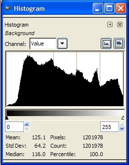
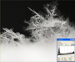
So, let's look at that sample histogram at the top of this article -what does it say about the photo it was taken from?See how the graph ramps up slowing from the left? that means that there's very little absolute 100% black pixels, so there's no detail loss in the shadows. Now, look at the right side -it doesn't peter off as slowly on the right as it did on the left does it? Instead, it abruptly gets cut off. That means there's a lot of 100% white pixels, which means there was some detail loss in the highlights.
It's easy to assume that histograms that fall off of either side are "bad", but that's not the case. It's important to consider the photo you've taken when looking at the histogram because sometimes under or over-exposed areas are ok. (If you're using a white background and you want it to be blown out for a "high key" look, for example.)
Examples / Practice:
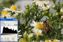
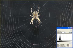
Here are some example photos along with their histograms so you can get a better feel for how to read a histogram: (click the photos to view the large version).
A photo showing a wide range of tones (slightly overblown):
A photo with the majority of it's data in the dark area of the histogram:

A photo showing a lot of over-exposure in it's histogram:

A photo showing a lot of dark and light areas without much in-between (grey):
Links:
For further reading, see: http://www.luminous-landscape.com/tutorials/understanding-series/understanding-histograms.shtml
..and here's a reason you may want to intentionally over-expose your photos by a little bit. (VERY interesting): http://www.luminous-landscape.com/tutorials/expose-right.shtmlMonday, December 1, 2008
Using Auto-Level to fix dull, gray-ish photos
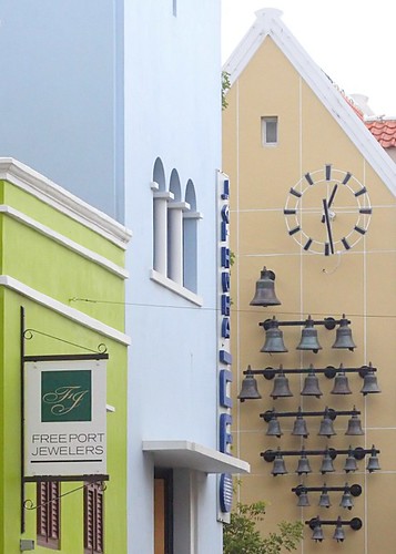
One of the most common issues I see in photos on Flickr is a dullness -a hazy gray look to images. This is often very easy to fix. We'll use Auto Levels to fix the dullness seen in this photo:
Feel free to download this photo at it's full size here to follow along with the steps to fix it:
www.flickr.com/photos/15059459@N02/3074716327/sizes/o/
After downloading the photo, open it in Gimp. Do you immediately notice the dullness or hazy look to the photo? If not, that's ok. Over time it'll become more obvious to you.
Find and click on the "Colors" menu and then choose the "Levels" tool. This will open up a new window as seen here:
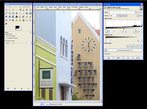
There's a lot of options in the Levels window, and we'll go over them all later. For now, just find the "Preview" checkbox towards the bottom and make sure that it's checked. This will change the look of the photo immediately when we make changes to it with the tool. If "Preview" is not checked you won't see your changes until you apply them by clicking on the "OK" button.
After making sure "Preview" is checked, click on the "Auto" button and watch how the photo changes. If you miss it you can click on the "Reset" button to undo the change so you can redo it.
See how the dullness is immediately fixed with Auto - Levels? The bells in particular go from dull looking to dark, as they should be. Click "OK" to apply the change to the photo permanently (what you see is just a preview, so hitting "Cancel" will cancel the change and the photo will go back to the way it was before you made the Levels change).
That's it for this photo -we're done!
When I first found out about this tool I did an Auto-Level on every photo I took because sometimes it made a huge difference even if I thought the photo looked good before using it. The more I used it the more I became aware of that dull cast in photos and could anticipate whether an Auto-Level was needed or not. I encourage you to try Auto-Levels on your photos to see what a diffence it can make. Sometimes it will make no difference, sometimes it'll make the colors in your photos go wacky and you won't want to use it. But, many times it can have a positive effect, so it's worth a shot!
Feel free to download this photo at it's full size here to follow along with the steps to fix it:
www.flickr.com/photos/15059459@N02/3074716327/sizes/o/
After downloading the photo, open it in Gimp. Do you immediately notice the dullness or hazy look to the photo? If not, that's ok. Over time it'll become more obvious to you.
Find and click on the "Colors" menu and then choose the "Levels" tool. This will open up a new window as seen here:
There's a lot of options in the Levels window, and we'll go over them all later. For now, just find the "Preview" checkbox towards the bottom and make sure that it's checked. This will change the look of the photo immediately when we make changes to it with the tool. If "Preview" is not checked you won't see your changes until you apply them by clicking on the "OK" button.
After making sure "Preview" is checked, click on the "Auto" button and watch how the photo changes. If you miss it you can click on the "Reset" button to undo the change so you can redo it.
See how the dullness is immediately fixed with Auto - Levels? The bells in particular go from dull looking to dark, as they should be. Click "OK" to apply the change to the photo permanently (what you see is just a preview, so hitting "Cancel" will cancel the change and the photo will go back to the way it was before you made the Levels change).
That's it for this photo -we're done!
When I first found out about this tool I did an Auto-Level on every photo I took because sometimes it made a huge difference even if I thought the photo looked good before using it. The more I used it the more I became aware of that dull cast in photos and could anticipate whether an Auto-Level was needed or not. I encourage you to try Auto-Levels on your photos to see what a diffence it can make. Sometimes it will make no difference, sometimes it'll make the colors in your photos go wacky and you won't want to use it. But, many times it can have a positive effect, so it's worth a shot!
Subscribe to:
Posts (Atom)