Getting critique on your work is the only way to find out how others perceive your work. But, beginners are often hesitant to join in with critiquing because they don't think they have the skills to judge a photo yet. I strongly disagree. Many of us aim to one day be good enough to have their photo in a newspaper or hanging on someone's wall. But the people who will be buying your art for their wall or looking at your photo in the newspaper will not be photographers -they'll be normal, everyday people. So, when giving critique don't worry if you could do better or not, it makes no difference -it's your opinion matters. And don't be concerned about being "right" or "wrong" -your opinion is just one opinion and the photographer should only take it as such. Just remember -there is no right or wrong when it comes to your own personal opinion!
So, with this in mind, here's a little cheat-sheet to give you some inspiration on what to look at when giving critique.
Here are the some basic areas to focus on:
1. As a whole, do you like the image? Does it look like someone spent time on it? Is it eye-catching? Could you see it on a wall, in an advertisement, or newspaper?
2. Exposure Overall is the photo too dark or too bright? Does it look dull and grayish?
3. Lighting: Is the lighting even? Are the shadows too dark or the highlights too bright? Are there distracting shadows?
4. Sharpness: Is the subject of the photo in focus? How much of the photo is in focus? Would the photo benefit from the background being more or less in focus?
5. Framing: Are there parts of the photo that were included, but don't add to the photo? Or is something missing or cut off that would have added to the photo?
6. Contrast: Does the subject stand out from the background, or does it get somewhat lost in it?
7. Noise: Does the image have a grainy appearance? Does it add to the image or negatively impact it?
Other areas of critique:
8. Rule of Thirds: Is the subject and/or horizon centered? Would the rule of thirds help make the photo more interesting?
9. Balance: Does your eye tend to ignore parts of the photo due to subject placement, bright spots, or certain colors?
10. Perspective: Is the angle that the photo was taken at effective? Would another angle be more interesting or appropriate?
11. Effects: Is the use of vignette (making the outside of the photo dark), adding of frames, selective colorization, etc effective or distracting? Does it add to the photo?
12. B&W vs Color: Was the use of color or black and white appropriate? Might it look better the other way?
Showing posts with label beginner. Show all posts
Showing posts with label beginner. Show all posts
Tuesday, January 4, 2011




Thursday, July 1, 2010
Auto Mode Cheat Sheet
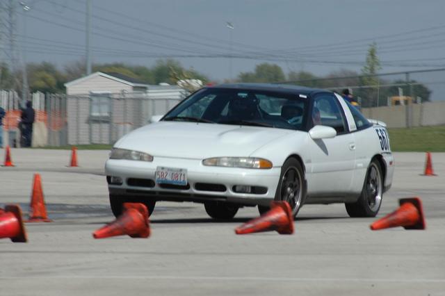
Much can be done with a simple point and shoot camera. SLR users choose between two creative settings, aperture and shutter speed, to control depth of field (AKA background blur) and the blur or freezing of motion. Point and shoot cameras give you some control over your depth of field and also allow you to freeze most motion with the standard modes available on all cameras. Blurring motion on purpose can be done as well, but we'll get to that last. I want to really focus on the ease of the first three -those alone will give you the control you need to take most photos.
Portrait Mode (the icon looks like a woman's head):
This is how you blur the background.
-The closer you are to your subject, the more background blur you'll get.
-The farther away your background is, the more background blur you'll get.
Landscape Mode (the icon looks like mountains):
This is how you keep everything in the photo sharp (avoid background blur).
-Focus a third of the way into the distance of the photo to get everything from close to far in focus (mostly for landscape shots like flowers in the foreground, mountains in the background).
Sports Mode (icon looks like a person running):
This is how you freeze motion.
-In low light, freezing motion may not be possible. Changing to "P" mode may get you better results.
P Mode (icon is the letter "P"):
P Mode usually allows you to take control over your ISO. Some cameras may let you control ISO even in the various auto modes, either way should work.
-ISO controls how fast your camera records light to make a photo. 100 is slower than 800.
-Higher ISO's (like 800) mean your camera makes more mistakes. Those mistakes show up in your photos as "noise" or that grainy, static-like appearance you've probably seen before (usually when viewing a photo at 100%).
-Generally ISO is set as follows:
-ISO 100: Bright sun
-ISO 200: Overcast, but bright (you can still see shadows on the ground)
-ISO 400: Overcast with no shadows or bright indoor lighting
-ISO 800: Average indoor lighting
-To blur motion, choose an ISO lower than the lighting conditions you are in.
-To freeze motion, choose an ISO higher than the lighting conditions you are in.
Portrait Mode (the icon looks like a woman's head):
This is how you blur the background.
-The closer you are to your subject, the more background blur you'll get.
-The farther away your background is, the more background blur you'll get.
Landscape Mode (the icon looks like mountains):
This is how you keep everything in the photo sharp (avoid background blur).
-Focus a third of the way into the distance of the photo to get everything from close to far in focus (mostly for landscape shots like flowers in the foreground, mountains in the background).
Sports Mode (icon looks like a person running):
This is how you freeze motion.
-In low light, freezing motion may not be possible. Changing to "P" mode may get you better results.
P Mode (icon is the letter "P"):
P Mode usually allows you to take control over your ISO. Some cameras may let you control ISO even in the various auto modes, either way should work.
-ISO controls how fast your camera records light to make a photo. 100 is slower than 800.
-Higher ISO's (like 800) mean your camera makes more mistakes. Those mistakes show up in your photos as "noise" or that grainy, static-like appearance you've probably seen before (usually when viewing a photo at 100%).
-Generally ISO is set as follows:
-ISO 100: Bright sun
-ISO 200: Overcast, but bright (you can still see shadows on the ground)
-ISO 400: Overcast with no shadows or bright indoor lighting
-ISO 800: Average indoor lighting
-To blur motion, choose an ISO lower than the lighting conditions you are in.
-To freeze motion, choose an ISO higher than the lighting conditions you are in.
Monday, May 17, 2010
Light, Direction
Think about it. Light is what photography is about. So, it's really important to notice it. The color, the direction, the shadows that result.
Next time you're driving an hour or so after sunrise or before sunset, notice the warm color and the long shadows. If you're driving North to South (or South to North), notice that one side of the road is in shadow and the other is bathed in beautiful warm light. Then ask yourself, in which direction would you want to look for photo opportunities?
The answer seems obvious in writing, but the majority of us have hundreds of sunset photos in our portfolios. Next time, try turning your back to the sunset and look for the photo ops that everyone else misses. The joy you get from being the one person in a crowd who's facing the "wrong" direction is a great bonus too! ;-)
Next time you're driving an hour or so after sunrise or before sunset, notice the warm color and the long shadows. If you're driving North to South (or South to North), notice that one side of the road is in shadow and the other is bathed in beautiful warm light. Then ask yourself, in which direction would you want to look for photo opportunities?
The answer seems obvious in writing, but the majority of us have hundreds of sunset photos in our portfolios. Next time, try turning your back to the sunset and look for the photo ops that everyone else misses. The joy you get from being the one person in a crowd who's facing the "wrong" direction is a great bonus too! ;-)
Tuesday, October 6, 2009
The windows of the soul
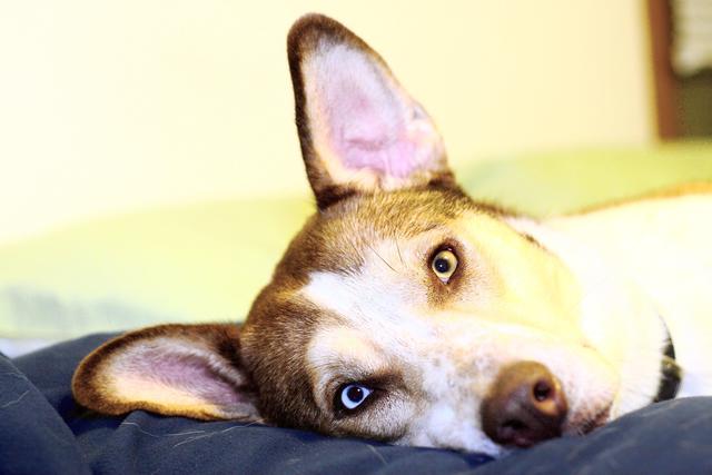
We connect with people (and other living things) through the eyes, so the eyes are the most important part of just about any portrait that you do. So, here's a few quick tips on getting better portraits by paying close attention to the eyes:
The Basics:
1. Make sure they are in focus. If you use autofocus, focus on the eyes. If you are focusing manually, then concentrate on getting them in focus.
2. Have your subject look into the camera, it creates a feeling of connection.
3. Shoot at eye level. This is one of the more well known "rules" of photography -if you're taking a photo of a toddler or a pet, sit or kneel on the floor to get on their level. If you have eye contact, though, I find that this rule can be broken effectively. Note that shooting up at a person or pet can make them look more powerful or important while shooting down at them makes them look smaller. (I find shooting down at people/pets more effective when the angle is more extreme -shooting straight down at a toddler or pet looking straight up, for example.) But shooting at eye level is always the safest.
Other tips:
4. Pay attention to the light. If you can get your subject at the right angle to the light their eyes will light up and the color in them will be greatly enhanced. Pay attention to the light and take advantage of it when you pose people, but also look for it when you're taking candids.
5. Make a connection. A tiny difference in the eyes can make the difference between a blank stare, sadness, happiness, anticipation, fear, etc. Generally when people hear "say cheese" they turn to the camera and give a cheesy smile with dread, embarrassment, fear, or no emotion in the eyes. You'll find genuine smiles (and the real emotion in the eyes that follow a real smile) will really light up your photos, so try to make a connection with your subject -if it's a person, try to talk a genuine smile out of them. For pets, you can often get anticipation in their eyes with a favorite toy or treat held up near the lens to get their attention.
The Basics:
1. Make sure they are in focus. If you use autofocus, focus on the eyes. If you are focusing manually, then concentrate on getting them in focus.
2. Have your subject look into the camera, it creates a feeling of connection.
3. Shoot at eye level. This is one of the more well known "rules" of photography -if you're taking a photo of a toddler or a pet, sit or kneel on the floor to get on their level. If you have eye contact, though, I find that this rule can be broken effectively. Note that shooting up at a person or pet can make them look more powerful or important while shooting down at them makes them look smaller. (I find shooting down at people/pets more effective when the angle is more extreme -shooting straight down at a toddler or pet looking straight up, for example.) But shooting at eye level is always the safest.
Other tips:
4. Pay attention to the light. If you can get your subject at the right angle to the light their eyes will light up and the color in them will be greatly enhanced. Pay attention to the light and take advantage of it when you pose people, but also look for it when you're taking candids.
5. Make a connection. A tiny difference in the eyes can make the difference between a blank stare, sadness, happiness, anticipation, fear, etc. Generally when people hear "say cheese" they turn to the camera and give a cheesy smile with dread, embarrassment, fear, or no emotion in the eyes. You'll find genuine smiles (and the real emotion in the eyes that follow a real smile) will really light up your photos, so try to make a connection with your subject -if it's a person, try to talk a genuine smile out of them. For pets, you can often get anticipation in their eyes with a favorite toy or treat held up near the lens to get their attention.
Wednesday, October 8, 2008
Best time of day to take photos?
Many times we go out to take photos during mid-day when it's convenient for us, but photos taken at this time when the sun is it's brightest and high in the sky can result in a washed out look for colors as well as overly bright and overly dark areas because of the great difference in brightness of areas in the sun vs shade.
So, a little extra thought about lighting and it's effect on your photos can really help your photography. I just learned a great rule of thumb for when the lighting is best for photography:
The exception is overcast days. When it's bright, but overcast (meaning you can see your shadow, but it's a fuzzy blob on the ground rather than a sharp-lined silhouette) it's a great time to take close-up photos of flowers, insects, and any other photos that don't include the sky (because white or gray skies are pretty boring).
So, pay attention to your shadow to gage the lighting conditions and improve your photography!
So, a little extra thought about lighting and it's effect on your photos can really help your photography. I just learned a great rule of thumb for when the lighting is best for photography:
"Shoot when your shadow is longer than you are tall"
The exception is overcast days. When it's bright, but overcast (meaning you can see your shadow, but it's a fuzzy blob on the ground rather than a sharp-lined silhouette) it's a great time to take close-up photos of flowers, insects, and any other photos that don't include the sky (because white or gray skies are pretty boring).
So, pay attention to your shadow to gage the lighting conditions and improve your photography!
Wednesday, July 2, 2008
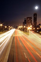
Unusual
Common photography advice about not centering your subject, not putting the horizon in the center, not taking photos of flowers from straight on, not shooting from eye-level, and so on are all about one thing: breaking habits.
It's everyone's natural tendency to take photos with the subject centered, from eye-level, etc so we've already seen those photos time and time again. They are the same as everyone else's and, therefore, boring. But that's also why photos are more striking when taken according to the rule of thirds or when taken from a different perspective.
So anything you can do to capture the world a bit differently will help catch the eye of your viewer. (Even if it does mean that people look at you funny when you're crawling around on your hands and knees taking pictures!)
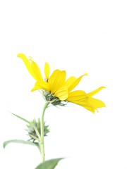
Isolate it:
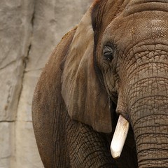
Crop it:
Use a different perspective:
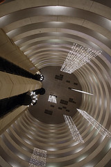
Don't center your subject:
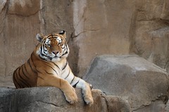
Take photos at different times of day (or night!):
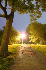
Get low:
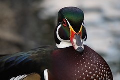
Use effects:
Or just find unusual subjects!:

It's everyone's natural tendency to take photos with the subject centered, from eye-level, etc so we've already seen those photos time and time again. They are the same as everyone else's and, therefore, boring. But that's also why photos are more striking when taken according to the rule of thirds or when taken from a different perspective.
So anything you can do to capture the world a bit differently will help catch the eye of your viewer. (Even if it does mean that people look at you funny when you're crawling around on your hands and knees taking pictures!)
Isolate it:
Crop it:
Use a different perspective:
Don't center your subject:
Take photos at different times of day (or night!):
Get low:
Use effects:
Or just find unusual subjects!:
Wednesday, September 5, 2007
Rule of thirds -the short version
I know I've already done this, but I've made a little drawing that may help people "get" the rule of thirds thing a little quicker than my previous full-page article did. It is here: link.

Wednesday, July 18, 2007
Giving directional subjects "room to move"
There's a general rule that when you have a subject that could be said to be facing left or right, you should leave some space in front of it so it has "someplace to go". This goes for any person, animal, car, flower, etc that you shoot in "profile" (or from the side).
The effects of this should be fairly obvious in the photos below:

The photo above makes most viewers a bit uncomfortable although they may not be conscious of why. Most of the time this is not a good way to crop or frame a subject that you've shot in profile. It's much more desirable to leave some empty space in the direction that the subject is facing so they don't seem "trapped" in the frame. The photo below seems more "comfortable" to most viewers.

Like most "rules" in photography, this one can be broken effectively from time-to-time. When framing a photo in a way that breaks this rule, just make sure you know why you are doing it. Sometimes backing up or zooming out a bit so you can get space on both sides of the subject (especially if it's moving) is a good idea so you can play with the crop later in software.
If you don't understand something or have trouble with any of my tips, feel free to contact me via a comment on this (or any) article, or see my website for my email address and I'll be happy to help you out!
The effects of this should be fairly obvious in the photos below:
The photo above makes most viewers a bit uncomfortable although they may not be conscious of why. Most of the time this is not a good way to crop or frame a subject that you've shot in profile. It's much more desirable to leave some empty space in the direction that the subject is facing so they don't seem "trapped" in the frame. The photo below seems more "comfortable" to most viewers.
Like most "rules" in photography, this one can be broken effectively from time-to-time. When framing a photo in a way that breaks this rule, just make sure you know why you are doing it. Sometimes backing up or zooming out a bit so you can get space on both sides of the subject (especially if it's moving) is a good idea so you can play with the crop later in software.
If you don't understand something or have trouble with any of my tips, feel free to contact me via a comment on this (or any) article, or see my website for my email address and I'll be happy to help you out!
Thursday, July 5, 2007
The "Rule" of Thirds
Most beginning photographers frame their photos so that their subject is in the very center of the photo. It's the most natural way to do it, especially when you're using a camera with just one autofocus point in the center. But, what the rule of thirds says, is that framing your subject differently can help your composition, resulting in a more interesting photo.
Here's how it works:
When you are looking through your camera, imagine a tic-tac-toe board drawn evenly across the entire frame. Instead of putting your subject in that center box, put them at one of the points where the tic-tac-toe lines cross.
Here are a few examples:
(Click on the photo to see a larger version without the lines.)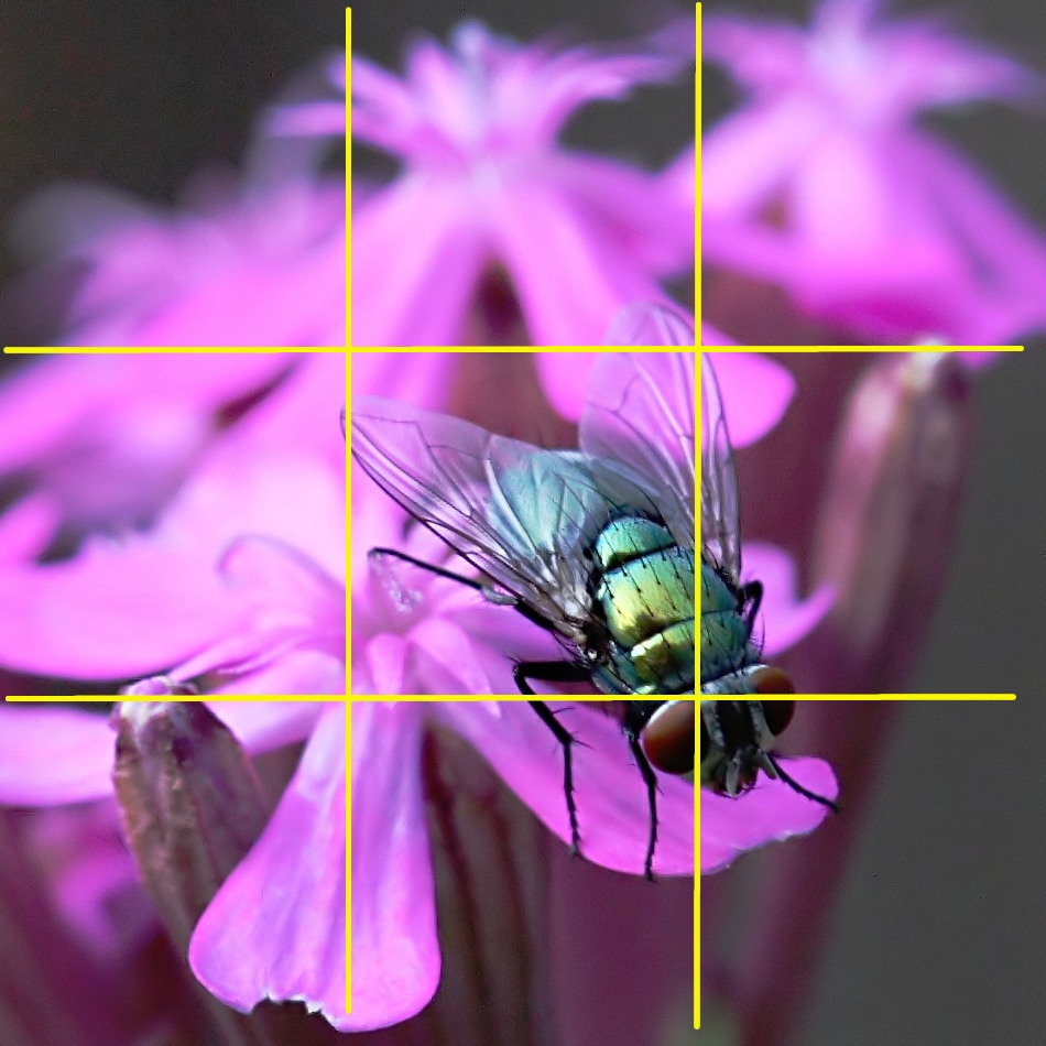
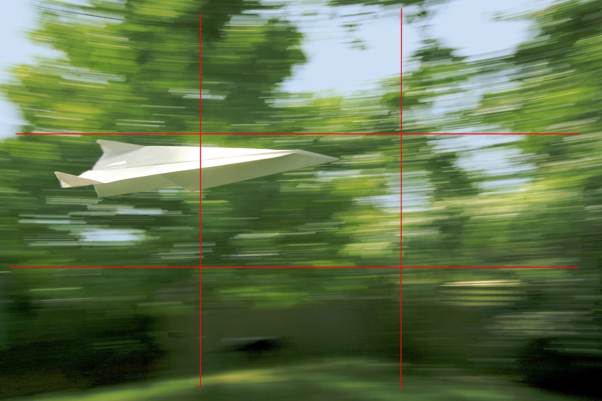
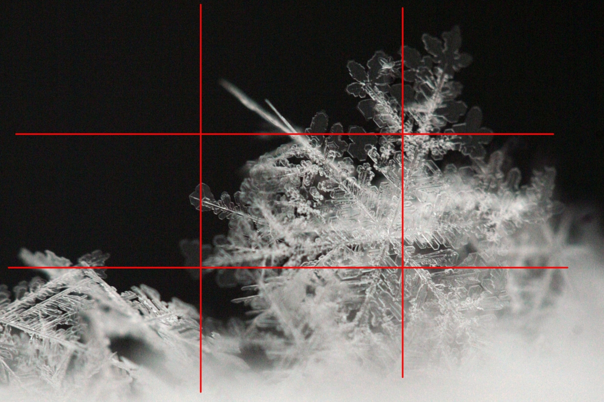
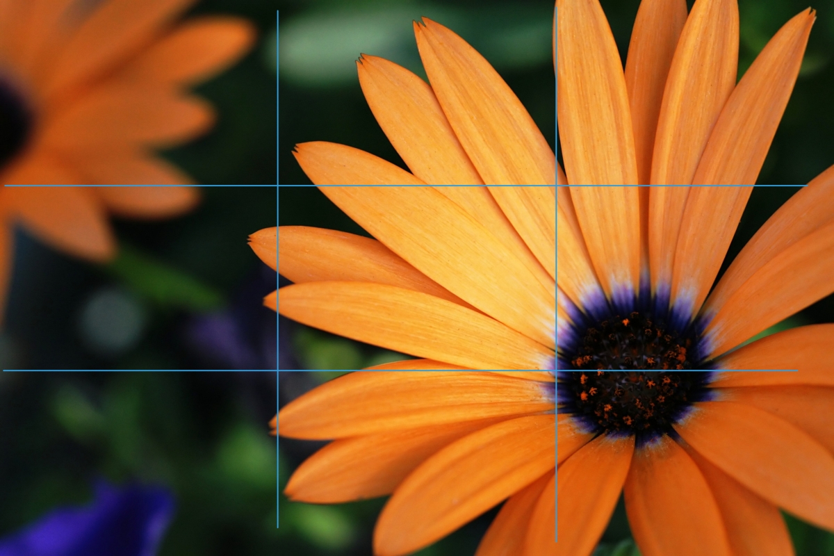
As you can see from the examples above, you don't have to be 100% accurate about placing your subject exactly at the intersection of the lines, but I hope you're seeing how effective off-center framing can be.
Horizons:
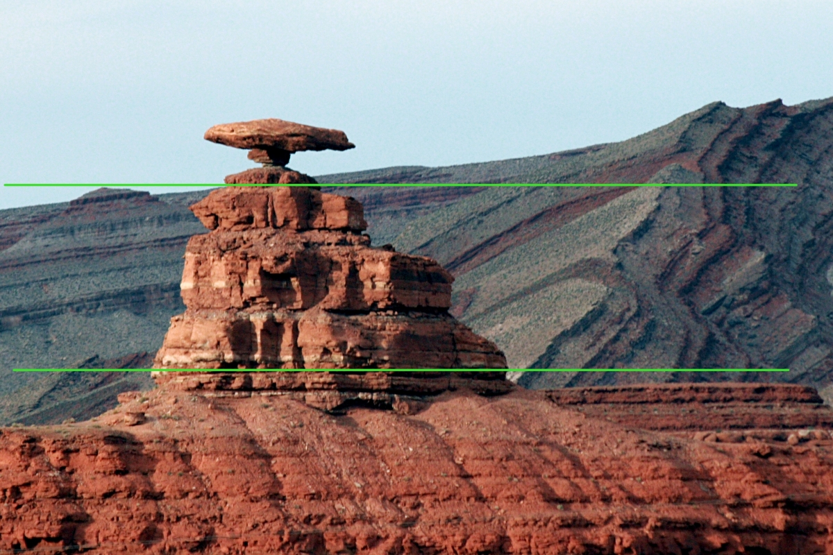
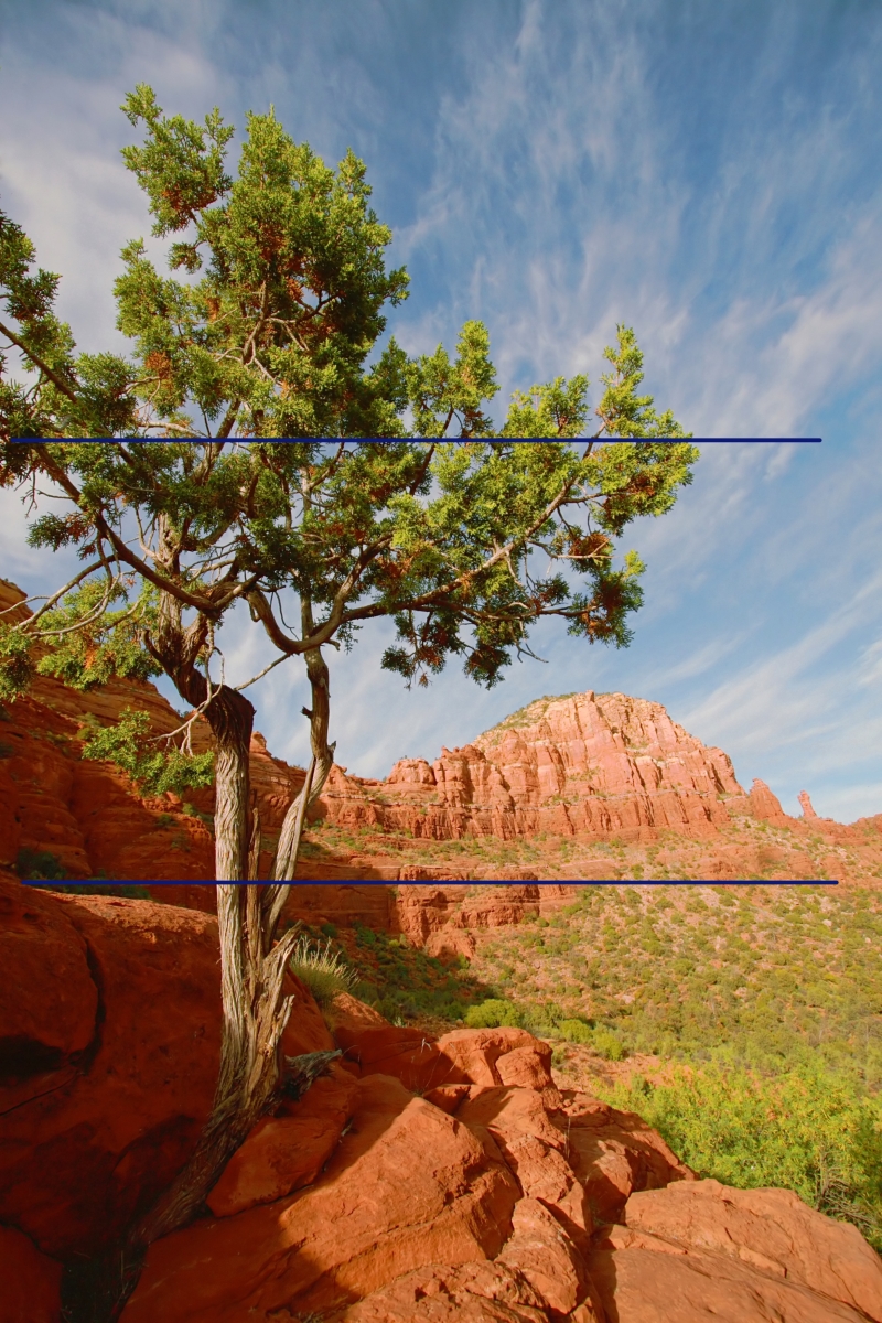
The Rule of Thirds applies to horizons as well. When it comes to horizons, our tendancy is often to place it right in the middle of the photo -effectively splitting the photo into 50% sky, 50% land. But if you place the horizon at one of the 2 horizontal tic-tac-toe lines, it will often lead to a more nicely composed photo.
Again, here are some examples:
(And again, you can click on the photos for larger versions without the lines.)
More of a suggestion than a rule?:
It's important to experiment with this rule to get a feel for it and to overcome the natural tendency to put either the subject or the horizon in the middle of the frame. But, after you've gotten over your bad center-of-the-frame habits, you may find situations where it's difficult to follow the rule of thirds, or times when you just think framing a subject in the center works for you. If you know why you're doing it -feel free! As you excel, you'll come to see that the rule of thirds is more a suggestion than a rule, but when you're first starting out it's a good idea to try to follow it whenever you can.
If you don't understand something or have trouble with any of my tips, feel free to contact me via a comment on this (or any) article, or see my website for my email address and I'll be happy to help you out!
Here's how it works:
When you are looking through your camera, imagine a tic-tac-toe board drawn evenly across the entire frame. Instead of putting your subject in that center box, put them at one of the points where the tic-tac-toe lines cross.
Here are a few examples:
(Click on the photo to see a larger version without the lines.)
As you can see from the examples above, you don't have to be 100% accurate about placing your subject exactly at the intersection of the lines, but I hope you're seeing how effective off-center framing can be.
Horizons:
The Rule of Thirds applies to horizons as well. When it comes to horizons, our tendancy is often to place it right in the middle of the photo -effectively splitting the photo into 50% sky, 50% land. But if you place the horizon at one of the 2 horizontal tic-tac-toe lines, it will often lead to a more nicely composed photo.
Again, here are some examples:
(And again, you can click on the photos for larger versions without the lines.)
More of a suggestion than a rule?:
It's important to experiment with this rule to get a feel for it and to overcome the natural tendency to put either the subject or the horizon in the middle of the frame. But, after you've gotten over your bad center-of-the-frame habits, you may find situations where it's difficult to follow the rule of thirds, or times when you just think framing a subject in the center works for you. If you know why you're doing it -feel free! As you excel, you'll come to see that the rule of thirds is more a suggestion than a rule, but when you're first starting out it's a good idea to try to follow it whenever you can.
If you don't understand something or have trouble with any of my tips, feel free to contact me via a comment on this (or any) article, or see my website for my email address and I'll be happy to help you out!
Subscribe to:
Posts (Atom)