Tuesday, October 12, 2010

Is lack of time an excuse?

Since I lost my job a couple years ago I've had a lot more time on my hands. For the last year I've been volunteering and working a part time job, but that left plenty of time for photography. Funny thing is I lost my motivation or inspiration. I'm not sure which was the cause, but I just stopped taking photos. It frustrated me, but I'd pick up my camera and just have no idea what to shoot. Even dragging my equipment on hikes didn't inspire me. All I got was a backache.

So, it's funny that now that I'm back in school with no time on my hands, and worse yet in the middle of a week that started with an Exam and a quiz on the same day yesterday, another quiz today, and contains 2 Lab Practicals tomorrow -and it's now that I end up having one of those flashes of inspiration that I've been missing. I took a good hour or two out of my studying to play with a concept that occurred to me while on a study break in the backyard as I was playing with my dogs.

I was looking at the leaves that were falling from the Maple tree in my backyard. They are beautiful and they reminded me of a photo that I had submitted to a contest about a month ago. It was taken at least 2 years ago. I'm proud that it's currently in the top ten, but it's just a reminder that I have nothing new in my portfolio. ...anyway, I started looking at the leaves that were face-down on my lawn and how plainly white they looked. How is one side so different than the other? Then a concept occurred to me...

I heard something a long time ago that struck me. Two people who are intent on fighting could hold a quarter up between them and fight for hours about whether it was heads or tails. Both would be right ...from their own perspectives. But we rarely think about how much our perspective adds to the conflicts in our life.

So, there was my concept. The leaf would replace the quarter. Beauty on one side, dull and boring on the other. It mirrors the perspective idea and maybe even expands on it. But, how do you shoot that?

I tried a variety of shots to convey the idea, but simplicity won (as usual, for me anyway) and this was the photo I came up with:

The Importance Of Perspective:

The importance of perspective
It's easy to think your perspective is the only one, but much can be missed by not fully investigating whatever's at hand.

This shot was accomplished by gathering all the "pretty" leaves from my backyard in a bucket, bringing them inside, and arranging them on a piece of black poster board at the bottom of my light tent, which was on the floor. A lamp was set on the side of the light tent opposite my hand. I then put my camera on a tripod and attached the remote (although the self-timer would work as well), grabbed one of the leaves, held it up and pressed the button!

Thursday, July 8, 2010

My Gear -Lenses

Canon 28-80mm f/3.5-5.6:
This was the kit lens that came with the Elan IIe. It's lightweight and plastic. I don't use it much. I suppose it could be a decent walkaround lens, but I don't really do much "walkaround" photography. I can't really say much more -I don't use it because it's not wide enough for landscapes and it's not telephoto enough for wildlife photos.

Canon 75-300mm f/4-5.6 IS USM:
I bought this lens while I was still using Auto on my Elan IIe and I was floored at the reach it gave me. I got years of use out of it before realizing how soft its photos were. I still use it here and there -I don't really have an adequate replacement for it, but I consider it a low-quality lens. Photos printed to 8x10 would probably look fine, but any larger and I fear the quality issue would become a problem. Note that this lens has since been upgraded, changed, and there are also several versions on the market (non-IS, non-USM, etc).

Canon 100 f/2.8:
Photos I've taken with this lens.
Feeling confident in my skills in other areas, I decided to tackle macros, so I bought this lens. When it arrived I learned how challenging macros can be! But, since then, I've mastered the art and found out how amazing this lens really is. Aside from your average insect or flower macro, this lens gives a shallow depth of field which can be used artistically, and it's also got good low-light performance due to the f/2.8.

Canon 10-22mm f/3.5-4.5:
Photos I've taken with this lens.
I got this lens as a gift from my husband and when I got it I wasn't sure I'd really ever use it. Wow was I wrong! I love this lens. It's not only good for landscapes, but it's also nice when you have no choice but to shoot closer to your subject than you want as well, and playing with the distortion it gives at 10mm is fun as well.

Sigma 50-500mm f/4.5-6.3 (aka the "Bigma"):
I got this lens as a gift from my husband as well, but I knew I'd use this one. 500mm! And it's much sharper than my Canon 75-300mm. I've talked to a few pro wildlife photographers who use Canon 100-400mm lenses and they say that the Bigma is not far off in quality. This lens is great for wildlife and shooting races, but it has one big downside: it weighs 4 pounds all by itself. This means a tripod or monopod is necessary if shooting for any length of time and carrying it around is a chore. Still, it's a great lens if you have the need for something like it. As an interesting side-note, I rented a Canon 70-200mm f/2.8 IS and did a sharpness test comparing it against my Bigma and the Bigma turned out to be sharper!

Sigma 30mm f/1.4:
Photos I've taken with this lens.
In an attempt to get a more shallow depth of field for car photography, which I thought I wanted to get into more, I bought this lens. It's extremely sharp, even at f/1.4 and it does a great job of giving a more shallow DOF than any of my previous lenses, which is awesome for either eliminating a distracting background, but it also performs very well in low-light environments so it's been great indoors as well.

Canon 50mm f/1.8 II:
Photos I've taken with this lens.
During my research before buying the Sigma 30mm, I found this lens, which was a fraction of the price at around $100. The only downside of the lens seemed to be it's construction, so I bought one of these as well just to see the difference between the two. There's no doubt the Sigma 30mm is built better. It's solid, metal, and has a smooth-moving and dampened focus ring. This lens, in contrast, is very light weight, made of plastic, and has the cheesiest focus ring I've ever seen -it's very thin and hard to grip, especially because it's at the very end of the lens. Still, this just might be the sharpest lens I own (it's either this or the Canon 100mm f/2.8) even at f/1.8! My husband and I tend to share the Sigma 30mm f/1.4 and the Canon f/1.8II and use them fairly interchangeably. It's great for getting a shallow depth of field and indoors in low light due to the f/1.8.

Canon MP-E 65mm f/2.8:
Photos I've taken with this lens.
This lens was another gift from my husband. It's not a beginner's lens, that's for sure. I had a hard time with macros when I started on my Canon 100mm, but this lens is several times harder to master. Sure, it goes up to 5X while the Canon 100mm is a maximum of 1:1, so there's that. The bigger the subject, the shallower the DOF, so the harder focusing is and timing the shutter press if you hand hold for macros like most of us do. But, on top of that this lens is "fixed focus". I find that most photographers I talk to that haven't used this lens have little to no idea of what that means, but it's pretty simple really. Take a prime like the Canon 100mm macro, set the focus so it's set to focus as close as possible and then don't move it. That's the MP-E 65mm in a nutshell. There is no focus ring. The focus is in one place that moves as you increase the size of the subject from 1X to 5X, so you are forced to change your focus by moving the camera closer or further away from your subject. At 1X you have to focus just a couple inches from your subject, higher magnifications require you to get closer. And if that's not hard enough to deal with, after 1X the viewfinder gets darker and darker at higher magnifications until at 4X you can barely see your subject indoors, and at 5X the viewfinder is nearly black. Outdoors is better, but still challenging. This, I've found out, is what the focusing lamps on my macro flash is for, but they timeout before I can focus most of the time so, I've just stuck to 1X to 3X so far. I've yet to find a subject that really requires anything higher than that, but I count myself as an advanced beginner with this lens still, so I'll add more if I find anything helpful to pass along.

Monday, July 5, 2010

How to combine fireworks photos in Gimp

I took my first attempt at fireworks photos last night. I did okay with them, but I couldn't balance the light so that the fireworks came out looking good along with the foreground. Either the foreground was exposed well and the fireworks were blown out, or the foreground was all black and the fireworks came out nice. So, I went home a little disappointed.

While going through my photos I had an idea -combine 3 of the photos: the foreground, and some individual firework shots, and then I'd get something closer to what I had hoped for.

So, I opened a shot of the foreground that I had taken for test purposes in order to get a starting point for my exposure settings:


And two separate fireworks photos that I had taken:


And I opened them in Gimp in different layers (with the background being the first or "background" layer).

I then set the Layer Mode to "Lighten Only" (you do this in the "Layers" window which you can open by clicking on the "Windows" menu > "Dockable Dialogs" > "Layers"). This is the key. "Lighten Only" means that only the parts of the firework layers that are brighter than the background layer will show up. This means the black sky is automatically ignored and just the fireworks show up in the image. No cutting or selecting required -neat huh?

After that it was just a matter of resizing and positioning the fireworks where I wanted them in the image and erasing the parts of the trails that overlapped the tree line so it'd look like they were coming from behind the trees.

When that all looked good, I flattened the image and then created a duplicate layer that I flipped and positioned so I'd get the reflection in the water of the fireworks. I erased the tree line in the new layer since I only wanted the fireworks to be reflected, then applied a "Motion Blur" to the layer so the reflection of the fireworks would be blurred just like the lights on the water.

After that I was done. Here's the result:
What?  Your fireworks photos didn't turn out like this?

Sunday, July 4, 2010

My Gear -Cameras

A commenter recently asked me to post my equipment list, so here's the first part:

Cameras:

Canon Elan IIe (film SLR):
My Dad and I bought it while I was in college and we "shared" it for years when I lived at home, then he passed it down to me a few years after I moved out of the house. It is still an excellent camera with most of the bells and whistles that my Canon 30D has, aside from the digital stuff, along with one none of my digital cameras have -it can automatically pick which autofocus point to use by following the movement of your eye. This feature requires some calibration to work, and it's not all that consistent, which is probably why they eventually dropped the feature in their products. I used this camera on it's various "Auto" modes while I was in college and for at least a year after it became "mine" before actually learning to use Manual Mode on it.

Canon 30D (mid-level DSLR):
My first digital SLR. I had decided I wanted a 5D because I was scared to buy a "cropped sensor" camera even though I had no idea what that meant. After a year of saving I had $1500 -half of what I needed for a 5D, but I was already so far behind the switch to digital and anxious to try it that I started researching what "crop sensor" meant to see if a 30D would work for me. I was surprised to learn that crop sensors are actually a benefit to photographers who shoot telephoto more than they do wide because they effectively add to the focal length of your lens. Since, at that time, I was mostly shooting wildlife photos (hence the name "Muddyboots Photography") I decided to go with the 30D and was very happy with it for 4 years. I still use it as a backup to my current camera, it's really nice to have two when you're at an event where you switch from telephoto to wide a lot.

Canon Rebel T1i/500D (budget-level DSLR):
A couple years ago I started getting into insect macros and I found myself struggling to hold the stem of a plant that an insect was on (to steady it) with one hand while operating my camera (one-handed) with the other. The 30D was just too big for my hands and I was jealous of my husband's 40D that had Live View on it, so took care of both issues by buying a T1i last year. -It took some getting used to to use the "Function" button needed to make up for the missing wheel. Otherwise, the camera's been great. There's no quality difference between the Rebel lineup and the 30D/40D/50D lineup, it's just a matter of body style. The Rebel body fits my hands better. I can now easily operate my camera one-handed, plus I have Live View, and video, so I'm thrilled!

Canon G11 (point and shoot):
Photos I've taken with this camera.
My old point and shoot died a few months ago. I hated that camera, but I got it because there was a cheap underwater housing for it, so it was a camera I could take when I went diving. But, I figured this might be the time to find a higher quality point and shoot camera that I wouldn't mind using when I didn't want to haul my SLR gear around with me, so I started doing some research. That was right before the G11 came out, so I was searching for information on the G10 -I loved the body and controls, but it's ISO performance above 200 was horrible, so I decided against it. Shortly after I made that decision, however, the G11 came out. Same body and controls, much better ISO performance, so I jumped on it. Underwater housings for it were about $170 the last time I looked, so it will fill that role as well when I have the money for Caribbean vacations again. I've since taken many photos with it and I must say I'm impressed. I recently printed this photo that I took with it set to ISO 400 at 11x14 and it's flawless without any noise correction at all!


Part II lenses) will be posted in the next day or II -stay tuned!

Thursday, July 1, 2010

Auto Mode Cheat Sheet

Much can be done with a simple point and shoot camera. SLR users choose between two creative settings, aperture and shutter speed, to control depth of field (AKA background blur) and the blur or freezing of motion. Point and shoot cameras give you some control over your depth of field and also allow you to freeze most motion with the standard modes available on all cameras. Blurring motion on purpose can be done as well, but we'll get to that last. I want to really focus on the ease of the first three -those alone will give you the control you need to take most photos.

Portrait Mode (the icon looks like a woman's head):
This is how you blur the background.
-The closer you are to your subject, the more background blur you'll get.
-The farther away your background is, the more background blur you'll get.

Landscape Mode (the icon looks like mountains):
This is how you keep everything in the photo sharp (avoid background blur).
-Focus a third of the way into the distance of the photo to get everything from close to far in focus (mostly for landscape shots like flowers in the foreground, mountains in the background).

Sports Mode (icon looks like a person running):
This is how you freeze motion.
-In low light, freezing motion may not be possible. Changing to "P" mode may get you better results.

P Mode (icon is the letter "P"):
P Mode usually allows you to take control over your ISO. Some cameras may let you control ISO even in the various auto modes, either way should work.
-ISO controls how fast your camera records light to make a photo. 100 is slower than 800.
-Higher ISO's (like 800) mean your camera makes more mistakes. Those mistakes show up in your photos as "noise" or that grainy, static-like appearance you've probably seen before (usually when viewing a photo at 100%).
-Generally ISO is set as follows:
-ISO 100: Bright sun
-ISO 200: Overcast, but bright (you can still see shadows on the ground)
-ISO 400: Overcast with no shadows or bright indoor lighting
-ISO 800: Average indoor lighting
-To blur motion, choose an ISO lower than the lighting conditions you are in.
-To freeze motion, choose an ISO higher than the lighting conditions you are in.

Saturday, June 26, 2010

6 Things I learned from my first big photography sale.

I recently made my first "big" photography sale to Bicycling Magazine who licensed two of my photos for their magazine. Below are some lessons I learned from the experience.


1. Flickr's a great place to advertise and potentially sell your work.
Active selling is not allowed on Flickr, but many people have found sales through the site and at least one member has even found a sponsorship by a Fortune 500 company!

2. Tagging is key.
On Flickr "tags" are basically search terms. List anything and everything you can think of that relates to your photo so people (including those who may want to buy or publish your photo) can find it. Be sure to include location terms if it's relavent. Some of my friends have sold photos to local historical societies or city halls based solely on location.

3. You don't have to be the best photographer if you capture something unique.
If you take photos of flowers or landscapes or tourist destinations, watch out, the competition in those genres is tough -there are just so many people taking similar pictures that your chances of standing out are very small unless you're very VERY good. But, if you have a photo of a nightime bicycle event like I did -there's not much competition and that paid off for me. Many of my friends have had similar sales due soley to being one of very few who had a photo of something that someone wanted (and was willing to pay for) like local historical buildings or an unexpected newsworthy event that didn't get general media coverage. Heck, I made a small sale because a store wanted a photo of an apple wearing shoes -istockphoto didn't have one, but I did!

4. It's not about the camera.
One of the photos that Bicycling magazine published was taken with an Olympus C5000 -a really horrible 5 MP point and shoot camera with terrible low-light performance (and it was a night shot!). So, don't worry if you don't have the most expensive SLR on the market ...or even if you don't have an SLR at all! Whatever you have is good enough, just learn to use it to it's fullest advantage and work on learning to compose an image well.

5. Creative Commons licensing does not hurt your ability to sell your photos.
Both of my Bicycling magazine photos were licensed with a Creative Commons Attribution Non-Commercial Share-Alike license. This license allows people to download and use my photo for free for non-commercial use including as their computer or phone wallpaper, or even on their personal blogs or websites (as long as they meet the requirements of the license).

So many people see the use of their photos as theft, but I see it as an advertising opportunity. I have anyone that uses my photo not only attribute the photo to me, but also include my website. And Flickr's guildlines say they must link back to the photo's Flickr page. This helps me advertise my photography lessons and also gain new audiences for my Flickr stream.

6. It helps to be professional and know your prices up front.
Under every photo I display on Flickr is a little blurb of text that explains the license the photo carries, the necessary attribution, and a link to my website for information on commercial use. On my website are my prices and the magazine's first email to me said that my listed price was fine with them. It also helps to have the ability to create an invoice and a W9 (in the US) available to send ASAP for publishers that may be on a tight deadline. For those who photograph people and wish to sell them, a release is also something you'll need on file.

Monday, June 21, 2010

Metering Modes Explained

We're going to start with the basics of exposure. Your camera is pre-programmed to assume that every photo that you take should be of an "average tone". The word "tone" confuses some people, but it just means a shade of color. So, light blue and light purple would be the same tone as would dark blue and dark purple. Get it?

The reason your camera makes that "average tone" assumption is pretty simple -it isn't smart enough to know what's in front of it. How can a camera tell if it's pointed at a white wall with dim light hitting it or a gray wall with really bright light hitting it? The answer is -it doesn't. It will assume that the wall is an "average tone" and your photo will come out an average gray tone either way.

Once you understand the camera's assumption you can use it to your advantage by anticipating and correcting for the camera's mistakes in judgement about a scene.

Let's pretend that this is the scene in front of you:
Sedona Tree

This is a pretty typical photo, so the camera's default metering should get it right. But, we're going to walk through exactly how the camera makes the decision of what the level of brightness should be for this scene to get a feel for how it works in more challenging photography situations.

"Evaluative" or "matrix" metering:
When you have your metering set to "scene", "matrix", or "evaluative" mode (they all mean the same thing, but different camera makers use different terms) what the camera does is it takes a look at the entire scene, averages it out, and decides on the correct brightness for the entire photo. For typical photos like the one above this default mode works very well since the majority of the photo is made up of colors of an "average" tone. But if the scene contains a lot of lighter than average or darker than average tones it won't work nearly as well.

Let's take a look at a scene where the camera's assumption about the scene being of "average tone" is wrong:

Odd Apple

The background of this photo is white. Not only that, but the background makes up more than 50% of the photo, so that's a lot of white! If the camera assumes that the scene as a whole should be of an "average tone" what you're likely to end up with if you take this shot with the default settings is something like this:


Hopefully that makes sense. ...the camera doesn't know the background is white. All it knows is that the scene should be of an "average tone". So, to compensate for all that bright white, it tones the whole photo down and makes the white look gray.

That's why, when your scene is not of "average tone", you need to choose one of the other metering modes that your camera offers. Your choices of metering modes usually include "spot" and "center weighted".

"Spot Metering":
"Spot metering" is usually my preference since it gives you the most control. The idea is rather simple, you just point your center autofocus point at something in your scene of "average tone" and your camera will only use that exact point to determine your exposure.

So, if in the apple photo above you pointed your center AF point at the apple, the scene would likely come out correctly with the white background appearing white instead of gray as it would if you used "evaluative" or "matrix" metering. If you pointed your center AF point at the white background, you could expect the photo to turn out the same or darker than what you'd get using "evaluative" or "matrix" metering.

Let's try one more. Here's a new scene:
Hosta Flower, Unedited

What would you expect to get if you use "evaluative" or "matrix" metering for this scene?
What would you meter off of if using "spot" metering when taking this photo?
...the answers are at the bottom of this article.

"Center-weighted" metering:
"Center-weighted" metering uses a fairly large circle in the middle of your scene to determine exposure while ignoring the tones at the edges of the photo. Since it's not clear what is and is not included in this circle where your exposure is evaluated, this mode doesn't give you the same level of control as "spot" metering does. So, I tend to use "evaluative" when I want to let the camera do the work, or "spot" when I feel I need to take control over the exposure for the shot. "Center-weighted" is kindof an in-between mode that I just don't find all that useful.

Answers:
So, if you took the photo of the purple flower on the black background in "evaluative" or "matrix" metering mode, you'd expect the camera to try to make all that black more of an "average tone". That means, it'd brighten it up to make it gray instead of black; so, you'd get a washed out version of the photo. If, however, you used "spot" metering and metered off of the open purple flower you'd likely get the black background to come out black as it did in the photo above.

Questions? Leave a comment or ask about it on my "photography_beginners" mailing list!

Thursday, June 3, 2010

"Stops" of light

As you get into photography you'll hear people talking about "stops" or "stops of light". Grasping what this actually means can be tricky, so let me attempt to explain it here...

If you have an SLR style camera it probably has a graph that looks like this on it in the viewfinder and perhaps also on other displays on the camera:
[-2...-1...0..+1..+2]
* NOTE that on Nikons the positive numbers are on the left and the negative numbers are on the right.
This graph is your exposure meter. "0" on the graph usually represents correct exposure. The other numbers measure "stops" of light. If you are on Manual Mode and you set your ISO, aperture, and shutter speed and the exposure meter indicates "+1" that means that you have one "stop" of light more than what is generally considered "correct exposure". Sometimes you want this, sometimes you don't. If you are aiming for "0", you can easily add or, in this case, subtract a "stop" of light as long as you know how to calculate "stops" for each of the 3 settings. Don't worry -it sounds like math, but it's really easy -you'll see.

With ISO, a move from ISO 100 to ISO 200 is one "stop" of light. And a move from ISO 200 to ISO 400 is also one "stop" of light. Each time you double the ISO number, you add a "stop" of light to the photo. So your ISO "stops" are:
  • ISO 100 <-- less light
  • ISO 200
  • ISO 400
  • ISO 800
  • ISO 1600 <-- more light
So, a move from ISO 100 to ISO 800 is 3 stops -easy right? If you set your ISO to "100" and your exposure meter showed "-2" and you wanted to expose for "+1" you could change your ISO to 800 and you'd be good to go. See how that works? Not too difficult.

Shutter speed stops are kind of the opposite. When you half the number you are adding a stop of light. This makes sense because 1/2 of a second is longer than 1/4 of a second and it makes sense that when the shutter is open longer, it's letting more light in. So, here are the shutter speed stops:

  • 1 second <-- more light
  • 1/2 second
  • 1/4 second
  • 1/8 second
  • 1/16 second
  • 1/30 second
  • 1/60 second
  • 1/125 second
  • 1/250 second
  • 1/500 second
  • 1/1000 second <-- less light
* Note that the halving and doubling of shutter speed stops are often rounded.

So, if your set your ISO and aperture to what you wanted and then set your shutter speed to 1/125 and your exposure meter indicated "+2" (over exposure) when you were wanting an exposure of "0" -you could change your shutter speed to 1/500 to decrease your exposure by 2 stops and get your correct exposure.

There's a reason I've left aperture for last. This is the one that most people have trouble with, but we'll work it out. If all else fails, just print this page out and stick it in your camera bag until you've got it worked out through practice.

Aperture controls how far open the blades on your lens go in order to let light in when a photo is taken. They can open just a tiny pin-hole or open up all the way, perhaps the size of a small marble or even a big one depending on the lens you have.

The geek who decided on how these different levels of opening would be defined decided to do something that makes most of us go "huh?" -he used the focal length (the size of the lens in millimeters -for example, a "50mm lens") and expressed the size of the aperture hole as a fraction of the size of the lens. ...I know, I know -I told you you'd say "huh?". It's okay if you don't understand or can't remember this. It makes no real difference in your photography. I only included it to make you understand that apertures are fractions. That's also why they are written as "f/4". So, just like other fractions, as the aperture value (f/8 for example) get's smaller the size of the hole gets larger. Just think of it as a fraction -just like shutter speed. 1/8th of a pie is larger than 1/16th of a pie. 1/8th of a second is longer than 1/16th of a second. And likewise f/8 is larger than f/16. And a larger hole lets more light in. So, f/8 lets more light in than f/16. Got it? ...if not, just memorize or print the aperture stops and learn it through practice. This trips a lot of people up, so don't be too hard on yourself if you are confused.

Ready for the 2nd confusing thing about aperture? Halving the aperture value (f/16 to f/8 for example) results in the addition of 2 stops of light. So, aperture stops are as follows:
  • f/1.4 <-- more light
  • f/2
  • f/2.8
  • f/4
  • f/5.6
  • f/8
  • f/11
  • f/16
  • f/22 <-- less light
* Note that available aperture values are determined by your lens. Not all lenses are capable of all of the above apertures.

So, if you set your ISO and shutter speed and had an aperture of f/16 your exposure meter indicated an exposure of "-1" and you wanted to expose for "0", changing your aperture to f/11 would get you the exposure you were looking for.

Wednesday, June 2, 2010

Neutral Density Filters

Neutral Density or "ND" filters come in 2 types: graduated, where they fade from clear to gray, or normal which are all gray. This article will be focused on the more popular completely gray ones, but once you understand the concept it's not difficult to figure out how to use the graduated ones as well.

As I said before, ND filters are completely gray and they come in different strengths. Many manufacturers label their filters 0.3, 0.6, and 0.9 while others may label them 1X, 2X, and 3X. Either way, they block 1 "stop" of light, 2 "stops" of light, or 3 "stops" of light respectively. -More on that later.

If you take a series of photos, each with a different strength filter, then one more photo without an ND filter at all, you might be surprised to find out that none of the photos would look any different from the others. Think about it this way, your camera can adjust for shade or indoor lighting vs bright sunlight, right? Well, it adjusts for the darkness that results from the filter in the exact same way.

So why would you use an ND filter then?
ND filters cut the amount of light that enters your lens. This may not effect the look of your photo, but it does effect the settings for shutter speed, aperture, and ISO that the photo is taken with. Let me give you an example of when you'd use an ND filter:

Let's say it's really bright outside and you are shooting a waterfall. You want to blur the motion of the water to get a milky effect like this. So, you set your camera to the lowest ISO you can, which we'll say is 100. And you set your aperture to f/16 (a sharp, high-number to cut down on the amount of light in your photo), and the shutter speed that you have to use to get the photo properly exposed is 1/45. -That's likely to be too high to blur the water much at all! ...so you disregard the sharpness loss of setting your aperture to f/22 which eliminates 1 stop of light. That will give you a shutter speed of 1/30 -still not enough to blur the water and (as is the case with many lenses) that's the highest aperture you can set with the lens you are using, so there's nothing else you can do via settings to get a lower shutter speed to blur the waterfall. ...but when an ND filter will help you!

* A 0.3 or "1X" filter will eliminate 1 stop of light which would give you a shutter speed of 1/22.
* A 0.6 or "2X" filter will eliminate 2 stops of light. ...that'd get you a shutter speed of 1/15. Now we're getting closer...
* Your 0.9 or "3X" filter will eliminate 3 stops of light. ...that'd get you a shutter speed of 1/11. ...that would do it if it's a fast-flowing waterfall.

I find ND filters that remove 3 stops of light or so to be the most useful. Also note that if you have a set of filters you can stack them to get an additive effect.

* If you stack the 0.3 and the 0.9 that'd remove 4 stops of light which would give you a shutter speed of 1/8 which usually blurs waterfalls very well.
* Stacking all 3 would reduce the light by 6 stops which would give you 1/4.
* ...but note that stacking creates more glass to shoot through, likely lowering your image quality. High-quality filters may be okay, though, especially if you don't crop the photo or print it at it's maximum size.

Monday, May 17, 2010

Light, Direction

Think about it. Light is what photography is about. So, it's really important to notice it. The color, the direction, the shadows that result.

Next time you're driving an hour or so after sunrise or before sunset, notice the warm color and the long shadows. If you're driving North to South (or South to North), notice that one side of the road is in shadow and the other is bathed in beautiful warm light. Then ask yourself, in which direction would you want to look for photo opportunities?

The answer seems obvious in writing, but the majority of us have hundreds of sunset photos in our portfolios. Next time, try turning your back to the sunset and look for the photo ops that everyone else misses. The joy you get from being the one person in a crowd who's facing the "wrong" direction is a great bonus too! ;-)

Wednesday, April 14, 2010

Shooting The Moon

Your camera gets confused when you have a really dark background (the sky) with a really bright spot on it (the moon). -It doesn't know what's more important: the dark sky, or the bright moon, so it'll often "compromise", which will make the moon too bright.

Fix #1: Spot Metering

Using "spot" metering to tell the camera which part of the scene you want it to expose for (more info on how exposure is determined here), works well, but not all cameras offer spot metering.

If your camera has it it'll make moon shots really easy. Simply select spot metering, then put the moon in the center of the frame (there should be an indicator for where the exact center-point is), hold the shutter button half-way down to activate the camera's meter and lock-in the settings for proper exposure, then re-frame the shot and press the shutter button the rest of the way down to take the photo.

Here's my result using Spot Metering (click photo to see a larger version):

Fix #2: Center-Weighted Metering and Exposure Compensation

If you don't have spot metering it's not a big deal, you can use Center-Weighted metering instead. It may not get you 100% of the way there, but you can use Exposure Compensation to make up for the difference.

If you know that the camera will over-expose the moon (make it brighter than you want it), then all you have to do is tell it to make it a bit darker with "exposure compensation".

If you have an SLR, your meter probably gives you a graph that looks like this:
[-2..-1..0..+1..+2]

If you have a "point and shoot", your camera may give you the value like "-1.2", but either way, "0" is "correct exposure" according to your camera. -That's what it'd choose if you set it to "Auto". But, you know that those settings make the moon too bright, so change the settings to give you a negative number, like -1, then take a photo and see how it comes out. Keep making adjustments until you find what works best for you. Just remember: Negative numbers make the photo darker, positive numbers make it lighter. (Setting the camera to +1 will help photos of snow turn out white instead of gray.)

If you have a digital camera you should be able to use exposure compensation with an "Auto" or "Semi-Auto" mode (see your camera's manual for how to do this). If you have a "point and shoot" film camera this probably won't be possible, but you can try pointing your camera down a well-lit street (make sure your focus is really far away), press the shutter button half-way down and hold it there, point the camera back at the moon, then press the shutter button the rest of the way to take the picture. This should make the moon a little darker than it would have otherwise come out...

For more on Exposure Compensation, click here.

Friday, April 9, 2010

How to Determine Your Depth of Field

There's more to background blur than aperture!

Sometimes it seems like the amount of background blur that you get in a given shot is completely random. I mean, the guideline that the larger the aperture (or the lower the aperture value), the more blur you get is a good one, but it doesn't always work, does it? ...or when it does work, you get varying amounts of background blur, even when using the same aperture value!

The reason for the variation is: There's more to background blur than aperture.

Your distance from the subject (the point of focus) as well as the focal length of your lens makes a big difference in how much background blur you'll get on a given shot.

* NOTE: (Focal length just means how much you're "zoomed in" -it's measured in millimeters, like "100mm".)

So, whitout further delay...

Here's a table to help you determine DOF:

(Click on the tables to view a less crowded and more printable version of the tables.)


These are actually just screenshots of my tables because the ones I made on Google Spreadsheets won't print in color. If you want to view the actual spreadsheet, click here.


Using the spreadsheet:

Print it out (preferably in color), and keep it in your camera bag.

Note that there are 4 tables, each for subjects at different distances from the camera. Use the first table when focusing on a subject that's about 10 feet away, the 2nd for a subject @ 20 feet, etc...


Similar tools, links:

There's a free DOF calculator for Palm OS available. If you have a Palm Pilot, it may be more convenient for you: Click here to go to the program's site. -I've never downloaded or used this software, so this is not an endorsement, use at your own risk.

Alternatively, you can search for online calculators (this is the one I used) or other DOF calculators that you can download for various portable devices. There are also cards you can buy with this information on them, but I find it easier to just print it out myself, study it and refer to it as necessary.

Questions? Comments? Email me on the Photography_Beginner'syahoogroup or use my info on this site's homepage.

Tuesday, March 9, 2010

White balance

Have you ever driven down a residential street or looked at an apartment complex at night and noticed how orange or blue the light is coming through some of the windows? Of course, it doesn't look orange or blue when we're in the room. -It's funny how hard it is to see the color of the light that surrounds us, but in order to become better at getting white balance right, that's exactly what we need to do.

To set up our options, I'll list the white balance options you'll find on most cameras:
* Auto
* Tungsten (aka incandescent or indoor)
* Fluorescent
* Flash
* Daylight
* Cloudy
* Shade

"Auto" is often wrong, so for the best accuracy you can set your white balance for the conditions you are in. For example, use:
* Tungsten: for normal "soft white" indoor lighting
* Fluorescent: for the long-tubed fluorescent lighting that you often find in garages and gyms
* Flash: for when you use flash
* Daylight: outside in sunlight
* Cloudy: outside in cloudy conditions
* Shade: outside in the shade

That will get you 90% of the way there -certainly close enough so that only minor tweaks might be needed in software to get your photo to look right.

If you want to understand what it is that the options are doing you'll be able to make better decisions in the field when the setting that matches your conditions isn't giving you what you want. It'll also let you use white balance settings to creatively add a color cast to your photo on purpose.

First, lets go over the color wheel really quick so we can remember what colors are opposites of each other:
* red - green
* orange - blue
* yellow - purple
* green - red
* blue - orange
* purple - yellow

So, when there's a color tint to the light, your white balance setting just adds the opposite color to the photo in an attempt to correct the tint to make white.

* Tungsten: the light is orange-tinted, so the camera corrects for it by adding blue
* Fluorescent: the light is blue/green-tinted, so the camera corrects for it by adding red/orange
* Flash: the light is blue, so the camera corrects for it by adding orange
* Daylight: the light is pure white, so it needs no correcting
* Cloudy: the light is slightly blue, so the camera corrects for it by adding a little orange
* Shade: the light is blue, so the camera corrects for it by adding orange

This means that by taking a photo in daylight with a white balance setting of "shade", your photo will have a very blue tint to it -this can artificially create the look of dusk in a photo taken in the middle of the day.

Of course, if you accidentally left your white balance on "Shade" and shot in the daylight maybe the blue cast wasn't what you're looking for -setting your white balance yourself is slightly risky because if you forget to set it when conditions change, your photos will not turn out as expected.


This subject inevitably leads some to ask -why not leave your white balance on "Auto" and correct for the color cast in software? The answer is ...well, it depends. If you shoot Jpg's, then dramatic color changes can degrade your image, so getting your white balance as close as possible is recommended. If you shoot in RAW, then yes you can adjust it in software with no degradation of the image -as long as you make your white balance adjustments in your RAW file without first converting it to a Jpg (which would defeat the point).


Thursday, February 18, 2010

Ghostly effect using slow shutter speed

Do you believe in ghosts?

Intro:

When you use a slow shutter speed light is recorded slowly. This is a great opportunity to get creative! You can use this simple technique to create a "ghostly" image, and after you master it you can use it for all sorts of artistic photography. The only limit is your imagination!

Setup:

You will need:

  • Your camera, mounted on a tripod or set on something very steady.
  • A low-light setting in which to take the photo (if there's too much light, its difficult to get the shutter speeds low enough for this to work.) I did mine in the evening as the sun was setting.
  • A person (you can use yourself, but it'll require some running around).

Camera Settings:

  • Turn your flash off.
  • Put your camera in Shutter Speed Priority mode. (In this mode, you can choose the shutter speed, but the camera will do the rest so the photo will come out properly exposed, etc.)
  • Set the time for 10 seconds if you can. If your camera indicates that 10 seconds is too long, make sure your ISO is at 100. If it can go lower, set it lower. If not, reduce the time to the lowest it'll allow.

Taking the photo:

This will require a little trial and error to get the timing right, but the following should get you most of the way there:

  • If you are using another person as your subject, have them get in place.
  • When you're ready to take the photo, click the shutter. And yell "Start" (or some other agreed upon word).
  • Your subject will need to be completely still for 5 seconds. Either have them do the countdown in their head, or you can do it and yell out to them when the time's up... whatever.
  • At the end of the 5 seconds, have the subject run out of the frame as fast as possible. -It's best to run at a right angle to the camera (either to the left or right of the camera, but not towards it).
  • 5 more seconds will pass, then you'll hear the shutter close and you're done.
  • Check the results, you may need to try again and either decrease or increase the amount of time the subject stays in the shot. The more time they are there, the more "solid" they will look.
  • If you are taking a photo of yourself, just click the shutter, run into the shot and take position as fast as possible, then do your count, and run out. You'll basically need to get into position in about 2.5sec, stay for 5 sec, then run out of the frame in 2.5sec.

Tuesday, January 5, 2010

DIY Flash Gel Holder

This gel holder is an easy and free way to use the Rosco gels (like these) on any flash.

Just take the semi-stiff, clear, plastic that comes as a part of so many things that you buy these days and cut it into a rectangle that's about 3 times as wide as you flash head and about 2 1/2 times as high.

Then fold it approximately (but not perfectly) in half so that it's easier to separate the two pieces to swap the gel out while it's on the camera. Next, match it up to your flash head -put the flash head in the middle, then fold the plastic so it fits the width of the flash head perfectly. When folded, it should look like this:

DIY Gel Holder, Unfolded

A rubber band on the end of your flash will allow you to tuck the tabbed ends of the flash holder under the rubber band on either side to hold it on your flash like this:

DIY Gel Holder, On Camera

Just make sure the opening on your folded gel holder is pointing up so the gel doesn't fall out. But, this design allows you to swap the gel in and out as needed.

DIY Gel Holder, Swapping Gel

Using gels for color correction with flash.

The situation is similar to my previous article -I have a model in a room. She's inches from a white wall and lit by a normal overhead light fixture that has a 60W tungsten bulb in it.

Because she's so close to the wall, the overhead light creates a shadow on the wall to the camera's left (her right).

Our eyes generally adjust for the yellow/orange cast of tungsten lighting so we don't even notice it normally. Similarly, if we put our camera's white balance on "Tungsten" then our camera can adjust for the color balance too. (Auto white balance can be hit or miss.) So, if we take a photo without flash it'd come out just fine as far as the color is concerned -we could just adjust for it.

But, if we add a second light source by taking the photo with flash, this is what you get:

Ungelled

Notice the unusually blue-colored shadow areas. Why did that happen? Well, it may help to turn the white balance to "Daylight" in order to see what the photo looks like when the tungsten light isn't corrected for:

Uncorrected color cast

Note that the room light (the yellow/orange tungsten light) is creating those shadows because the light from the tungsten light isn't reaching those areas. Then, when we use flash we're adding light to the whole scene INCLUDING those shadowed areas. But the light from the flash is white while the room light is that yellow/orange color. So, uncorrected, what you see is a lot of yellow/orange cast with normal gray shadows -because the flash filled those in, they don't have the same orange tint to them.

Then, if we correct for the orange cast with a white balance setting in our camera or in software after the photo's been taken -here's what actually happens: Remember the color wheel? Opposite of orange is blue, so to make orange go away, the computer adds blue to it. If we add enough blue for the background to look white, the same amount of blue is added to those already neutral gray shadows, so they look blue! ...so now we know why we got the results we did for the first photo, and we can work on fixing it.

What we need to do is to make all of our light sources the same color. That way, when we correct for the tungsten light the shift towards blue doesn't make our shadows blue. So, if we put a yellow/orange gel on our flash, here's what we get (after color correction):

Gelled

Pretty neat, huh? All you have to do is gel your flash so it matches the light in the room. If it's tungsten light, then use an orange gel. If it's fluorescent light than you'd usually use green. Trying to color match yourself can be hit or miss, so gels are sold that match your average tungsten and fluorescent light perfectly.

Saturday, January 2, 2010

Lighting techniques

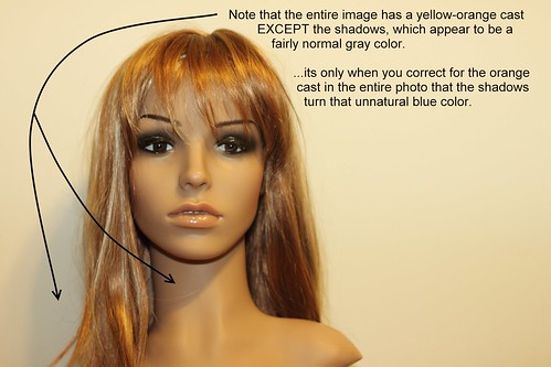
Many times when shooting an event or while at a family function you'll be called upon to take a photo of a person or group against a wall; so this a good project for beginners to practice. I'm going to walk you through one sample situation and we'll discuss some different ways that you could take the photo and their good and bad points. Note that this is part one of a two part article. This part will discuss quality of light only. The next article will discuss the color of the light. You'll notice that there are different color casts to the example photos included below -please ignore them for now. I want to tackle one issue at a time so, for now, we'll be focusing on the quality of light only.


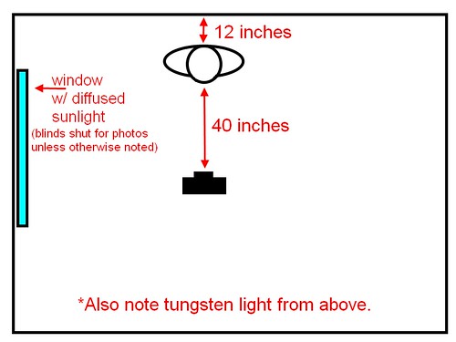
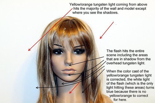
Okay, first let's talk about the situation. You're being asked to take a photo of one person against a white wall with a window to the camera's left (the model's right). The window has blinds on it so you can close or open them as you see fit. Outside it's bright, but cloudy so the light's fairly nicely diffused by the clouds, but since it's on the model's right side, it only lights half of her face. Overhead there is a 60W tungsten light bulb in a fairly normal (slightly diffused) ceiling fixture.

Here's a diagram:
Setup for model shots

If you close the blinds and take a shot using only the room lighting (the tungsten bulb) here's what you get:
Overhead tungsten bulb only
Note the fairly well-defined shadow under her nose and lips and also on her neck due to the lighting from above. Also, the light's not catching her eyes well since her brow is blocking most of the light from above.

If you open the blinds to allow the light from the window in you get this:
Overhead tungsten plus diffused side-light from a window
That's softened the shadow on the neck and under the lip, but it's created a shadow from her nose on the left side of her face and we really want more light on the left side too.

To get more light on her left side, we'll grab a reading lamp with a 100W equivalent daylight-balanced CFL in it and put it to the model's left (camera right). Here's the result:
Window side-light w/ lamp to fill shadows
Wow, the lamp is brighter than the window light, so now we have sharply defined shadows from the lamp on the model's right side from her chin and nose!

Perhaps we can tone down and diffuse the lamp light by putting something in front of the bulb? Let's try a piece of copy paper held in front of the bulb pointed at the model:
Window side-light with diffused lamp to fill shadows
That softened the shadows on the face nicely. The shadow on the neck's still there, but I'd call this acceptable!

But what if there was no such reading lamp? Perhaps we could try flash instead? Here's one using the on-camera (pop-up) flash:
On-camera (pop-up) flash
Whoa! That's harsh -check out the highlights in the hair, under the eyes, on the chin, and the sharp "chinstrap" shadow on the neck. This isn't very flattering light, it needs to be softened a LOT!

So, let's try putting something in front of the flash to help disperse the light better. A tissue or a paper towel would work, but all I could find was some toilet paper. Let's try to make due with that -I folded it a few times, then put it over the flash and here's the result:
Pop-up flash diffused w/ toilet paper
That toned the highlights down, but only slightly and the more we diffuse the flash, the less light we get out of it and the worse the shadow under the nose will get due to the overhead light.

So, let's try a more powerful flash. Below is the result of attaching a Canon 580EX flash on ETTL and aimed directly at the model.
Canon 580EX flash on camera pointed at model
Not too surprisingly, just like the pop-up flash, the 580EX straight-on is too harsh.

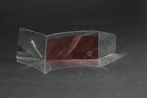
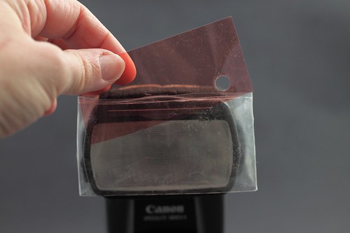
Let's try attaching one of those cheap $5 diffusion caps to the flash head (keeping the flash pointed directly at the model):
Canon 580EX w/ $5 diffuser cap pointed at model
Well, that diffused fairly well -the highlights are softer, but there's enough light to soften the shadow under the nose too. The shadow on the neck under the chin is still quite dark and well-defined, though.

Let's try taking the diffuser cap off and pointing the bare flash bulb at the ceiling instead.
Canon 580EX flash on camera pointed at ceiling
Wow! That did a great job of getting rid of that "chin strap" effect of the sharp shadow on the neck under the chin! There's enough shadow to show definition, but they are soft so they aren't distracting. I'm counting this one as a keeper.

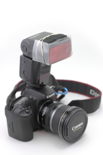
I have one more thing in my bag I'd like to try, a Lumiquest Pocket Bouncer. Let's attach that and try it with the default white surface.
Canon 580EX with Pocket bouncer using white surface
Hmm... chin strap is back. The rest of the shadows look good, though.


...this article was really to spur some discussion, so feel free to comment here, on the individual photos on flickr, or on the 
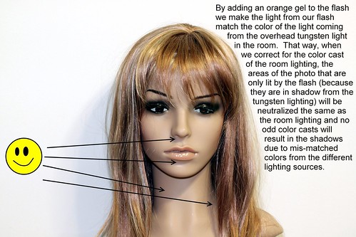
mailing list. I'd be happy to try other techniques and take more sample photos as well as explain the how's and why's of the above photos if you have questions. Otherwise, stay tuned for part two of this article where we'll discuss white balance and the how's and why's of using gels on your flashes.