So, let's start over. Here's what you need to know:
- The far left edge of the graph represents black
- The far right edge of the graph represents white
- The middle is all the shades of gray in-between (and for color photos, just think about them being converted to black and white before being represented on the graph)
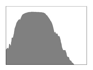
- If the data peters off to zero at the edges of both ends of the graph, your exposure is perfect.
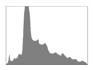
- If the data gets chopped off on the left side and peters off to zero on the right before reaching the far right edge, your photo is too dark or "underexposed".
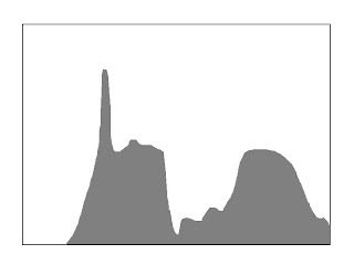
- If the data gets chopped off on the right side and peters off to zero on the left before reaching the far left edge, your photo is too bright or "overexposed".
Proper exposure:

Too dark (under-exposed):

Too bright (over-exposed):

1 comment:
Very nice!
Post a Comment