Tuesday, January 25, 2011

Creating a twin

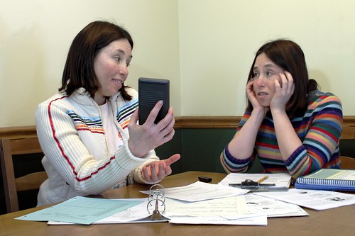
Fluid Therapy Math -I just dont get it


This is a fairly easy project to accomplish. You need a camera with manual mode, a tripod (or somewhere steady to place the camera on), and image editing software like Gimp (which is free).

If you aren't familiar with Manual mode, that's ok. You may need your camera's manual, however, if you don't know how to find out and change your ISO, aperture, and shutter speed.

  1. First, find your location and set up your camera.
  2. Put your camera on Aperture Priority mode. For Nikons this is usually marked on your mode dial as "A", for Canons it is "Av". (We'll switch to Manual mode later.)
  3. Decide on your primary ISO. For indoor photography with average lighting you'll need ISO 800, for brightly lit rooms 400 might be okay. We'll talk about adjusting this again a little later.
  4. Decide on your aperture. Aperture controls depth of field or how much of your photo will be in focus in the areas in front of and behind your focus. f/8.0 is a safe choice.
  5. Take a look at the shutter speed that results from your ISO and aperture choice by pressing the shutter button halfway while the camera is pointed at whatever you plan to photograph.
  6. If your shutter speed is 1/15 or slower you might have issues with motion blur in your photo. To get a faster shutter speed, increase your ISO (go from ISO 400 to 800, for example) and/or choose a lower-numbered aperture (go from f/8 to f/4, for example).
  7. If you have a shutter speed of 1/30 or higher you'll probably be okay. The closer you are to 1/30, the more careful you'll have to be to keep still while the photo is taken.
  8. Write down your ISO, shutter speed, and aperture.
  9. Change to Manual mode and dial in the ISO, shutter speed, and aperture that you wrote down.
  10. Change to the white balance that makes sense for the environment you are shooting in. If it's indoor (old-style) light bulbs or "warm" CFLs, use "incandescent" or "tungsten". For "cool" or "daylight-balanced" bulbs use "daylight", etc.
  11. If you have a remote it'll make it easier to get into position and take the photo, but if you do not, then you can use your camera's self timer instead. Experiment and see what works for you.
  12. Make sure your image is framed how you want it.
  13. Dial in the focus on where you will be.
  14. It may help to pre-envision your shot and make mental or actual marks for positions where your first and second photo might interact or in places you want to avoid overlap. These are easy to lose track of and hard to correct later in post.
  15. Either get yourself in position and take the photo with your remote, or press the shutter button and get into position before the self-timer takes the photo.
  16. When you think you have a photo that you want to use, go change outfits if you'd like to, and then get into position for the second photo and take that one the same way you did the first one.
  17. When you have the photos you want to combine, open one of them in Gimp or whatever photo editing software you use.
  18. Open the second photo as a layer "over" the first. (In Gimp, go to "File" > "Open as Layers").
  19. Use the Free Select Tool to roughly cut out your image from the image in the top layer (in Gimp you may need to go to "Windows">"Dockable Dialogs">"Layers" to see what layer you are working on).
  20. Invert your selection to change the selection from your image to everything else but you in the image on the top layer. (In Gimp, click on the "Select" menu and click "Invert".)
  21. Press the "Delete" key on your keyboard to delete everything but you in the image on the top layer.
  22. It should magically appear as if there were two of you in the photo at this point. If it looks good, flatten the image (in Gimp, go to the "Image">"Flatten").
  23. Make any other adjustments you'd like to the image and save as usual. Note that if you don't flatten the image before saving you may get an error or it may just not work. Images with multiple layers cannot usually be saved as a .jpg file.

Tuesday, January 11, 2011

Growth comes from overcoming frustration

With the funds I received from a rare and generous donation I was able to buy a Pullip doll that I intend on using for photography. That might sound really stupid, but as you can see from the examples of Pullip photos here, they really can make great subjects.

So, the doll arrived the other day and I immediately started to think about how to photograph her. My first thought was to make it animal-oriented. I bought her because she looks a little like me, and so I thought about posing her with all of my Vet Tech books (for school) in the background.

I arranged the books and the doll and this was my best shot out of the first shoot:


That wasn't nearly as effective as I thought it would be. So, I re-assessed the situation and decided to focus more on the doll. Here's my best shot from the 2nd round:


That's better, but still not a very good photo. I started getting frustrated. Why did I spend all that money on this stupid doll? Why can't I do this? Maybe I should stick with the still life genre or macros -things I'm good at.

I took a deep breath and thought about the advice I'd give to someone else in my situation -take a look at other people's photos of the same subject. That's when I found this photo. THAT's what I wanted to produce!

What's the difference? No background. They got in much closer. I decided to forgo the background and start working on the kitchen table. I propped my doll's head up and positioned her, then took some photos shooting down at the doll at various angles. And that's how I came up with this:


Untitled

Much better. Postable. I'm glad I stuck with it. The trick of searching Flickr for inspiring photos has helped me out of similar situations in the past and it's one of my favorite pieces of advice for frustrated photographers. The other lesson to be learned (or re-learned) here is that even though our instincts often lead us to want to include more in a photograph, it's often more effective to get closer instead. Zooming in can eliminate distractions and create more intimacy with your subject. I think that's where I was going wrong with the first couple of shots.

Tuesday, January 4, 2011

Critique guide for beginners

Getting critique on your work is the only way to find out how others perceive your work. But, beginners are often hesitant to join in with critiquing because they don't think they have the skills to judge a photo yet. I strongly disagree. Many of us aim to one day be good enough to have their photo in a newspaper or hanging on someone's wall. But the people who will be buying your art for their wall or looking at your photo in the newspaper will not be photographers -they'll be normal, everyday people. So, when giving critique don't worry if you could do better or not, it makes no difference -it's your opinion matters. And don't be concerned about being "right" or "wrong" -your opinion is just one opinion and the photographer should only take it as such. Just remember -there is no right or wrong when it comes to your own personal opinion!

So, with this in mind, here's a little cheat-sheet to give you some inspiration on what to look at when giving critique.

Here are the some basic areas to focus on:

1. As a whole, do you like the image? Does it look like someone spent time on it? Is it eye-catching? Could you see it on a wall, in an advertisement, or newspaper?
2. Exposure Overall is the photo too dark or too bright? Does it look dull and grayish?
3. Lighting: Is the lighting even? Are the shadows too dark or the highlights too bright? Are there distracting shadows?
4. Sharpness: Is the subject of the photo in focus? How much of the photo is in focus? Would the photo benefit from the background being more or less in focus?
5. Framing: Are there parts of the photo that were included, but don't add to the photo? Or is something missing or cut off that would have added to the photo?
6. Contrast: Does the subject stand out from the background, or does it get somewhat lost in it?
7. Noise: Does the image have a grainy appearance? Does it add to the image or negatively impact it?


Other areas of critique:

8. Rule of Thirds: Is the subject and/or horizon centered? Would the rule of thirds help make the photo more interesting?
9. Balance: Does your eye tend to ignore parts of the photo due to subject placement, bright spots, or certain colors?
10. Perspective: Is the angle that the photo was taken at effective? Would another angle be more interesting or appropriate?
11. Effects: Is the use of vignette (making the outside of the photo dark), adding of frames, selective colorization, etc effective or distracting? Does it add to the photo?
12. B&W vs Color: Was the use of color or black and white appropriate? Might it look better the other way?