This is a nice graphical manual mode cheat sheet. It's much like my previous Manual Mode Cheat Sheet post, but prettier:
http://livinginthestills.tumblr.com/day/2011/06/12
Saturday, December 17, 2011
Tuesday, September 13, 2011
Getting everything in-focus in an image.
Let's start by defining two terms:
-Shallow depth of field: when only a small portion of the photo is in focus and everything in front of or behind the focus point is blurred. Example: http://www.flickr.com/photos/
-Deep depth of field: when a lot (or all of) the photo is in-focus and nothing is blurred due to being in front of or behind the focus point.
Two things work together to determine your depth of field: where you focus, and your aperture.
-Low-numbered (aka "large" or f/4 rather than f/16) apertures give you a more shallow depth of field.
-High-numbered (aka "small" or f/16 rather than f/4) apertures give you a deeper depth of field.
But, the distance from the camera to where you focus also matters.
-The closer to the camera that you focus, the shallower the depth of field at a given aperture.
-The farther away from the camera that you focus, the deeper the depth of field at a given aperture.
So, to get an infinity focus (or close to it) you need to focus far from the camera and use a high-numbered aperture. If you aren't using Manual modes yet, then choosing the "Landscape" Auto mode on your camera (icon usually looks like mountains) and a distant focus point will get you similar results.
The sweet spot seems to be about a third of the way into the distance in your image -if you focus there (in a landscape) you should get about infinity focus. But please note that macros and studio shots are different since the focus point is so much closer to the camera, it is often impossible to get infinity focus without taking several pictures with different areas in focus and then stacking them in software after the fact.
Wednesday, June 8, 2011
Black and white conversion
The easiest way to convert a photo to black and white is to choose the menu item or button in your imaging software that just converts it for you. In Gimp 2.6.3 you find this under the "Colors" menu and it's called "Desaturate". But like many other things in photography, the easy way isn't always the best way to go about things.
I'm going to use this photo as an example for two different ways to do black and white conversions. I use Gimp, but these different techniques will work in Photoshop and many other programs as well. Here's the photo we'll be working with for this article
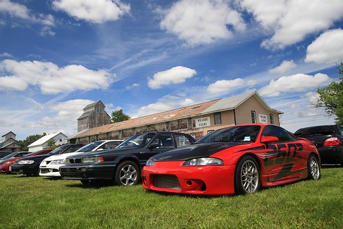
First, I'll show you what you get when you just "Desaturate" or do an auto color to black and white conversion
This isn't a bad black and white conversion, but the car ends up being a shade of gray that's very close to that of the grass, so it doesn't stand out well. The barn is a lighter shade too that blends in with the sky rather than standing out. So, let's talk about how Channels can help us get a better result.
Back in the day black and white photographers would carry filters with them that were red, green, or blue to adjust what colors would appear darker or lighter. Channels works in much the same way. This requires a little thought at first, but with some practice it becomes second nature. (And it's always fine to just play with the Channel controls until you like the way it looks too.)
If you put a red filter on the camera it blocks red from being recorded on the black and white film. This means that red blotchy skin is much less noticeable when a red filter is used. A red filter also darkens the color blue, so if you are shooting landscapes and you want a dramatic dark sky you can use a red filter as well. Let's make a table of the filters' effects to make this easier to use as a reference:
Red:
-makes red lighter
-makes blue darker
Blue:
-makes blue lighter
-makes green darker
Green:
-makes green lighter
-makes red darker
So, how does this relate to Channels? Channels adjust the amount of red, green, and blue used in the photo. This means that, effectively, Channels work like a filter does in black and white film photography. In fact, in Gimp (and I assume in Photoshop and other software), Channels will also convert to black and white at the same time that you adjust the amount of red, green, or blue. In Gimp this is done via a "convert to monochrome" checkbox. (The Channels tool in Gimp is under the "Colors" menu, then "Components", then "Channel Mixer".)
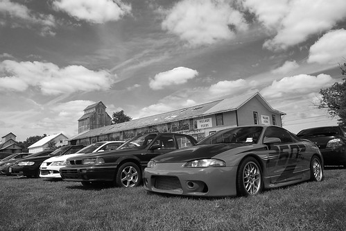
On to examples! Here is the photo using 100% red (the equivalent of using a red filter in black and white photography):

I like this result a lot! But, just to make sure this is the best one let's check out 100% green:
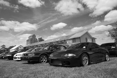
Check out the difference in the color of the car between these two photos! Pretty impressive, huh? Now let's see what 100% blue looks like:
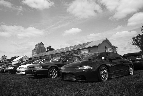
See the difference in the look of the grass in this one? I think red's my pick for this photo. But, unlike the days of film where you'd have one of the 3 filters to choose from, nowadays you have more flexibility than you may even want! You can choose 75% red, 25% green or 80%-20%-20% or any combination you think looks the best. So, give it a try and gain a lot more control over the outcome of your color to black and white conversions!
I'm going to use this photo as an example for two different ways to do black and white conversions. I use Gimp, but these different techniques will work in Photoshop and many other programs as well. Here's the photo we'll be working with for this article
First, I'll show you what you get when you just "Desaturate" or do an auto color to black and white conversion
This isn't a bad black and white conversion, but the car ends up being a shade of gray that's very close to that of the grass, so it doesn't stand out well. The barn is a lighter shade too that blends in with the sky rather than standing out. So, let's talk about how Channels can help us get a better result.
Back in the day black and white photographers would carry filters with them that were red, green, or blue to adjust what colors would appear darker or lighter. Channels works in much the same way. This requires a little thought at first, but with some practice it becomes second nature. (And it's always fine to just play with the Channel controls until you like the way it looks too.)
If you put a red filter on the camera it blocks red from being recorded on the black and white film. This means that red blotchy skin is much less noticeable when a red filter is used. A red filter also darkens the color blue, so if you are shooting landscapes and you want a dramatic dark sky you can use a red filter as well. Let's make a table of the filters' effects to make this easier to use as a reference:
Red:
-makes red lighter
-makes blue darker
Blue:
-makes blue lighter
-makes green darker
Green:
-makes green lighter
-makes red darker
So, how does this relate to Channels? Channels adjust the amount of red, green, and blue used in the photo. This means that, effectively, Channels work like a filter does in black and white film photography. In fact, in Gimp (and I assume in Photoshop and other software), Channels will also convert to black and white at the same time that you adjust the amount of red, green, or blue. In Gimp this is done via a "convert to monochrome" checkbox. (The Channels tool in Gimp is under the "Colors" menu, then "Components", then "Channel Mixer".)
On to examples! Here is the photo using 100% red (the equivalent of using a red filter in black and white photography):
I like this result a lot! But, just to make sure this is the best one let's check out 100% green:
Check out the difference in the color of the car between these two photos! Pretty impressive, huh? Now let's see what 100% blue looks like:
See the difference in the look of the grass in this one? I think red's my pick for this photo. But, unlike the days of film where you'd have one of the 3 filters to choose from, nowadays you have more flexibility than you may even want! You can choose 75% red, 25% green or 80%-20%-20% or any combination you think looks the best. So, give it a try and gain a lot more control over the outcome of your color to black and white conversions!
Monday, February 14, 2011
New quicklinks!
For those who subscribe to this blog, I apologize for the last few posts tonight, but they are part of a huge improvement for navigating the articles here on the Muddyboots Photography Blog!
For the last 6 months or so it's become more and more obvious that finding the information you want on this blog can be frustrating at times, but I think I made great strides tonight with my "Quicklinks"!
Now you can simply click on your topic of interest on the top right side of this blog (under the donate button -hint, hint!) and get all the articles on that subject right away. No sifting through labels or tags required. It should be quick and easy!
So, check them out, let me know what you think, and stay tuned as I fill in some of the gaps of knowledge that I found while compiling these quicklinks. More articles will be coming soon!
Quicklinks for: Photography Equipment
Cameras:
Lenses:
DIY
- My cameras (including reviews)
- Infrared converted camera rental, Part 1
- Infrared converted camera rental, Part 2
- Choosing a camera, what does "crop sensor" or "cropped sensor" mean?
- What kind of camera should I get?
Lenses:
- Help when shopping for a new lens
- My lenses (including reviews)
- Researching a budget all-around zoom lens
- Canon 50mm f/1.8 II "Fantastic Plastic" lens
- Sigma 30mm f/1.4 and Canon 100mm f/2.8 reviews
- Choosing a normal prime lens
- Examples of what focal lengths actually mean
DIY
Quicklinks for: Image Editing
Many of the following are written for Gimp because it's free, but the steps are the same for Photoshop, PSE, Elements, Paint.NET, and any other image editing software that has layers.
- Gimp basics
- Adjusting Curves based on a photo's histogram
- Using Auto-Levels
- Using Levels (beyond the Auto button)
- Using Curves
- Combining firework photos
- Creating a twin
- Color to black and white conversion (with Channels)
- Fixing posterization (or color bands)
- Fixing "dullness" or a grey cast in your photo
- Using HDR to overcome large exposure differences due to mid-day sun
- Creating a vignette effect
- Panorama how-to
- Selective colorization (Making a B&W photo with an area of color) for Gimp
- Selective colorization for Paint.NET
- Stacking photos to produce long star trails
Subscribe to:
Posts (Atom)